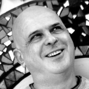
Stefano Dominici
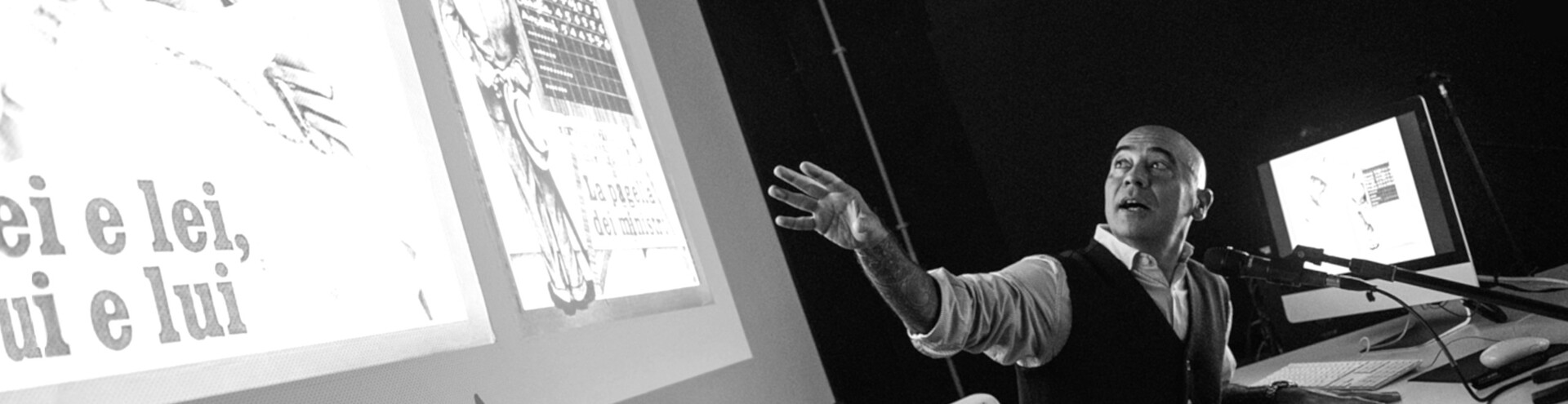
In Conversation with Stefano Cipolla
Stefano Cipolla is a distinguished Italian graphic designer and seasoned journalist known for his editorial work at newspapers such as "Il Manifesto" and "La Repubblica" in the early 2000s and, since 2018, as the art director of the weekly magazine "L'Espresso".
Since the beginning of his career in the 1990s, Stefano has shared his expertise in conferences and workshops, and as a teacher at institutions such as the European Institute of Design in Rome, the Scuola di Giornalismo di Urbino, MiMaster in Milano, RUFA in Rome, and on the Domestika online platform.
The interview is part of a series of online meet-ups with prominent design professionals hosted by Design Culture Collective APS, a European non-profit cultural association whose goal is to reaffirm, foster, promote and divulge the culture and the value of the design practice. For more information on DCC and their initiatives or to become a member, visit their website.
The text has been edited for length and clarity.
(Stefano Dominici, interviewer) Good evening Stefano Cipolla, art director of “L’Espresso”, and thanks for taking the time to talk to me. Let’s start from prime movers, shall we? What path led you to a career in information design?
(Stefano Cipolla) Good evening, and thanks for having me. If by path you mean my own personal history, I guess I should tell you straight away that it hasn’t been an entirely straight path, and the way I ended up working in the world of information design was by no means the ordinary way. I attended liceo classico, humanistic secondary school, and then went on to a degree in political science, all the time cultivating a parallel all-consuming passion for images — for drawing more than for designing, one could say. At the time, this would be the late 1980s, the practice wasn’t what it is today, so I asked my dad to pay for a visual communication course at the European Institute of Design in Rome, then one of the few schools that offered such opportunities. My dad wasn’t particularly happy about it, but ended up paying anyway, and those studies set me on my professional path: first as a freelancer in a number of advertising agencies, then as a warehouse worker.
I fell in love with newsroom work at “Il Manifesto”: I started in 2001, which proved to be a rather intense year for newspapers, with the 9/11 attacks in New York and the subsequent invasion of Afghanistan. It was also the year of the G8 meetings in Genoa and at “Il Manifesto” this was an event that, because of its national importance and of its political weight, equalled the attacks on the Twin Towers. It was during those months that I realized that everything I had previously learned about design translated perfectly to the world of newspapers. My love of news and newspapers was born then. And we should remember that “Il Manifesto” had and still has a great tradition in graphic and visual design — Piergiorgio Maoloni, a great newspaper designer who is not as well known as he should, worked there.
Anyway, working at a newspaper seemed to me a way to really put design to work in the service of society. As Albe Steiner said, that of the graphic designer is a very important job. And a hard one to fence in: think of signage and wayfinding, for example. Steiner himself designed the COOP logo — which has remained pretty much the same — but also had a decisional role in how to position goods on the shelves in the supermarkets. It is not by chance that in the news business graphic designers are professional journalists: how information is laid out on the page is as important as the way the text is written.
After a few years working at such an important but somewhat niche, or non-generalist, newspaper, I moved on to “La Repubblica”. I was called there to design the “Domenica di Repubblica”, their Sunday magazine. I did that for fifteen years, despite the terrible hours, so I most surely enjoyed it but I also clearly did something right, for them to keep me around. Then in 2018 I took the Art Director position at “L’Espresso” and completed my move from the world of daily news to that of weekly news. Which has been great: being a little removed from the trenches I had been in for quite a few years has made my life a little less hectic and has allowed me to be home a little earlier every evening, something I count as a plus.
You mentioned Maoloni — whom I was fortunate enough to meet early in my own career — and Steiner. Are they the designers that influenced you? Are there any others? Who are your points of reference within the world of design?
I’ve read comics since I was little. Italy was quite the place for comics, both the more artsy ones, I’m thinking Hugo Pratt or Crepax, and the popular series, and here Bonelli comes to mind. Then Marvel visually blew it all up and everything changed, for me at least. I remember spending my first salaries not on Rolex watches, but on original Spider-Man panels or on a Milton Glaser drawing. I think the influence of Push Pin Studios, Glaser’s and Chwast’s graphic studio in New York, and the work of John Alcorn there, has stayed with me, Alcorn especially. He moved to Italy in the early 1970s and designed quite a few covers for the Biblioteca Universale Rizzoli, whose books could be found in every home while I was growing up. They were everywhere, bought by every sensible parent, and those images, that visual style, we were immersed in them and they’re with me as we speak.
The other major influences I’ve already mentioned: Albe Steiner, Piergiorgio Maoloni. I shouldn’t also forget Angelo Rinaldi, art director at “La Repubblica”, who not only taught me how to design newspapers, not the easiest of activities, but also how to navigate the work environment. How it is necessary to talk to every journalist, every printer, every single individual which makes the miracle of the newspaper possible. This quasi-living organism that sees the light every morning and dies every evening, day after day after day. This was one of the other great snippets of wisdom I received from a colleague — this was early in my career, at “Il Manifesto”, which was a bit of an intimidating place for a young wannabe designer, shrouded in cigarette smoke and built on the work of some many brilliant minds as it was — after some minor mistake of mine had made it all the way to a final cover. Smoking quietly, she told me not to worry, since “today’s newspaper wraps tomorrow’s fish anyway”.
And it’s true. It’s this challenging deresponsabilization, here today gone tomorrow, coupled with the great responsibility of providing readers with a tool to use to interpret reality, here and now, that applies in general, not just to traditional newspapers, those in print, but also to online newspapers.
So when I talk about information, and information architecture, I of course include digital information in the picture. Now more than ever. We didn’t really know what we were doing back when we started, and we understand things a little bit better now. Paths are opening up in the design crafts that we even couldn’t think of a few years ago, and that is an incredible blessing. When I talk to students I always tell them there’s two types of teachers: those that on the very first day tell the class that only ten percent of them will be working in the field, and those whose optimism is unquenchable, those that tell the class that if they want to work in the field, they’ll work in the field, they’ll find their way. They’ll become artists, typographers, typeface designers, digital animators, and a thousand other things, and they’ll make it. I guess I’m more of the latter, and I’m glad to say that so many of my former students made it. Which is great, for them but for me as well. Just recently, my company employed someone right out of school for a six-month internship and I’ve been working with them on a daily basis: what enthusiasm, what passion, what contagious curiosity. How can anyone be anything but optimistic?
You recently worked on the redesign of “L’Espresso”. What can you tell us about the project? Can you take us behind the scenes and explain how you handle a process that will redefine the way such an historical weekly magazine engages with its readers?
I can give you a tour: we can take a look at all of the good things we did, but also have a peek behind the scenes, where all the compromises that we would like to avoid are made. Those with the client and those with advertisers, for example.
That sounds perfect.
This was my second project for “L’Espresso”: it was the more personal one, however, the one I did straight from scratch together with my deputy and good friend Alessio Melandri, all the way down to having new fonts designed for us.
A bit of backstory: “L’Espresso” was founded in 1955. It’s a weekly political and cultural magazine, the kind of print product that is called a “generalist” product in that it’s not aimed at one niche audience but tries to reach as many readers as possible. After about 60 years of being a Friday magazine, “L’Espresso” became a Sunday supplement to “La Repubblica” in 2016 to broaden its readership. It then remains on sale throughout all of the following week.
You can clearly see that being tasked with remaking “L’Espresso” comes with a certain degree of responsibility: you’re dealing with a very important magazine that cannot be made unrecognizable, whatever changes of direction or changes of ownership it has gone through.
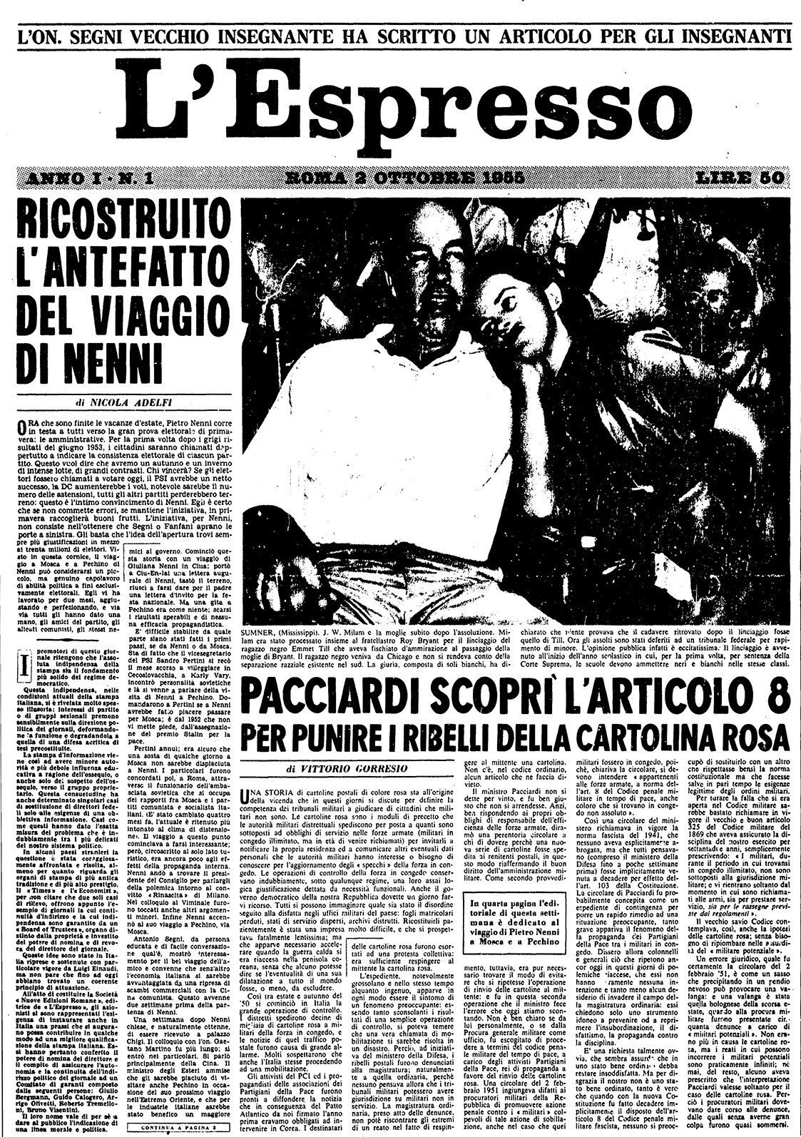
Figure 1. The first issue of “L’Espresso”, October 2 1955
Still, it has changed, hasn’t it? It was a different magazine in 1955 (fig. 1). It was a time of sheet-size publications, with lots of lead as we say, that is with lots of writing and one big image. The new “L’Espresso” saw the light on January 15 2023, a little over a month ago, and we’re still at the stage where we’re constantly running analytics and crunching numbers.
In projects like this you always start from something technical. So this was the grid we came up with for the project (fig. 2). A ten-column grid is a grid that allows for a lot of modularity and therefore plenty of movement within the page.
Figure 2. The ten-column grid used for the redesign
The project was born out of the desire to reinterpret and reappropriate the graphic tradition of the magazine. I can comfortably say now that we had quite a lot of fun, but there were moments when we doubted whether or not we had been overambitious: we had to go through the complete “L’Espresso” archives, wade through millions of pages and images and identify those patterns and elements that, decade after decade, had created what you could call the magazine’s signature visual style. It wasn’t easy. In that image from 1955 (fig. 1) you can see a signature between two straight lines and that wider attachment which then becomes a smaller column. This is but one example of many such elements we absolutely wanted to keep. We found so many.
A newspaper has a soul. A newspaper has its own DNA. Eugenio Scalfari and Ezio Mauro, the two editors who ran “La Repubblica” for twenty years each, did not talk about readers, they talked about community. Every newspaper has its own DNA and every reader has to recognize themselves in the newspaper: that’s why I believe it was important to reaffirm some form of visual continuity. This was also the first issue to use a new format, three centimeters longer, and that allowed a degree of freedom. The photo was taken by Oliviero Toscani, who is part of the history of Italian visual communication. Then we also worked on the design of the fonts we use. The company gave us the possibility to commission custom-made fonts, so we turned to an internationally well-known digital foundry based in Florence, Zetafonts. They immediately embraced our desire to take inspiration from the magazine’s past, and created these two fonts (fig. 3). The sans-serif one is especially very much based on the fonts that “L’Espresso” used in the 1970s.
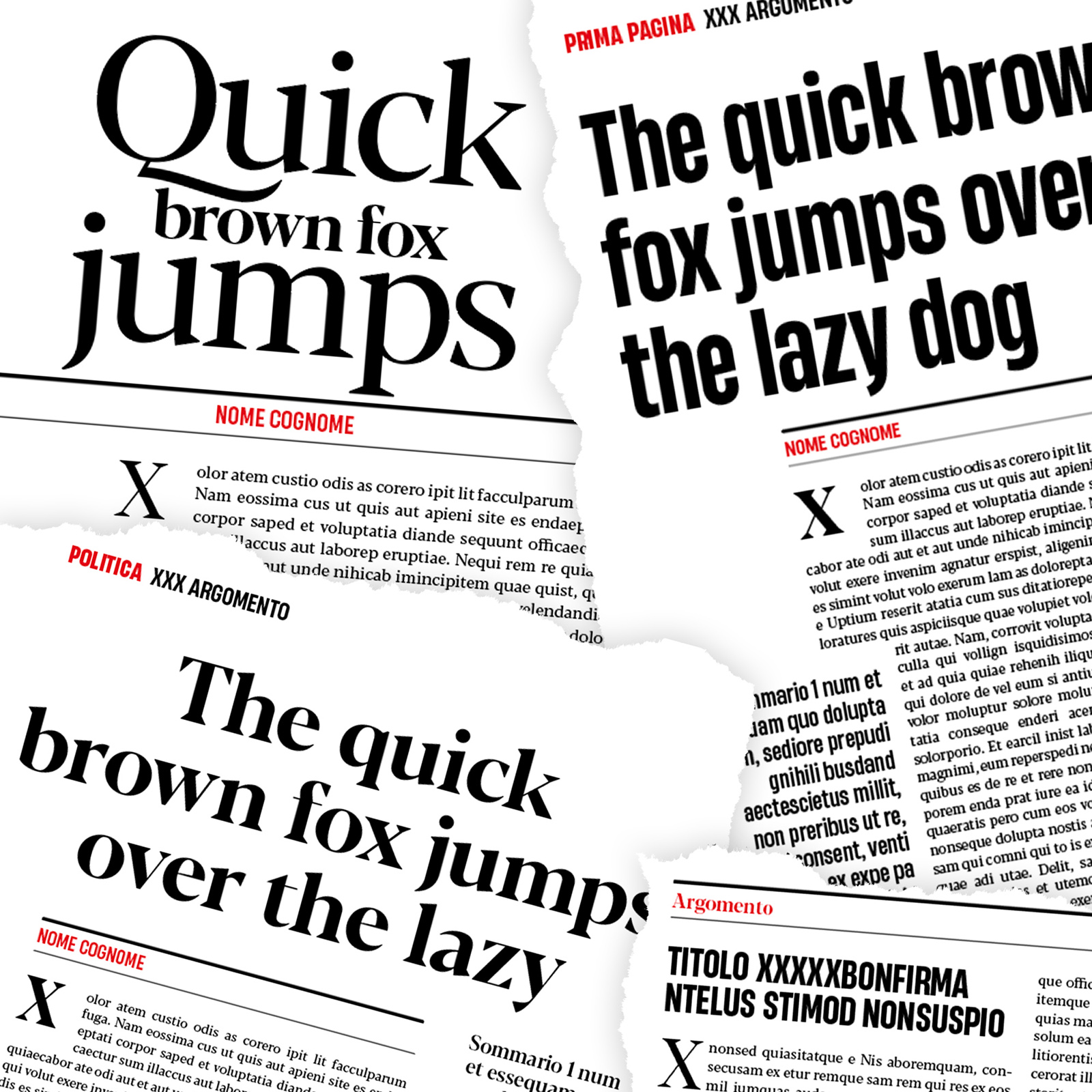
Figure 3. The custom-made fonts used for the new “L’Espresso”
The magazine is out now, but we’re still discussing small improvements to the fonts, you know, the type of nerdy things that might never see the light. We are also working on an idea for a spread with the table of contents on two pages that they used in the late ‘80s. It’s been one page for a while now. I’m not sure how technical you think we can get?
I think we can take a little more.
Alright. So, this sans-serif typeface, which is an extremely ‘70s typeface, we tried to make it work with the table of contents: each section of the paper opens on a double page, so we tried to use typography substantially — we worked hard on it, so let’s use it, right? — and create fairly impactful openings. Here for example, you can see how each section has the typeface that sets it apart.
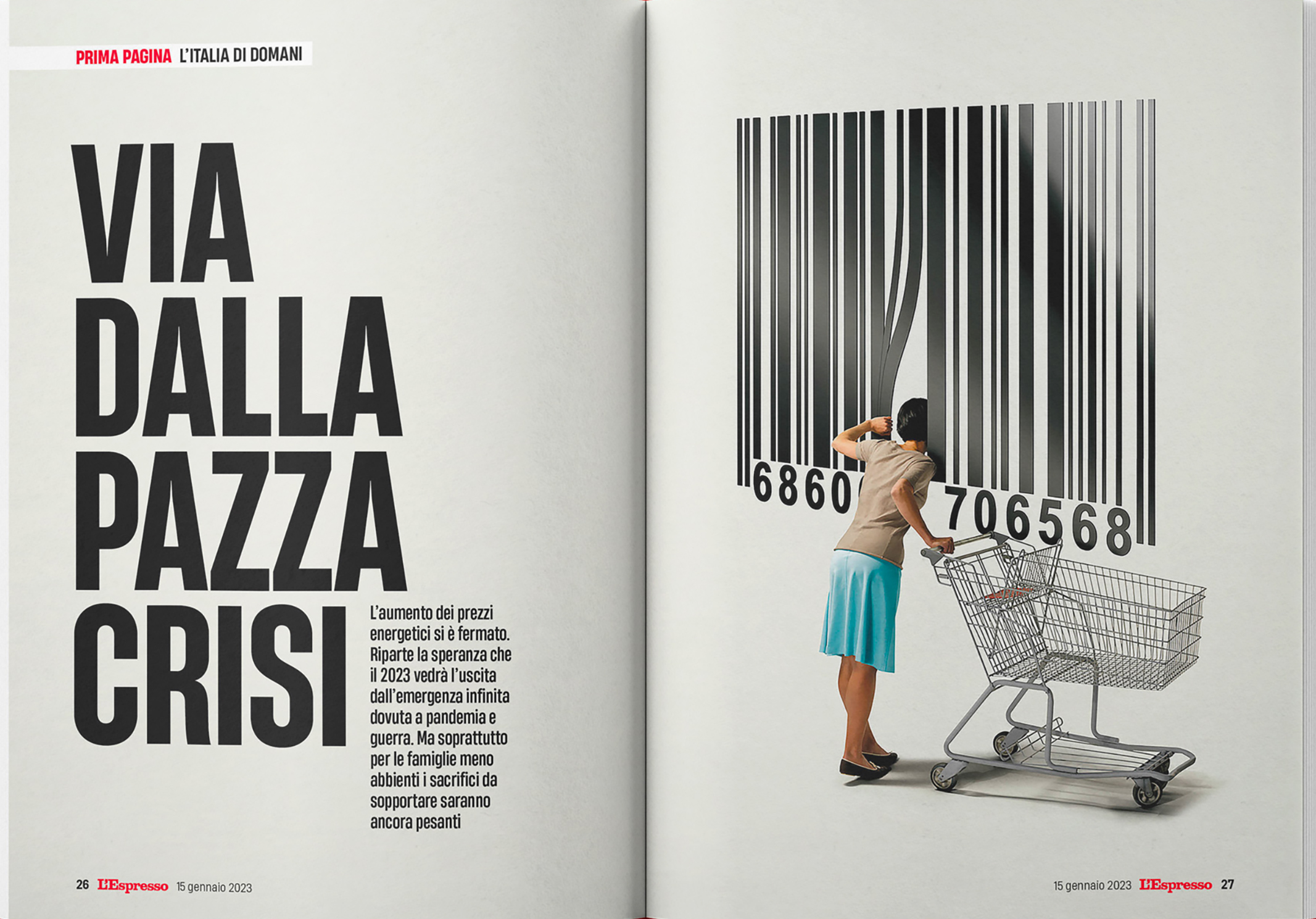
Figure 4. The ‘prima pagina’ double page opening
The front page, which is clearly the first section in the magazine, uses a sans-serif font, so its headline (in the table of contents) uses that. Politics on the other hand uses a serif font, and we had a little fun exaggerating the photographic cut as well (fig. 5). We thought it suited Giorgia Meloni’s personality.
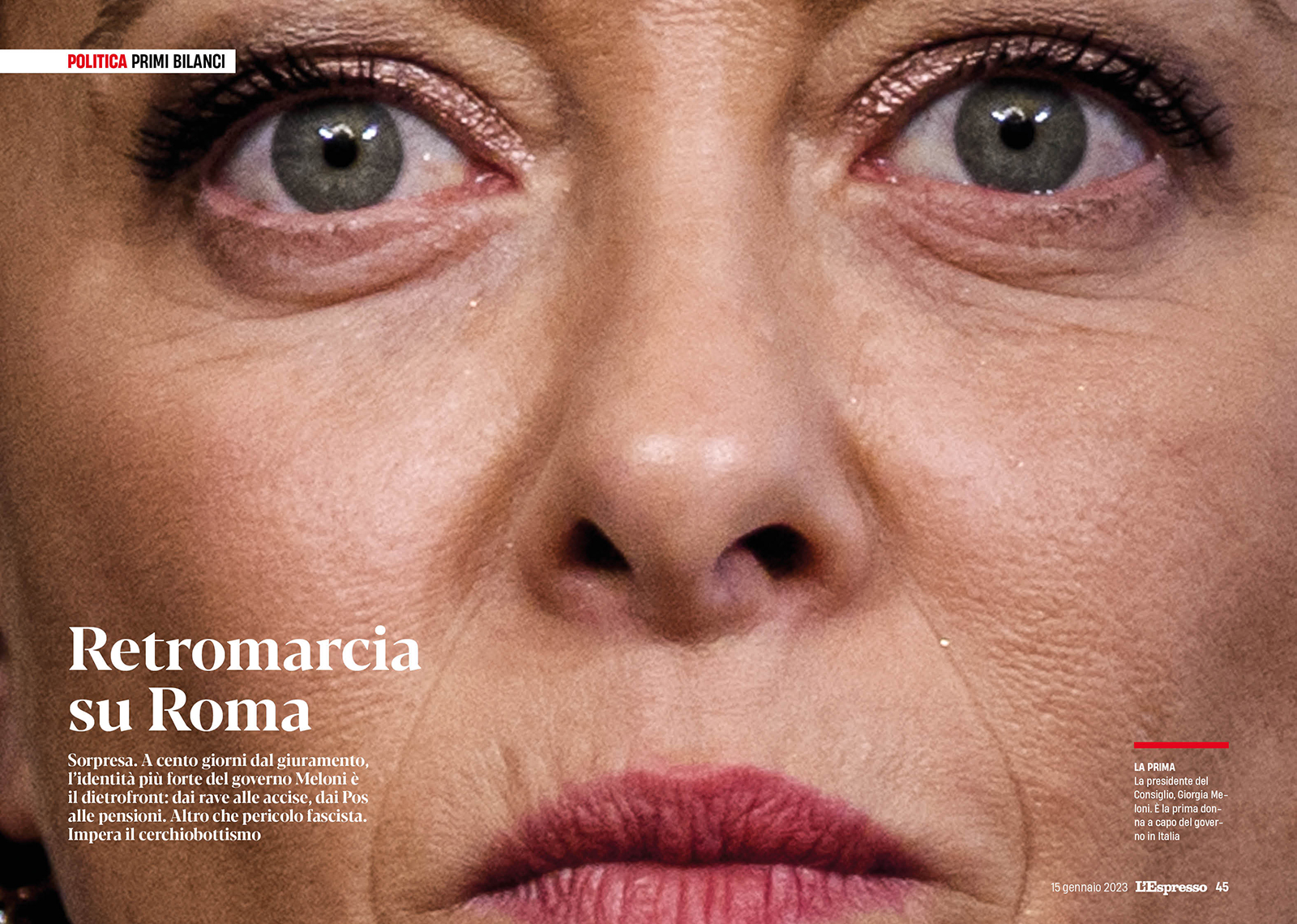
Figure 5.The Politics section opens with Sans-serif
What we have then in (fig. 6) is another example of a section opening on two pages: we go back to the world economy, so we have the White House and Joe Biden and one of those colorful images that scream America. We use the sans-serif font for readability here. You can see how the openings are always very airy and spacious, always centered on either a photo or an illustration. At the same time, we keep the structure cohesive, so that readers can easily scan the pages and place themselves in respect to the magazine.

Figure 6. The Economy section opening spread in full color
Check out the culture section opening for another example (fig. 7). See, the main photograph can land on the right or on the left of the opening pages, and we can move things around quite freely. The ten-column cage allows for a lot of reference points for positioning elements.
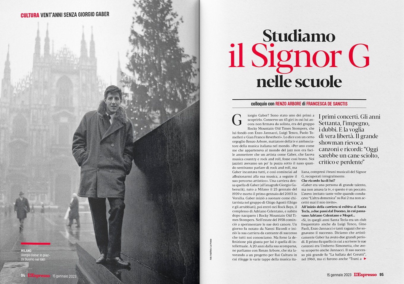
Figure 7. Airy and spacious opening pages: the Culture section of the magazine
Finally, take a look at this other opening (fig. 8). We go back to information architecture and the need to balance the space on the page. The photograph of Armani on the right — taken by Paolo Pellegrin, one of the great Italian photographers — is so strong, so intense that the left page had to be rebalanced using something equally strong.
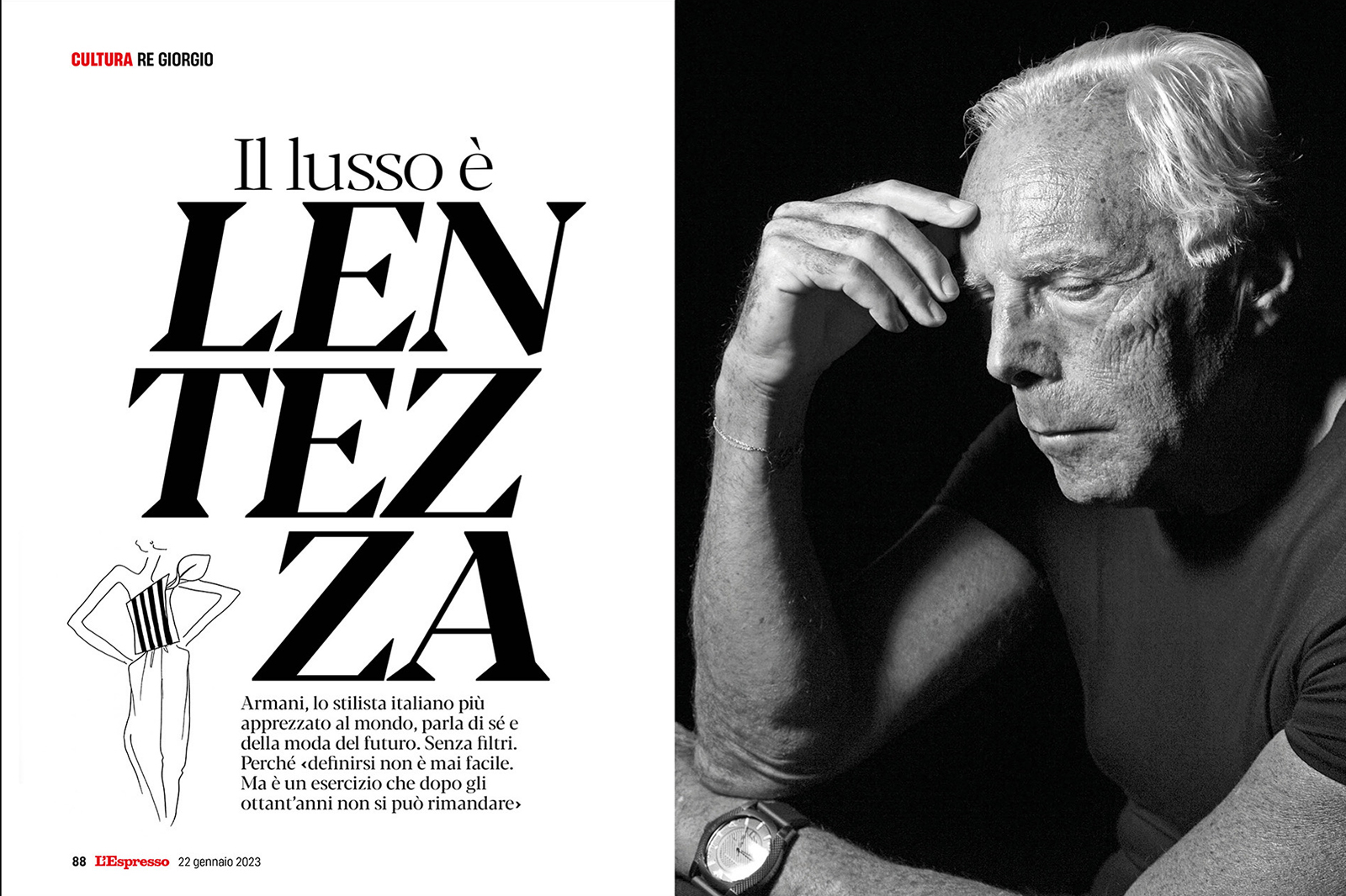
Figure 8. Balancing space between the two pages
And so once the title was composed, I had the privilege to have to come up with something that could typographically stand side to side with the image. Allow me to say that this type of work, the subtle, structural work with the page is what is great about this job. Way more than the flashier bits.
How was it behind the scenes?
It wasn’t as difficult as it has been at other times. I had the freedom to shape the project in a way that the results would fully satisfy me. But contingencies are to be expected anyway. Within a month of the launch, the editor left. Which meant I was in the not very comfortable situation of having a new visual design, designed with the support of the former editor who was now gone, that I had to explain and detail to a new editor I had never met before. Every designer has been at least once in a similar, let’s say political situation. We have to talk to the client, my new editor in this case, and we need to make them understand things that we may take for granted but for granted they are not. Think of asking the company to spend money on having a designer create a new typeface for the magazine. And then needing to explain why the company should do that when there are already thousands available that could be licensed and used. How a new custom-made typeface means being able to give a soul and its own personality to the magazine, something it wouldn’t have otherwise.
There are so many compromises. Anyone who designs knows all about it. My take is that the important part one needs to always remember is that any rejection, any request for compromise, any adjustment should never be taken as judgment passed on you as a person. If I were to give one single piece of advice to anyone would be to never confuse “you” with your work. When an editor or a colleague objects or criticizes something you did and asks for changes, they are not questioning you, they are not asking “you” to change. It’s a professional request to make something you made more fit for others, and that very often leads to a better final product. I think it’s even more important to keep this distinction very present when that doesn’t happen, when objections are detrimental to the design but one is in no position to convince those making the ultimate choices, because it’s not an easy thing to do at all: we all feel our work is very personal, and we all have a tough time keeping these two sides — us and our work — separated.
But we should never forget that design also has business responsibilities, and that when push comes to shove a case may simply be made for “putting the cart wherever the master wants it”, as the Italian saying goes.
Your biggest disclaimer when it comes to this specific project?
In the five years prior to this project I worked quite a lot with both Italian and international illustrators. I can’t say much about the quality of what I did, though I hope it was good, but it sure was a lot in terms of quantity. This attention and interest to illustrations is a legacy that I carried over from “La Repubblica”, where Angelo Rinaldi and I worked so much with young and upcoming illustrators, many of whom then became rather famous internationally. Olimpia Bagnoli and Emiliano Ponzi, for example. When I moved to “L’Espresso” I brought all these illustrators I’d been working with along with me and also started to collaborate with the junior ones already part of the organization. This way of working, this space, had become a very important reference point for the illustrator community, so I pretty much wanted to keep the “La Repubblica” model going at the new place, you could say.
At my first meeting with the “L’Espresso” editor, his one initial comment was that he hates illustrations.
It was a hard blow. But as much as it hurt on a personal level — believe me, hearing that hurt a lot — I think being a professional means one immediately starts to recalibrate and strategize: “put aside your current reference points”, “start working with photography more”, that sort of thoughts. I cannot be sure that trying to be flexible helped, or how much, but we have both moved slightly towards a different balance. I have to thank my friendship with Olimpia Zagnoli and Emiliano Ponzi, who have worked hard with me to provide the magazine illustrations that quite honestly cannot be passed on, but also the editor’s willingness to challenge his own likes and dislikes. We were recently looking at a page which contained a beautiful colorful illustration by Olimpia, and he smiled and said “We can keep this one, it’s too beautiful”. I now include two, possibly three illustrations in any given issue, which is a couple of steps down from the five or six I used to, but it definitely feels more of a developing conversation, the way it should be.
A final question: when creating the magazine, or any other communication artifact for that matter, how important is structure to you? Do you think of the page as a space?
Structure comes in way before we actually create the artifact. The very concept of a “magazine” comes with its own inherent structure, even before we have a “flat plan”. There are flat plans that have columns first, then sections, then a central part that could be a photo report, and then close with more columns. Laying out the flat plan is more the editor’s job than mine: I just ask them every day if they now have it, since if they don’t figure it out first and then don’t tell me, I cannot really balance out the pages.
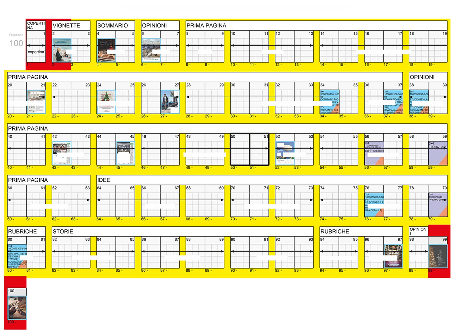
Figure 9. The flat plan for “L’Espresso”
For some of this information architecture we really start with the basics. We know that people read top to bottom and left to right in Italy, especially so with magazines and newspapers. So one already knows there is a pre-existing hierarchy and practice provides you with various ways to handle it, say a large picture at the center of the page that can balance the second part of the page. Or pages where an infographic rather than a photo or an illustration gives you the better flow. Structure is key, of course, and that includes the relationships between the various text parts — body, headlines and so on — and their typography. I’m not saying anything groundbreaking if I say that structure is a critical piece of what makes a specific magazine’s design a good one or a bad one. Still, it’s probably worth saying.
I think it is. Thanks, Stefano.
My pleasure entirely.