Vlad Atanasiu
Improving the Quality Control and Exploration of Digital Documents Using Visualization and Serendipity
Abstract
This article contributes to the quality control of digitization workflows, and to the exploitation of historical document collections, by demonstrating the utility of serendipitous exploration (as opposed to targeted searches) through the use of Document Towers, a visual representation of the physical structure of documents as architectural models. The Document Towers are evaluated via a qualitative case study on historical Swiss newspapers, a thought experiment comparing them to alternative solutions, a diagrammatic visual and numeric assessment of exploratory tasks, and several quantitative and empirical usability measurements and psychometric surveys. The experiments confirmed that both serendipitous exploration and the Document Towers visualization are objectively well-suited for the quality control and exploration of digital documents. A significant disparity in subjective usability was observed between librarians and academics, who rated the visualization concept below and above average, respectively. Other findings included the redefinition of quality control as a tool of knowledge and dialogue among stakeholders in information systems; a generic diagrammatic instrument for evaluating the outcomes of explorations; demonstrating how the adoption of novel information technology may benefit from adaptation to individual psychologies and socio-professional contexts; and, unexpectedly, novel historical insights into Swiss map-making, newspaper history, and censorship.
Introduction
“The greatest value of a picture is when it forces us to notice what we never expected to see” — John W. Tukey, statistician (Tukey 1977, p. vi)
Goals and contributions — This article intends to advance the quality control of mass digitization workflows, specifically by empirically demonstrating the utility of serendipitous exploration (as opposed to targeted searches) for information systems. To this end, a series of experiments are carried out to evaluate the technology developed to enable the serendipitous information-seeking strategy, a paradigm named Document Towers. The Document Towers are a literal interpretation of the concept of Information Architecture, in that they visually represent the physical structure of digital documents in the form of architectural models. The power of these visualizations lies in their potential for surprise, and hence, informativeness.
The contributions of this article extend beyond its initial goals to cover some unintended research outcomes. In the course of evaluating the Document Towers for quality control, their potential for historical research was discovered; thus, the case study on quality control was supplemented by one on the historical exploitation of digital archives. Furthermore, a link among quality control and historical research was identified, which lead to a redefinition of quality control as a task integrated with other dimensions of digital archives (such as the relationship between service providers and users in shaping technologies). Other unexpected contributions were novel historical findings, and the development of a formal diagrammatic method for the evaluation of explorations. Perhaps a more far-reaching discovery was that of substantial differences between librarians and academics with respect to the usability of information technologies with similar characteristics to those of the Document Towers; these findings may be ascribed to differences in individual psychological styles and socio-professional contexts. All these insights helped redefine the theoretical and practical perspectives on quality control with respect to the importance of serendipity as a tool of knowledge, as a dialogue among stakeholders, and as sensitive to social and technological contexts.
Relevance — The broad perspective according to which “the shape-shifting quality of mass digitization, and its social dynamics, alters the politics of cultural memory institutions” (Thylstrup 2019, pp. 3–4) is contingent on the usability of digital libraries and archives, which is itself commensurate with the quality of data as ensured by quality control. The role of quality control is also in an operational sense larger than any individual stage in a digitization workflow: it can further be instrumental in the identification of user demands and service opportunities, and can intervene in shaping the very architecture of information systems.
In terms of functionality, interaction with digital libraries and archives is dominated by targeted search strategies, which compel users to articulate clear ideas about what is being searched and to express themselves in ways that are comprehensible to the computerized information system. Reality, however, is less clear-cut, and information-seeking and historical research often incorporate imprecise and unknown information. As will be further explored in this article, novel and different strategies are thus required, such as panoramic overviews, serendipitous insights, open-ended exploration, affective human–technology bonds, and complementarity between automated and interactive approaches.
The adoption of these technologies is, however, contingent on their subjective usability, independent of their objectively demonstrable qualities. It is therefore desirable that such technologies benefit all stakeholders in information systems (data providers, technology providers, and users). Notably, our empirical findings suggest that this is not always the case; hence, another significant aspect of the present article is that it highlights the role of personalized information technologies, along with the need to determine how to adapt socio-professional contexts to make them more receptive to technological progress.
Reading keys — As the above remarks make clear, one way to benefit from this text with multiple disciplinary perspectives is to generalize and transfer the knowledge derived from it. For example, the antiquarian investigation into Swiss map-making, along with the minutiae of Document Towers usability statistics and user psychometrics, have value beyond their own specific scopes; we encourage the reader to apply the methods of generalization and analogy while engaging with this article.
Readership — This article is of equal interest to librarians and archivists who design and supervise mass digitization projects, and to computer scientists and service providers who create software for the quality control and exploration of digital libraries and archives.
Background — The work here described builds on prior collaboration between the author, the case study participants, and their respective institutions (the Department of Informatics of HES-SO//FR and University of Fribourg and the Swiss National Library in Berne). It is intended as a pilot study to inform future, larger information systems projects.
Terminology — Technically, the case study deals with collections of digitized historical newspapers, called newspaper “archives” by the curating institution, which is a library. As many para-textual investigations of the documents were performed for this study (on material, technological, and institutional aspects) the approach is arguably closer to research in archives than in libraries, resulting in the use of the term “archives”.
As for the term “document” — which, famously, can designate even a living antelope if it becomes part of a zoological collection, according to the French documentalist Suzanne Briet (Briet 1951, pp. 7–8) — the focus is on paginated documents (codices), although any information with a spatial extent can in principle be represented by Document Towers.
The term “serendipity” was originally coined in 1754 to describe two fictitious princes that were “making discoveries, by accident and sagacity, of things they were not in quest of” (Merton & Barber 2004, pp. 1–3; McCay-Peet & Toms 2018). A practical (albeit unhistorical) image to keep in mind while reading this article, with respect to the distinction between “exploration” and “search”, is that of Marco Polo riding wide-eyed into the unknown Orient, and of Livingstone, wearing blinders, to keep him focused on finding the source of the Nile.
“Socio-professional” (a French loanword) designates social characteristics of professional environments, such as market pressures for technology companies and publishing pressures in the academic world.
Organization — The article begins by providing the background to the case study in terms of defining quality control for document digitization in general and at the Swiss National Library (Swiss National Library n.d.) in particular, then discusses the state of the art in digitization quality control (Section 2). Next, it introduces the Document Towers paradigm, explains how to use it, and compares it to existing solutions (Section 3). The evaluation experiments (Section 4) make up the bulk of the article. A discussion of the research outcomes concludes the article (Section 5).
Further reading — The role of exploration and serendipity in libraries, and the digital technologies supporting them has been surveyed by the author in (Atanasiu 2022a, Annex). For technical aspects related to the Document Towers, the rationale of its design paradigm, its technological and cultural background, and the utility of document structure representation in a multifarious range of applications, the reader may refer to the author’s dedicated publications (Atanasiu 2022a; Atanasiu and Ingold 2021).
Background on Digitization Quality Control
Knowns — Quality control of document digitization consists principally in checking that all required document elements (e.g. titles, paragraphs, notes, styling, cross-references, tables, illustrations) have been correctly identified, that there are no missing, double, or faulty scanned pages, that the page order is correct, that tables are not wrongly segmented, that captions are linked to pictures, that pictures have the required resolution and color profile, and so on (Riley & Whitsel 2005, pp. 41–43; Almeida et al. 2009, pp. 150–151, 153; Chapman & Leonard 2013, p. 406). The workflow is subject to a number of strategic tasks, notably planning acquisition and allocation of resources (e.g. personnel, costs, time, know-how, software, hardware), monitoring digitization status and progress, and communicating between team members, with the management, and with external service providers or institutional partners.
Unknowns — In addition to these well-defined tasks, there are quality-related aspects that cannot be foreseen and are therefore not included in the service provider specifications or captured by off-the-shelf software — these are discovered (or not) by chance during the quality control process. This case study will present a number of examples.
Automation and Manual Control — The conformance of file format, image aspect ratio, and colorimetric parameters are examples of digitization aspects whose control can be easily automated. Statistical sampling techniques further reduce the workload. Practitioners recognize, however, that manual intervention remains necessary and that achieving high quality results is a considerable time and finance drain (Riley & Whitsel 2005, p. 43; Almeida et al. 2009, p. 151). The workload can range from ten percent of the digitized batch (for controlling simple image parameters) to its entirety (such as for historical documents with pages that are brittle or stick together, or dictionaries, where character formatting is functionally meaningful (Chapman & Leonard 2013, p. 408)). In addition to the identification of individual errors, formal methods must also be implemented to evaluate errors in terms of type, quantity, and relevance. The experience gained from manual control steps should flow into the development of the automatic quality control. Digitization and conversion projects are burdensome endeavors, and it is best to solve issues early on; e.g. to avoid “legacy bugs”, which are difficult and costly to eradicate once contracts are signed, or projects finished and programmers departed (Steffen 2016, pp. 2–3, 7).
Requirements — Decisions regarding the components of the quality control process are, as apparent from the above paragraphs, made primarily on technical and administrative grounds. Libraries and other document repositories do also involve the end-users in the planning process to improve the utility of public services and augment market revenues (Serenson 2000). User requirements, however, evolve over time, according to cultural, social, financial, and political interests (Buckland 1991, p. 55–67), sometimes with a consequential impact on quality control.
The Swiss National Library (SNL), in occurrence, has collected only a limited number of samples from the total output of Swiss newspapers since its founding in 1895, before switching to systematic collection during the mid-20th century, resulting today in substantial digital collation work and administrative overhead for various libraries in order to retroactively fill the gaps in newly designed online portals. The respective status of text and image parallels the ancient debate regarding the merits of orality and literacy (Ong & Hartley 2012), in that images were scares in newspapers until fairly recently (e.g. the late adoption of photography by major newspapers, despite the early success of the illustrated press) and in need of study (cf. the history of maps in newspapers, which remains an underexplored domain of the otherwise vast fields of cartography and media studies). In this context, the SNL deemed it unnecessary to microfilm advertisements in newspapers until their historical interest was acknowledged in the 1980s, meaning that part of the current quality control effort consists in identifying missing advertisements.
Summary — The quality control of document digitization and conversion is resource-consuming, experience-based, not necessarily methodical or efficient, and at times even frustrating. Potential improvements are numerous: provide transparency regarding decisions made about technological solutions; allow searching for known issues, as well as exploration of unknown issues; support quantitative and qualitative issue evaluation; facilitate overview, planning, monitoring, and communication. Ideally, the solutions should be effective in on-site conditions, polyvalent with respect to users and tasks, and lightweight in terms of development costs, maintenance, and learning curve.
State of the Art
There are three different states of the art in document digitization quality control, depending on whether one focuses on the document repositories sector, the digitization and conversion industry, or the academic research world. Their salient characteristics and interactions, with a focus on newspaper digitization (Center for Research Libraries 2015; Dunning et al. 2012), are briefly described below.
Software — Several software have been developed for the quality control and monitoring of the physical-to-digital and digital-to-digital format conversion workflows; these are typically integrated in large enterprise-level systems, such as docWorks Validator by Germany’s Content Conversion Specialists (CCS) (Content Conversion Specialists n.d.), LIMB Processing by France’s i2S (i2s n.d.), and Kitodo Meta and Flow, an open-source project of German-speaking libraries funded by the German Research Foundation (DFG) (Kitodo n.d.). The main role of the modules with respect to quality control is to check the conformance of XML schemes and image quality aspects such as color profiles, compression level, and resolution. Analysis results are reported through infographics, and some corrective measures can be automated. The main drawbacks are that document structures remain invisible and the solutions are costly and complex.
Standards — In partnership with the industry, academia, and funding agencies, libraries have developed various de facto document description standards, including ALTO (Analyzed Layout and Text Object), originating in the META-E project (2000–2003) co-funded by the European Commission, and maintained initially by CCS and now by the Library of Congress (Wikipedia contributors [n.d., a]), and METS (Metadata Encoding and Transmission Standard), also maintained by the Library of Congress (Wikipedia contributors [n.d., b]). Since the 2000s, the Australian National Library (Wikipedia contributors [n.d., e]) and the pan-European Europeana Newspapers project (Europeana Newspapers n.d.) have pioneered many aspects of newspaper digitization and conversion, including the adaptation of ALTO and METS, best practice metadata recommendations, and computational analysis and workflow support methods. An interesting aspect of the German pilot project as regards planning a national comprehensive newspaper digitization program (2013–2015) is that apart from providing an overview of the status quo and proposing recommendations, careful consideration is given to local organizational, cultural, and other particularities, in addition to striving for generic technical solutions (Staatsbibliothek zu Berlin 2017, pp. 5–6). As standards in professional digitization projects, the ALTO/METS formats are interesting for generating Document Towers, but are not common formats in which digital documents are created and exchanged (such as Microsoft Word for office documents, Adobe InDesign IDML in the publishing industry, PDF for interchange and archiving, EPUB for general readers, LaTex for scientific publications, and bitmap images for scanned documents). Formats are important, since they differ in terms of the type and quality of information they carry.
Research — Academic research has been involved in several of the software and related projects discussed above. For example, applied research carried out within the Europeana Newspapers project yielded in methods and software for workflow quality prediction (Clausner et al. 2016), document structure viewing (Mühlberger & Hackl 2015, pp. 56–59), recording image processing steps (Pletschacher & Antonacopoulos 2010), ground-truthing (Clausner et al. 2011), and OCR performance analysis (Clausner et al. 2015), as well as datasets for document structure ground-truthing (Clausner et al. 2016). The theoretical basis derives from long-standing and diverse fields, such as statistical process control in industrial and management settings (Oakland 2008), data quality in the field of “big data” (Sadiq 2013), outliers theory in statistics (Barnett & Lewis 1978), and misclassification research in pattern recognition (Atanasiu 2016, p. 2).
Vannevar Bush’s Memex reading machine of the 1940s and Xerox’s windows and graphical user interface of the 1970s are two examples that achieved notoriety while being representative of the research on document and library visualization carried out in the information visualization field (Bush 1945; Card 2008; Fang et al. 2009). Several related techniques have been adapted to digitization quality control, such as the software–hardware hybrid prototype developed at the Conservatoire national des arts et métiers (CNAM), Paris, consisting in a zoomable juxtaposition of page thumbnails projected on a cabinet-sized half-sphere (Almeida et al. 2009, 2006). Nonetheless, much work remains to be done with respect to visual quality control solutions.
Proposed Solution: The Document Towers
“The good bookstore sells books, but its primary product, if you will, is the browsing experience” — Jeff Deutsch, bookseller (Deutsch 2022, p. 24)
“It is probably wise to include a random element in a learning machine” — Alan Turing, computer science pioneer (Turing 1950, p. 459)
Theory: Understanding the Document Towers
Paradigm — Document Towers were created by the author as a means of gaining an overview of the layout of digital documents without the need to browse them page by page, a laborious exercise. More generally, the Document Towers are a visual discovery technique for patterns and singularities in digital documents. The Document Towers represent the three-dimensional physical structure of documents: that is, the location, size, and shape of text paragraphs, bitmap images, vector graphics, page boundaries, colors, typefaces, keywords, and indeed any entity that can be attributed a spatial extent. The resulting visualization resembles an architectural model of a building, hence its name.
Rationale — The physical patterns revealed by the Document Towers are traces indicative of the document’s logical structure, semantic content, and meta-information. This valuable equivalence of form and function is the principle that enables the user to become informed through observation, by interpreting what is seen rather than by querying that which might not even be there. The essence of this exploration is serendipity, and the Document Towers foster this type of information-seeking strategy. For this reason, they seemed an appropriate solution for tasks such as quality control and historical research, where serendipity — or surprise and high entropy, in information-theoretical terms — is expected and welcome. One goal of the present article is to test this hypothesis.
Implementation — The Document Towers paradigm has been implemented in a software program, called Crystal, because in a crystal labyrinth you cannot loose yourself, unlike in paper or digital documents, made of opaque or intangible matter. Crystal takes as input a JSON-formatted file containing the coordinates and labels of entities extracted from documents, renders them as Document Towers, and provides interaction capabilities, such as filtering, zooming, panning, rotation, and various measurements. Crystal extracts the label and geometry data from IDML and ALTO files; to process PDF documents, an API for the Enlighter software by Sugarcube (Ingold et al. 2014; Sugarcube n.d.) is used, while for document images, OCR software such as ABBY FineReader is employed.
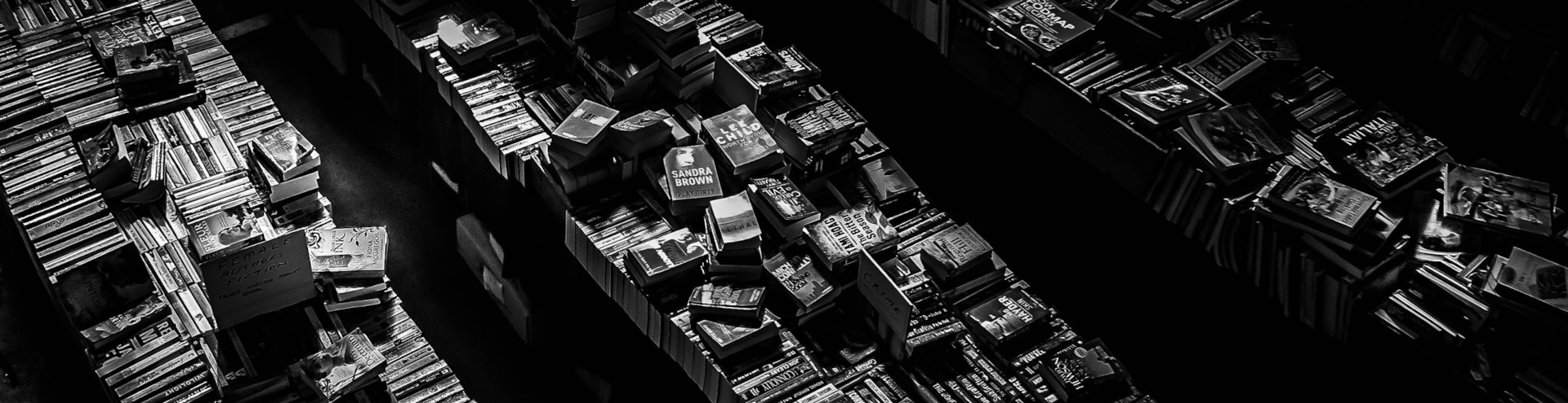
Comparison — There are a number of known issues with the use of visualization for the quality control of digitization processes (Almeida et al. 2009, pp. 151–151). The most common and consequential of these is the difficulty of concomitantly maintaining an informative degree of overview and detail on a sufficiently large set of documents (Cockburn et al. 2008). A typical quality control interface can provide great page-level detail, but an overview of the dataset is limited to a few thumbnails of the current document under examination (fig. 1). An increase in the number of thumbnails, usually accompanied by a reduction in their size, easily leads to crowding and loss of insight. A further issue is the physical manipulation of the data, especially in the case of highly dynamic visualizations that necessitate human–machine interfaces more sophisticated than a keyboard and mouse. By way of illustration, the use of a isometric joystick with six degrees of freedom to zoom in and out of the documents is notoriously difficult for first-time users, while scrolling the thumbnails in the viewport can be disorienting, just as when webpages are scrolled too fast (Igarashi & Hinckley 2000; Almeida et al. 2009, pp. 153–155). Among the most common software solutions are space-filling thumbnails (Cockburn et al. 2006) and dynamic and interactive visualizations, in addition to experimental techniques such as fish-eye view (Bederson et al. 2004), perspective view (Reinfurt & Wiesenberger 2014), rapid serial visual presentation (Back et al. 2006; Spence & Witkowski 2013), and augmented reality (Lee et al. 2013).
How do the Document Towers deal with the visualization problems and prospects described above? In short, through the three-dimensional stacking of pages, they preserve the natural structure of paginated documents, making it easier to identify (for example) misaligned, misplaced, missing, or spurious elements that are repetitive and appear at fixed locations, such as page numbers, chapter headings, or pages left blank. Three-dimensional stacking also increases spatial information density and the range between overview and detail. The simplification of data from detailed images to a wireframe of entity bounding boxes diminishes crowding. The color-coding of physical, logical, and semantic entities facilitates data classification, and thus expands the type of insights that can be obtained beyond what unmarked thumbnails can provide. Interaction issues are avoided so long as static views of document collections and items are sufficient for their exploration. The interface does however have zooming capability and supports filtering via on/off criteria selection. Through techniques such as representing paper sheets as slabs and organizing the document structures in city-like grids, the Document Towers portray documents as buildings and libraries as cities. Familiarity with the target domain of the architectural and urban metaphor utilized by Document Towers contributes to make the abstract entities (document structures) more affordable and hence facilitates insight discovery. The use of a metaphor in itself, apart from its specific embodiment, can carry a number of benefits, notably being a cognitive stimulant if it can intrigue the user and thus lessen the tediousness of a task such as interactive quality control.
Automation — It is possible to combine visual analytics and computational pattern analysis within the Document Towers. For example, the classification of layouts based on raster images of the document pages is useful for interpreting scanned documents in cases where segmentation into objects is not available. The numeric values corresponding to the layout types can be color-coded and displayed on the external “walls” of the Document Towers. Even if object coordinates are present in the digital document files, their spatial distribution patterns may be displayed in a more compact and legible way as color-coded “Ribbons”. Figs. 6 to 8 present layout characteristics of sample documents using the combined visual–numeric approach. For technical details on the measurements, see (Atanasiu and Ingold 2021) and (Atanasiu 2022b).
Media — The Document Towers may be implemented in a variety of media, the usual form being that of an architectural wireframe model. These representations can further be augmented by color-coded Ribbons, which may be engraved on a physical medium to facilitate document navigation for users with low vision. Other embodiments, such as sound objects, could be useful in special applications (Atanasiu 2022a).
Art — Last but not least, the Document Towers are not devoid of a certain aesthetic appeal. They may be simply enjoyed “as is”, or could alternatively be employed for communication purposes (e.g. as paintings or sculptures in the lobby of a library) to showcase their contents to a broader public audience in a new light.
Gallery: Visual Exploration of the Document Towers Universe
This pictorial section presents some of the dominant digital document exploration paradigms in response to which the Document Towers emerged, and illustrates the broad variety of their embodiments and applications.

Figure 1. Logical navigation
Logical navigation — Time is an essential dimension of periodicals, such as newspapers; thus, it is intuitive to design the interface to a digital newspaper collection based on a temporal navigation principle. In this picture, we see screenshots from the e-newspaperarchives.ch website, from which we drew content for our case study. To access a specific issue, the users first scroll through the list of years and months, then the list of days, after which they slide individual pages within the viewing window, move the cursor over paragraphs and pictures to highlight available objects (in red on page 2), and finally click on them to read the text or the metadata (highlighted on page 1). While this navigation principle is logical, it is not particularly efficient for browsing a large document collection: it is abstract, requires too many manipulations, and offers only a limited area for viewing the actual document image. Note that this interface is very similar to that used by the library employees for the quality control of this dataset.
Logical structure — Figure 2 shows a screenshot of a typical viewer of the logical structure of PDF files (Apache PDFBox’s PDFDebugger (Apache Software Foundation n.d.)). The information pertains to the document pictured in Fig. 1. The CropBox object (highlighted) contains the coordinates of the area visible to document readers. As the name of the software suggests, it is mostly useful to professionals searching for issues in digital files.

Figure 2. Logical structure
Content visibility — While physical libraries may be impressive works of art and architecture, as well as splendid places to work in or visit, their content can be as inscrutable as electronic documents, as most titles on the book spines are too far away to be legible. Science fiction has found a solution to this problem (fig. 3): information about the content of the works is communicated via color codes and dynamically displayed on the luminous spines of holographic books, as envisioned in “Star Wars” (Episode 2, “Attack of the Clones” (2002); (Fandom contributors n.d.)). As cover design is one of the factors considered when prospective readers select books in libraries and bookshops (Lador 1990; Kawaguchi & Suzuki 2018; Ooi 2019, pp. 81, 96), it is easy to imagine electronic book spines that personalize their appearance, enticing the reader to “Come hither!” in a manner reminiscent of the holograms that emerge like fairy-tale djinns from the giant outdoor advertisements in 2017 “Blade Runner 2049”.
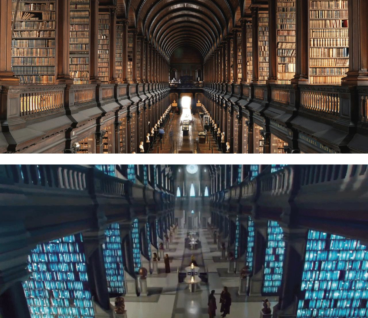
Figure 3. Content visibility: Trinity College Library, Dublin (top) and Jedi Temple Library, Coruscant (bottom). Images: Irish Welcome Tours and 20th Century Fox / Lucasfilm.
Spatial structure — Figure 4 shows a view of the user interface of the Crystal software that implements the Document Towers concept (Atanasiu & Ingold 2021).

Figure 4. Spatial structure
It represents the spatial structure of the newspaper shown in Fig. 1 in the form of an isometric projection, as described by sets of coordinates in the document’s ALTO file. There are four pages in this newspaper, the physical boundaries of which are rendered top-to-bottom by stacked red slabs. The two blue objects represent the two bitmap images on the first page. Also available for visualization through the interface menu are the bounding boxes of text paragraphs. The document model can be zoomed in and out, panned, and rotated. The software provides a schematic representation of the document layout in a single view.
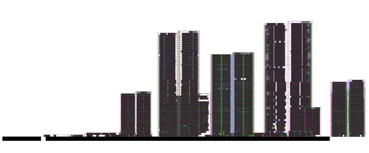
Figure 5. Urban metaphor
Urban metaphor — By exaggerating the width of a single page and the other objects on its surface, making them transparent or reducing them to a wireframe, and retaining the double-page structure of physical documents, objects that resemble architectural models of buildings and cities can be produced. This picture, entitled “Kendall Square” and derived from catalogs of the MIT Press, recalls an urban skyline. The Document Towers concept uses the document-as-a-building and the library-as-a-city metaphors to facilitate thinking about document collections (which in design terms is called “to increase affordability”; (Nielsen 1993)).

Figure 6. Architectural model
Architectural model — Figure 6 illustrates how variations of the Document Tower visualization technique may evoke various different architectural styles. For instance, these scholarly books produced by the École pratique des Hautes Études, Paris, recall the ceramic tiles covering the ziggurats of Babylon, the “Towers of Babel” so to speak. From a technical perspective, the colors encode the homogeneity of page layouts (with red indicating greater homogeneity). (Documents courtesy of Laurent Garrigues)
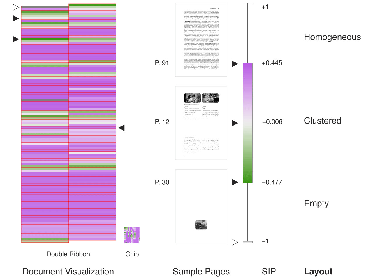
Figure 7. Semantic color-coding
Semantic color-coding — Figure 7 demonstrates how the computational pattern analysis of documents may be combined with visual analytics. In the first step, the type of page layout (varying between homogeneous, clustered, and empty) was characterized numerically using the structural information potential (SIP) algorithm (Atanasiu 2022b). In the second step, the resulting values were color-coded and rendered both as a “Double Ribbon” (for left and right-hand pages) and as a more compact “Chip” to facilitate further visual inspection. The document represented in Fig. 8, one of the author’s books, was further analyzed in Document Tower form in (Atanasiu & Ingold 2021). From the visualization, we can see that chapters of text with homogeneous layout (in red) are interspersed with image sections characterized by a clustered layout (in white), while there is one mostly empty page between sections (in green). The red stretch at the end of the book (the lower part of the Ribbon) represents the visual uniformity of the bibliography and index. A correspondence exists between the visual and semantic structure of the pages: visually clustered pages usually contain semantically differentiated and hierarchized content (such as title, paragraphs, footnotes, figures, etc.), homogeneous pages tend to have a more limited semantic focus (signified by the absence of titles), and pages on which “ink pixels” are concentrated offer little information, being largely empty. Jan Tschichold, one of the most influential Modernist typographers, referred to irregularly shaped layouts as “asymmetric typography” (Tschichold 1995). In information-theoretical terms, “asymmetric” pages are potentially more informative because the size range (and thus types) of objects extend over multiple scales, similarly to fractals. The same principle can be applied when interpreting Document Towers: in short, irregularities are perceptually salient. This is why the outsized map in the newspaper collection shown in Fig. 12 could be easily detected.
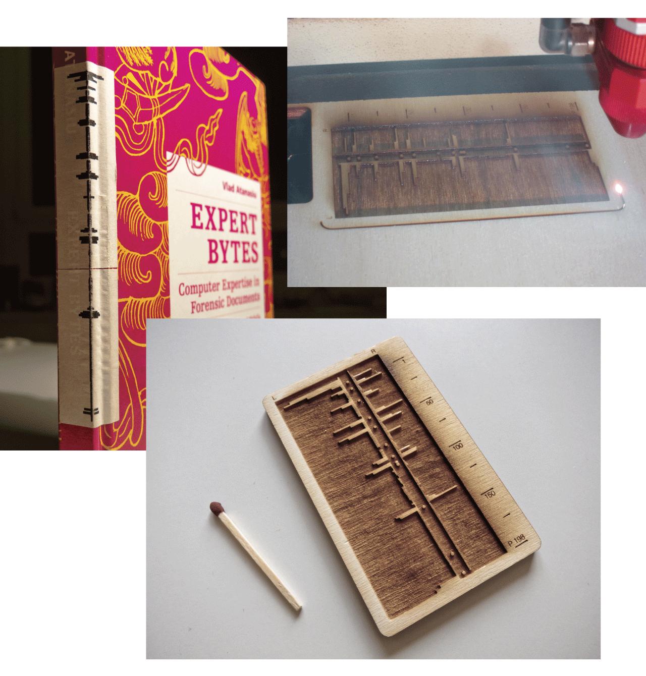
Figure 8. Tactile information
Tactile information — Information derived from processing digital documents can be displayed on the spines of physical documents. Here, the author’s book (Atanasiu 2014) is augmented by a “Ribbon” representing the size of bitmap images on each page. To make this information accessible to persons with low vision, the Ribbon was engraved with a laser cutter on a wooden tablet.

Figure 9. Poetic machines
Poetic machines — When zooming into Document Towers, very strange patterns often emerge. Such patterns tend, at least to this author, to evoke various poetical ideas through the juxtaposition of the abstract and the concrete. The ensuing synesthetic pleasure enhances one’s motivation to explore these fascinating document structures at length. Apart from their oneiric qualities, the aesthetic dimensions of the Document Towers may also play a role in improving their usability given the close connection between fascination and exploration.
Practice: How to Explore Documents in Three Steps Using the Document Towers
Figure 10 shows eighty-nine PDF documents represented as Document Towers placed on a regular grid, with each wireframe object standing for one raster image. Some notable patterns include the tall Document Tower vs the small ones, the regular vs the irregular, and the outliers; these correspond, respectively, to a book misclassified as an article, scanned vs natively digital documents, and images that fall outside the PDF viewport.
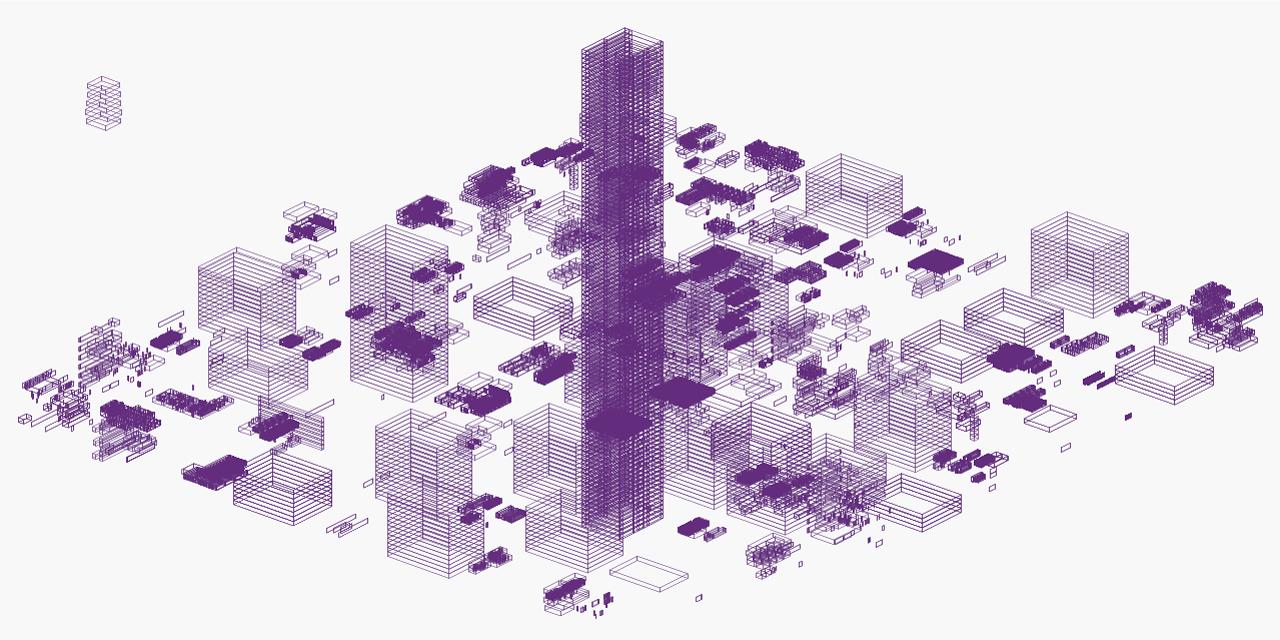
Figure 10. Eighty-nine documents as Document Towers
Exploration happens through a three-step workflow:
Observe — Observe the document visualization and identify patterns of interest. E.g. a tall Document Tower; regular vs irregular Document Towers (fig. 10).
Interpret — Determine the source generating the patterns. E.g. the tall Document Tower is a book misclassified among a set of articles; moreover, the regular Document Towers correspond to scanned documents, in which each page is a raster image the size of the physical document page, while the irregular Document Towers represent natively digital documents containing raster images located in various places throughout.
Act — Operationalize the findings. E.g. Remove the misclassified book from among the articles and place it in the folder dedicated to books; perform optical character recognition on the scanned to document to make the text content searchable.
Patterns to look for are:
- Amounts (e.g. number of objects per page, pages per document, documents per visualized set).
- Size (e.g. page area covered by objects).
- Distribution (e.g. uniform, clustered, random, and regular patterns).
- Categories (e.g. the Document Towers may represent the bounding boxes of physical pages, raster images, vector graphics, or text blocks).
- Diversity (e.g. relative amounts of object categories).
- Outliers (e.g. object located outside the viewport of a PDF document). Absences (e.g. a stamp that is visible on the scanned page raster image, but not within the document object model).
Concepts to identify include:
- Visualization leverages the capabilities of the human visual system, and therefore differs from the numerical and linguistic analysis of documents.
- Depending on their cognitive abilities and preferences, different users may receive different benefits from visual document representations than from numerical and verbal representations.
- The spatial structure of documents can potentially provide information about their contents and other characteristics (Atanasiu 2022b).
- Exploring the spatial structure is quick (a whole document in one glance), economical (object coordinates are available in digital documents), and polyvalent (many potential applications).
- Exploration is about finding the unexpected, while searching involves finding the expected.
- The spatial structure of the same document may differ according to the digitization process and digital storage format employed (Atanasiu & Ingold 2021); moreover, its usability may vary with the user’s skillset and mindset, as well as the application context.
In addition to document exploration, the Document Towers have an extensive and diverse range of applications, including document overview, navigation, quality control, misclassification detection, document design, representation for readers with low vision, and aesthetic appeal, among many others (Atanasiu 2022a).
Evaluation
Approaches — Usability is defined by the ISO standard 9241-11:2018(E) as having three facets, namely effectiveness, efficiency, and user satisfaction (ISO 9241-11:2018(E) 2018), which we address from the perspectives of different methods: qualitative, theoretical, diagrammatic, and quantitative. The choice to apply such an extensive approach was also made due to the difficulties associated with evaluating the outcomes of explorations and serendipitous activities.
The first experiment performed is a qualitative case study, comprising self-reports, interviews, behavioral observations, and historical research, the purpose of which is to evaluate the effectiveness of the Document Towers; here, the evaluation criteria are the number, type, and relevance of insights gained.
The second experiment is intended to evaluate the efficiency of the Document Towers, which we achieve by comparing its various qualities to those of alternative solutions using the method of thought experiments; this allows for the theoretical consideration of a large variety of use cases that would be impractical to test empirically.
The third experiment uses diagrammatics to facilitate an integrated evaluation of effectiveness and efficiency. Its specific contribution is to offer a solution to the problematic issue of evaluating exploration outcomes.
The fourth experiment empirically measures user satisfaction with the Document Towers, using quantitative analyses of one rating-scale-based usability satisfaction questionnaire, and furthering the interpretation of the results via two rating-scale questionnaire-based psychometric evaluation approaches.
Focus — The Document Towers are in their early stages of development, meaning that it is necessary to first evaluate the paradigm before the performance of any specific implementation. The goal is now to find out what insights produce the Document Towers, with what quality, and for which applications. Therefore, it is not appropriate for an exploration endeavor to decide a priori on a specific evaluation task, as other tasks not yet imagined might be missed. This approach could be called “exploratory evaluation”, in reference to the “exploratory data analysis” in statistics, first popularized by John W. Tukey, and defined in his own words as follows: “It is important to understand what you can do before you learn to measure how well you seem to have done it.” (Tukey 1977, p. v).
Object — By representing the content of opaque documents, the Document Towers make the invisible visible; thus, from this point of view, their utility is self-evident, similar to the first X-ray photograph of Marie Curie’s hand. The Document Towers also have polyvalent uses, so that only a case study specific to one application can be presented here. A survey of potential applications is published separately in [Atanasiu 2022a], as mentioned before.
Data — Since the evaluation tasks are quality control and historical research, any finding derived from the Document Towers is helpful, especially if significant. Therefore, the evaluation will not necessarily require large amounts of testing data.
Participants — To evaluate the Document Towers for digitization quality control and for supporting historical research in a library setting, participants with multiple skill sets are needed. That comprises digital technologies and humanities, and how such projects may be integrated in the specific missions, management, and resources of a library. Ideally, the participants should also know how to use the Document Towers to obtain insights, so that the evaluation can concentrate on the Document Towers’ capacity to yield insight rather than their learning affordance. The combination of these requirements restricts the pool of respondents eligible for participation in the evaluation. While studies with small numbers of participants have low statistical power (Brysbaert 2019), and some usability evaluations involve massive numbers of users (e.g. N = 11,429 for a single study on recommendation serendipity carried out via smartphones by the Chinese IT giant Alibaba (Chen et al. 2020)), small-sample studies are an unavoidable reality in many fields and circumstances. Reasons for this may include the relative rarity of the occurrences under study (e.g. aviation accidents), the complexity of situations (e.g. in personalized medicine), ethical considerations (e.g. crimes), costs and duration (e.g. training machine learning algorithms), or issues concerning access (e.g. to archival records). The growing awareness of the relevance of such cases has given rise to a body of research focused on small sample size and single-case statistics and experimental design (Franklin et al. 2014; Morley 2017; Schoot & Miočević 2020). From this perspective, if the results are demonstrably significant for the end users, tasks, or contexts, then a small number of participants is both sufficient and justified. Given the stated constraints on our subject matter, we accordingly adopt this approach as the basis for the four distinct evaluation methods used in this article (N = 3 in the first experiment, and N = 21 in the fourth experiment). As a case in point, while our first case study has just three participants, their use of the Document Towers was found to generate a broad range of insights about the test documents, which are further analyzed for their historical relevance to a depth that would not be possible for practical reasons with a large participant sample.
Tasks — As previously stated, the quality control of document digitization processes comprises well-defined issues, such as identifying missing pages, which can be dealt with by dedicated procedures and software, and the performance of which can be evaluated using standard information retrieval criteria such as precision and recall (Zhang 2008, p. 240). An essential, but technically much more difficult aspect of quality control is the myriad of serendipitous findings. To use an analogy, Columbus’ journey would have been deemed a failure if evaluated strictly on the basis of the task he set out to complete (to reach India by sailing westwards from Spain). In the case of library documents, the problem is compelled by the findings’ diversity, the fact that one finding might lead to another, the context-dependent nature of the data, and the subjectivity of interests among library users. A holistic, qualitative approach, as adopted in this article, seems appropriate for containing such a fluid problem.
Regarding the question of result replicability, it will become evident from the evaluation outcome that participants have seized the opportunity to use the Document Towers to arrive at idiosyncratic ends. While “qualitative research doesn’t pretend to be replicable” (Marshall & Rossman 1995, p. 144), response variability is also a desirable and enriching feature of the task to be tested (i.e. exploration).
Incidentally, these characteristics of quality control parallel some of those of research in the domains of the humanities and cultural heritage, which are included among the core operational areas of national libraries. The evaluation will stress how the Document Towers establish a precious feedback loop between library personnel and library users and expand the definition of quality control from narrow factual issues (e.g. a missing page) to an instrument of knowledge (e.g. the missing page reveals censorship).
First Experiment: Qualitative Case Study
“If you can’t measure it, you can’t improve it.”— Peter Drucker, apocryphal
“Incongruities do not, however, usually manifest themselves in the figures or reports executives receive and pay attention to. They are qualitative rather than quantitative.”— Peter Drucker, management theoretician (Drucker 2015, p. 69)
Method
Approach — Why does this experiment use qualitative evaluation? While quantitative, analytic, and objective evaluations prevail in computer science, qualitative evaluations, common in psychology and social sciences among other fields, can produce different insights, and describe, with flexibility and synthetically, contexts that are noisy, fluid, hyperconnected, and circumstantial. These are properties of the problems to be evaluated, namely quality control, historical research, serendipity, and exploration. This study also concerns itself less with software engineering, which naturally lends itself to quantitative evaluations, than with the complexity of human–computer interactions and interface design, the cognitive processes of historical research, and how para-textual document information is captured by and percolates through digital information systems. Moreover, the Document Towers integrate paradigmatically machine processing of documents and human knowledge about their meaning, thus naturally lending themselves to quantitative analyses, in line with the view that “our current fascination with information technologies must be balanced by careful attention to the more specifically human dimensions of librarianship” (Nauratil 1989, p. 104).
Scope — The elements of the Document Towers to evaluate are identified in a systematic fashion using the so-called “Nested Levels” model for visualization design, which distinguish between the domain situation at the top of the design parameters, the mid-layers of data and task abstraction and the visual encoding and interaction idiom, and the lower level of the algorithm (Munzner 2015, pp. 66–93). The evaluation object is the proposed paradigm, i.e. an architectural representation metaphor of document structures: first in terms of insights into documents and collections, then for its utility to the specific tasks of quality control and historical research, and possibly other tasks such as planning and communication within the library administration, or as an information system for the library users. The evaluation perspectives are that of the point of view of the librarian performing quality control and offering access to information, the computer scientist inventing digitization and information systems, and the historian using them.
Participants — The participants were Florian Steffen (FS), head of the Digitization Unit of the Swiss National Library, representing the quality control practitioner in this case study; Andreas Fischer (AF), computer science professor, Department of Informatics, HES-SO//FR and University of Fribourg, bringing the technologist’s perspective to the study; and the author (VA), informatics researcher and historian, standing for the patrons using the library and archive services. While the participants have engaged in ongoing professional collaborations, including on the Document Towers, it is not their sympathetic disposition that has led to the discovery of objective facts in the data through the use of the Document Towers. Indeed, prior to the evaluation, they were unaware of the particular quality control issues in the dataset to be tested, which were selected randomly among newly digitized documents, such as for example the nature and significance of one of the main findings: a remarkable map, a missing image, and unlabeled white space. One important dimension of the case study — the recognition of the utility of the Document Towers for historical research and its implications for quality control that lead to the inclusion of the author as study participant — was itself an unplanned outcome of observations made by FS and AF, along with collegial discussion by all participants. Although the design and interpretation of the case study were developed by VA, these results were made possible only by teamwork. This approach is akin to participatory research and action research, which actively involve designers and users to challenge the mentalities and behavior of both parties (Marshall and Rossman 1995, p. 4).
Data — The evaluation made use of documents with which the Library’s Digitization Unit was engaged at the time of the case study, specifically a newly digitized batch of historical newspapers that had not yet entered the quality control process. This choice provides the evaluation with real-world data for evaluation, and may result in real-world actions by the Library if interesting findings emerge. The data consists in eighty-two items in nine annual batches of the major historical Swiss newspaper Züricher Freitags-Zeitung [ZFZ, Zurich’s Friday Newspaper] (1674–1914; in 1814, it was the most read Swiss newspaper [Bollinger 2018]) sampled over the period 1766 to 1905, and one hundred items in one batch of the journal of the influential Christlicher Metallarbeiterverband der Schweiz [Swiss Christian Metallurgical Union] (1902–1999) from 1968 to 1970. The documents form a collection of more than one hundred newspaper titles made available by the Library and its partners via the website e-newspaperarchives.ch. Logical entities were extracted from the scanned documents by a subcontractor and returned as ALTO/METS and enriched PDF files; page, image, and headline boundaries were then represented for each batch as a City of Document Towers (fig. 2).
Procedure — The evaluations were carried out by VA individually and lasted approximately one and a half hours, followed by group discussion (VA self-administered the protocol and was subsequently questioned by AF and FS). VA summarized the results, with the exception of those concerning AF, which he presented; the final text was approved unanimously. Participants had previous knowledge of the Document Towers visualization paradigm and software, Crystal. At the start of the evaluation, they were invited to experiment with a sample document (e.g. upload data, filter information, select views, zoom, explore, and interpret). Next, the participants were asked to visualize the ten datasets using Crystal and verbalize their intentions, actions, and experiences, as well as answer specific questions; discussion with the evaluator was encouraged. The questions were as follows: “Please describe what you see in the visualization; highlight what appears remarkable”, “For what tasks and for which users do you think the visualization would be useful?”, “How could the visualization be useful for quality control?”, “Describe your experience, especially concerning interface ergonomy and visualization readability”, and “What is your bottom-line impression of the visualization paradigm and software implementation?”

Figure 11. Objects evaluated
Figure 11 shows the Document Towers visualization of the 82 ZFZ issues used in the case study, (see sample pages in Fig. 12). Page boundaries are represented as red wire boxes, single issues as stacks, and issues are grouped by year. The blue boxes are items labeled as “Illustration” in the ALTO files of the digitized documents from which coordinates were obtained. — The newspaper logo is visible at the top of every issue; from 1863 onward, they show a different aspect ratio, suggesting a design change, confirmed by comparing front pages (B vs C). The larger page sizes in the 1831 batch are supplements, and their identification through visualization facilitates planning and performing quality control. The conspicuous blue box of 1805 (A) stands for a map. The Document Towers provide visual proof that illustrations were quasi-absent from the ZFZ before the 20th century. — Comparing information available in the ALTO files as Document Towers and the document images reveals the intentional exclusion of tax and library stamps from digitization (no box around them in A, B, and C). This action costs money and time, as the objects have to be removed most likely manually, and is prone to errors, since it was discovered that not all stamps were excised. During interactions with the information system, both users and automated search engines are deprived of knowledge about the historically and possibly legally significant information carried by stamps.
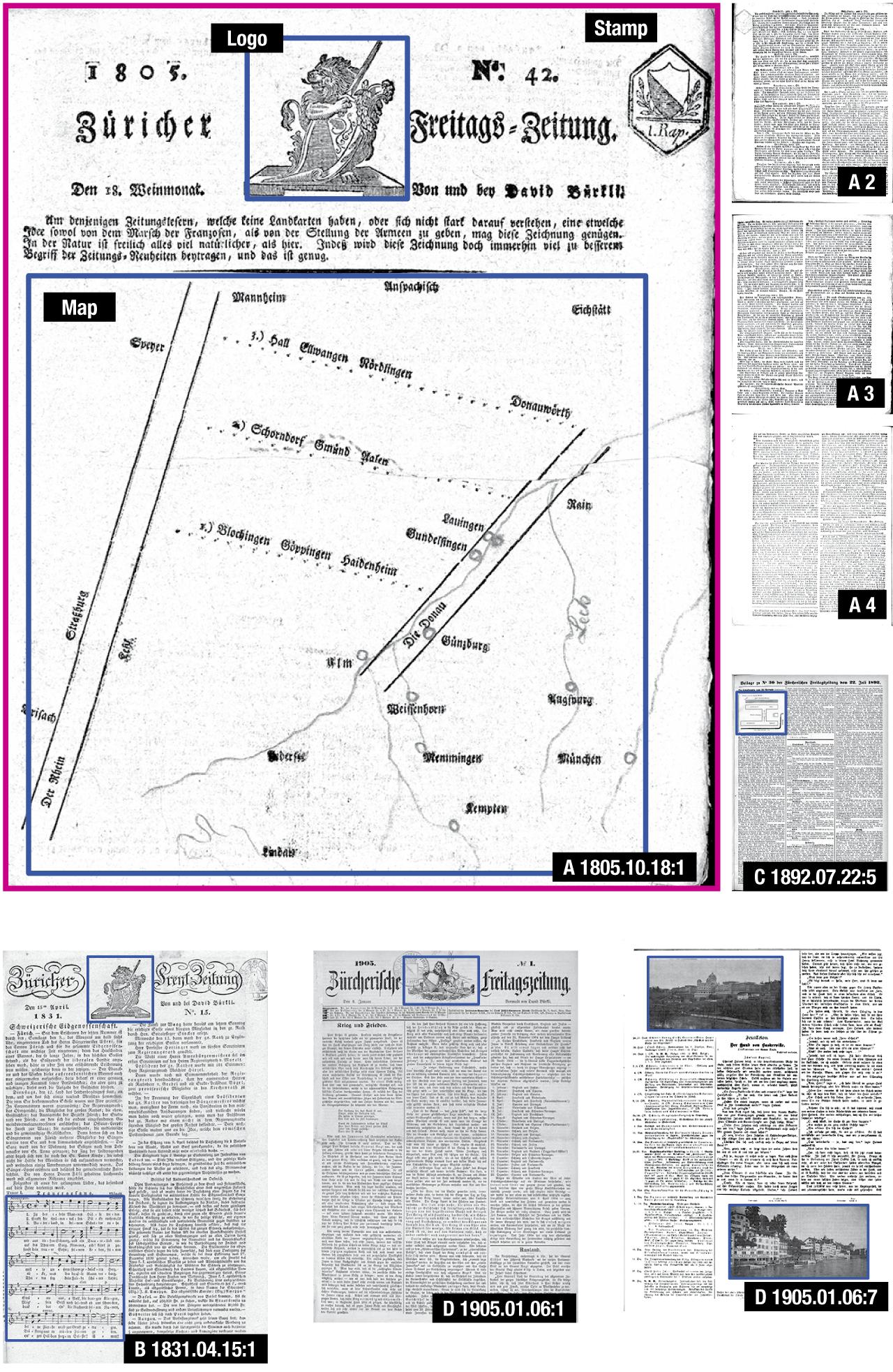
Figure 12. Actual ZFZ sample pages relevant to the visualization of fig. 11
Results
From this point onward we are discussing the primary findings derived from evaluating the Document Towers, where those findings subsequently led, which concrete actions were taken by the participants as a result of the pilot evaluation, their significance, and the role played by the document visualizations.
Participant FS — FS found the Document Towers “extremely useful for quality control”. An essential reason is that they allow identification of potential anomalies; here, FS pointed to how “monotonous” certain document runs represented as Document Towers appear, which he interpreted as a sign that there is in all likelihood no error to be expected. Another factor is that the Document Towers substantially facilitate “the identification of artifacts that can be subsequently searched [in other datasets], which is the ultimate quality control [method]”. The discovery of overall patterns and trends also help in estimating the extent of, severity of, and costs incurred due to quality issues. Finally, the Document Towers spark novel ideas about quality control and, more generally, the use of digital documents and services within the wider context of the library’s activities.
The Document Towers’ importance was clear to FS, as they mitigate the great difficulty (“impossibility”, in his words) of discovering features (e.g. when an image viewer is parametrized to fit images to the viewport, users are unaware that images with the same aspect ratio might be of different sizes) and interpreting data (e.g. coordinates are more easily assessed as a map than as a numerical list). FS noted with interest that the Document Towers prompt questioning of the data in many and important respects; among these were some not envisioned by the designer, such as using the Document Towers to train library staff on quality control and to “keep [patrons] longer on the library website”.
In conclusion, FS, as head of the Digitization Unit, was (i) convinced of the Document Towers’ utility for quality control and other tasks, and (ii) supported a common initiative for developing the paradigm through a future academic, industry, and government research and development project. Furthermore, spurred on by the aesthetic appeal of the Document Towers and Ribbons, the possibility of using them as part of forthcoming exhibitions at the Swiss National Library will be explored.
Participant AF — AF made some of the same central observations as FS and AV about the Document Towers, namely their discovery quality, complementarity to existing quality control instruments, polyvalence in terms of users and tasks, and attractiveness.
From a computer scientist’s perspective, AF saw future potential of the Document Towers to support machine learning methods for document analysis. Such methods learn by example how to segment scanned pages into layout elements, read printed or handwritten text, and detect logical structures, to name only a few applications. In order to achieve high accuracy, machine learning requires a considerable number of human-annotated learning samples, which should ideally cover all particularities of a document collection. AF viewed the Document Towers as an excellent means of obtaining an overview of the document collection and selecting learning samples accordingly. Another intriguing use of the Document Towers is to display the results of the document analysis methods for human inspection, aiding quality control and (in particular) the immediate identification of systematic errors repeated over large parts of a document collection, as these errors create distinct patterns. Finally, AF pointed out that the Document Towers may serve as a platform for visualizing search results, referring to it as “a city at night with lights indicating hits of a query” (e.g. search terms or whole document structures).
Participant VA — VA adopted the role of a historian and assessed how the Document Towers impact research into newspaper history. They focused on the map, the stamp, and the censorship gaps.
The map — An outlier image-block of singularly large size in the Document Towers batch instantly attracted attention (fig. 2: A). By consulting the relevant document-image, that of the front page of the 18 October 1805 ZFZ issue, the object was identified as a cartographic diagram of the principal localities and rivers of Napoleon’s military campaign in Southern Germany during the War of the Third Coalition (1803–1806), which was discussed in the news conveyed by the document. Before the end of the 19th century illustrations were rare in this prominent Swiss newspaper — a well-known fact about the use of images in periodical mass media in general, but made explicit through the Document Towers visualization (occasional single-sheet news pamphlets or “Flugblätter”, however, relied heavily on illustrations since their inception in the 16th century (Weisz 1933, p. 33; Neue Zürcher Zeitung 1980, pp. 135–138)). A subsequent visual check was performed on all currently online ZFZ issues from 1705 to 1815, as well as a keyword search (“carte” in French and “Karte”/”Carte” in pre-20th century German, i.e. “map”) of the entire e-newspaperarchives.ch database. The first three maps to be found were from 1805, 1827, and 1859.
An additional literature survey, interviews with domain experts, and consultation of original documents in multiple libraries were conducted by VA (Weisz 1933; Gidalewitsch 1956; Bogel 1973; Neue Zürcher Zeitung 1980; Maissen 2005; Mussell 2012; Hafner 2015; Rickenbacher 2011, pp. 293–296, 299–301) resulting in the detection of one monochrome political map of Switzerland published in 1799 and reprinted on 15 August 1800 in Der Schweizer Bote of Lucerne as a single-page issue of the newspaper (Höhener 2018). Another political map, of canton Säntis in 1798, is described in the literature as a newspaper map (Höhener 2018, p. 13) because it was commissioned by the Wochenblatt für den Kanton Säntis newspaper (1798 (1, 2): 6); however, the multicolor (i.e., more expensive) map was likely not part of the regular subscription, since it was sold by the publisher separately (1798 (9): 38). In conclusion, a simple document structure visualization led to a serendipitous discovery of the first known example of Swiss cartographic journalism specifically made for and incorporated into the newspaper layout, the first cartographic representation of military events in a Swiss newspaper, and the second attestation of cartographic content in a Swiss newspaper.
The deeper merit of the map is that it raises various questions about the nexus between military cartography and the mass media industry (an underexplored field (Monmonier 1989, p. ix; Rickenbacher 2011, p. 11; Novaes 2019, p. 3)), the marketing and technological road to the emergence of modern Switzerland (more than two and a half thousand maps were printed by the British press prior to 1800, while seemingly none were printed in Switzerland during the same period (Lehman 2011, p. 343)), and cartographic literacy (conceivably low, if we consider that the ZFZ was advertising the weekly sale in Zürich of military maps of Napoleon’s campaigns for no less than the price of half of its yearly subscription rate, or the equivalent of two pounds of pork meat; such high production costs — or marketing shrewdness? — may explain why we see so few maps in Swiss newspapers of the era (maps sold: ZFZ 1805.11.08:4, ZFZ 1806.10.24:4; comparative costs: ZFZ 1801.12.18:1, Zürcherisches Wochen-Blatt 1809.05.08:3 (e-newspaperarchives.ch n.d.)).
The stamp — While viewing the page containing the map, VA observed a discrepancy between the newspaper image and the metadata extracted from it and visualized by the Document Towers: specifically, the image showed a stamp missing in the metadata (fig. 2: A). The precise nature and significance of the stamp and its omission was at first mystifying to the evaluation participants. What were we looking at? Perhaps a library mark? Was the omission an error made by the subcontractor, or did the Library digitization specifications direct the service providers to ignore stamps? The result of a rather convolved inquiry lead to three surprising discoveries:
- The item represents a tax stamp for newspapers introduced in 1801 during the Helvetic Republic (1798-1803), to be applied on empty paper sheets or after they were printed (ZFZ 1801.04.17:1) (e-newspaperarchives.ch n.d.; Stockar 2012). The tax was an instrument of financial censorship of the press [34: 283], as its cost was fully half the price of the actual newspaper (ZFZ 1801.12.18:1) (e-newspaperarchives.ch n.d.; Guggenbühl 1996, p. 284), and derided by journalists as “saving reading time” and promoting among them the “potent brevity of [the illustrious Roman orator] Tacitus”, as it resulted in fewer words being printed (Der helvetische Volksfreund 1801.05.02:167) (e-newspaperarchives.ch n.d.). The import of this humble stamp scheme should be judged with reference to its famous predecessor, the equally unpopular Stamp Act of 1765, created by the British parliament for its American colonies and regarded as one of the key events leading up to American independence (Wikipedia contributors [n.d., c]). The ability to derive such diverse and historically significant information underscores both the interest of the finding and the Document Towers visualization that was instrumental in its discovery.
- The Swiss National Library did not explicitly require the digitization of objects incorporated in documents after printing, such as library stamps or handwritten notes.
- The subcontractor randomly included and excluded such objects from ALTO/METS files, as attested by a library stamp in another newspaper (Zürcher Wochenchronik 1904.01.02:2) (e-newspaperarchives.ch n.d.) discovered by FS after being alerted of the general issue of omitting non-editorial objects.
The censorship gaps — A third set of results that emerged from the visualization experiment concerned the so-called “censorship gaps”, empty spaces in printed publications denoting information that has been suppressed by official censorship (fig. 3) (Demm n.d.).
There is no means and no information in the typical OCR metadata to identify censorship gaps; thus, current digital information systems perpetuate the obfuscation of information effectuated in times long past for modern readers. This topic is not only historically and socially important (Mussell 2012, p. 90–95), but also difficult to quantify (Guggenbühl 1996, p. 15) and challenging for computer science: without additional knowledge, it is impossible to differentiate a genuine unprinted area from a censured one on a purely visual basis; some censorship-related gaps are half a line short and can be confounded with paragraph endings; other censorship techniques were used in addition to gaps, such as the blackening the relevant information with ink (Wikimedia Commons contributors n.d.), or the removal and rearranging of text in order to hide any visible hint of censorship, as apparently engaged in by the ZFZ. That VA was first made aware of the censorship issue through researching the stamp question, itself identified by physical juxtaposition with the map, again demonstrates the importance of serendipity for historical research in particular and information systems in general (Martin & Quan-Haase 2016, 2017). The Document Towers are an example of how exploration enabled by “panoramic vision” — as opposed to the “tunnel vision” enforced by keyword searches — can be implemented in a technology serving historians. They also demonstrate why exploration and serendipity are useful information behaviors that should not be neglected in the design of digital information systems.

Fig. 13. Meaningful gaps
The top of Figure 13 shows censorship gaps in Der Republikaner of March 14, 1802, a pro-Helvetic Swiss newspaper and antagonist of the ZFZ (34: 140–151). The gaps have the typographical oddity of being marked by footnote numbers; these footnotes identify the “whitespace” as made by “wise” censorship (as sarcastically noted by the publisher, who promises to supply the missing data once censorship is abolished). The information void is made visible by the Republikaner and turned into a subversive political statement, just as their absence from the ZFZ reflects its pro-regime attitude (34: 199–206). (Bern University Library, Q7/BeM.His.Alt.SQ44 1802/03. Photo: VA). The empty space within the second column of this ZFZ issue (1805.12.13: 8) at the bottom is explained by a caption as being a censored advertisement. The diagram on the far right locates text strings as extracted by OCR. Nothing in the metadata distinguishes the empty spaces that are margins from deleted paragraphs.
All participants — The quality control performed by participants with the Document Towers was visual analytics rather than linguistically or numerically mediated search. It highlighted how the use of a classical search interface — the textual input field — presupposes that users know what they are searching for and can formulate appropriate keywords; by contrast, a visual representation supports the discovery of unknown patterns, through visual scanning, instead of translating possibly vague intentions into words.
It was telling that the participants did not refer to the Document Towers’ aptitude for browsing and navigating documents, two of the initial motivations behind the development of the Document Towers. Browsing is a basic document interaction, efficient for physical codices but (as has been empirically observed in the past) frustrating for digital documents, (e.g. the slow rendering of e-paper and the inability to navigate quickly between text, endnotes, bibliography, and indices) (Liebert 1994, p. 449–500; Signer and Norrie 2010). It is suggested that because what users are doing with Document Towers is precisely browsing and navigating, they do not need to be specific about it; the difference is that they do it with their eyes rather than with their hands.
In addition to verbal feedback, the participants’ behavior was also looked into, and commonalities were found between the visualization medium and its communicative power. After initially using the software interface, paper hard copies prepared in advance were used for the remainder of the evaluation (fig. 14). The cause was the slowness of graphical rendering, repeated for each newspaper batch. Also important was that hard copies offered more physical display space than the laptop screens typically used by the local communities represented by the participants (i.e. library professionals, library patrons, and computer scientists).
In fact, no single computer screen provides as much space (and multiple screens are often unavailable for financial and technical reasons) as that obtained by the participants, who spread hard copies of different document representations across several tables, making it convenient to compare, organize, discuss, and collaborate on a broad dataset sample. Even the fact that the analysts did not need crowd around a screen and jostle for control of the computer mouse and keyboard contributed to a more relaxed, fluid, and integrative communication environment. Hard copies are furthermore persistent, preventing the need for time-consuming regeneration of past digital representations.

Fig. 14. Participants AF and FS evaluating the Document Towers on screen and on paper
The evaluator pasted Document Towers hard copies on the office walls, which led to the discovery of an additional quality: without requiring any intervention (e.g. opening a computer, generating a view) or technical infrastructure (e.g. no energy consumption), the unobtrusive presence of hard-copy murals facilitate the memorization of information, prompt the rethinking of insights, and provide openings for discussion with passing colleagues, who may be drawn in by the intriguing Document Towers.
In conclusion, the software interface and hard-copies are complementary modalities of interaction with the document representations. The relevance of these observations exceed the specifics of this case study, insofar as they have been repeatedly made in the past in the broader context of the debate regarding the advent of the so-called “paperless office” and the respective affordances of paper and electronic means of information presentation (Heath & Luff 2000; Sellen and Harper 2002).
Second Experiment: Thought Experiment
“Think!”— Thomas J. Watson, chairman and CEO of IBM (Wikipedia contributors [n.d., d])
Under normal circumstances, no library would voluntary incur the expense and conservation hazards associated with moving two hundred years’ worth of newspapers (a sizable physical volume) from the potentially off-site storage to a reading room in order to answer a single reader’s question. Thinking alone is sufficient to prove this claim, and there is no need to test librarians’ resolve in their function as guardians of information — as is apparent at least to those readers still accustomed dealing with physical documents, humans, and bureaucracies in a world of digital libraries. The author would like to demonstrate here that it is possible to apply similar thought experiments to compare the Document Towers to other document analytics techniques, since their salient characteristics are well understood.
“Thought experiments” are those for which testing does not require implementation, or that cannot be tested for various practical reasons. In this way, they are akin to simulations. Readers may be familiar with their potency from one of the seminal events in computer science history, Alan Turing’s 1950 thought experiment for testing the intelligence of machines of the future (Turing 1950).
Our task is to find the first three maps published in the ZFZ newspaper; thus, it is a historically-oriented follow up to the quality control experiment. The search is performed physically on the original documents, linguistically through keywords, visually via thumbnails and Document Towers, and mixed linguistically–visually on images obtained by metadata filtering.
Physical — Owning to considerations of conservation, costs, availability, administration, and (particularly) slow speed, consulting large amounts of physical documents is practically impossible for inconsequential questions such as ours. Physical documents nevertheless remain indispensable, as the digitization process filters and distorts the information of the original medium.
As an example, the map found in the digitized ZFZ shows hand-drawn rivers and locations (fig. 12: A1), while the rest of the map is created with typographic means, i.e. by arrangement of characters and lines (a German-Swiss invention of the late 18th century called “typometry” (Hoffmann-Feer 1969)). To determine whether the hand-drawing on the ZFZ map was part of the publication or subsequently added (by the publisher or a reader? for which purpose?) and evaluate its bearing on map production costs (were all the possibly 800 to 1000 exemplars of an issue hand-“illuminated”, as the German text puts it? (Wiskeman 1959, p. 10) ZFZ 1805.11.08: 4 (e-newspaperarchives.ch n.d.)), the digitized document is not enough to assess material aspects of paper and ink. Additionally, as is well understood by historians, there is often only one digitized copy of an entire print run available, even though instances are not identical and thus carry different information (Mussell 2012). When a physical exemplar of the 1805.10.18 ZFZ issue was located in Basel and examined, it contained no hand-drawings, suggesting the need for further research.
From a historical perspective the finding ascertains that newspaper cartography at the time was costly, which might explain why so few maps were published in Switzerland before the middle of the 19th century. From an information systems perspective, this case study exemplifies the informational richness of physical documents in comparison to their digitized avatars. The extreme simplification of documents to entity boundaries carried out by the Document Towers may constitute a reminder to users to remain aware of the differences between physical and digitized objects.
Keywords — Searching for maps using keywords is based on the assumption that maps have captions or are referenced in text (likely by the word “map”); this is the case for the ZFZ map (fig. 1). Notwithstanding, this requires a certain amount of user expertise, as they need to be able to read an unusual script style (Fraktur) to double-check the OCR transcription (containing about 7.5% errors on this specific page), be knowledgeable of historical spellings (under French cultural influence, “map” was written in pre-20th century German both as “Karte” and “Carte”), and master German, French, and Italian in order to be operational in the multilingual Swiss environment. Nevertheless, linguistic search excels relative to other search techniques in terms of the high quantity of information that can be searched.
Thumbnails — Searching maps by browsing newspaper page thumbnails potentially results in the highest quality, since what is being examined are rich, relatively unfiltered document images. As the volumes of thumbnails increase, however, the process becomes problematical. On e-newspaperarchives.ch, there are currently 33,790 pages of ZFZ to visualize for the period 1704 to 1914; this is not only slow to do, but also unreliable due to the resulting boredom (an important human factor that should not be neglected in information systems design). It took VA thirty-two hours to search the ZFZ from 1705 to 1815 for maps by looking at thumbnails, since thumbnails are generated only for one issue at a time and are too big to fit in the viewport in their entirety. One librarian was asked how to find the first Swiss newspaper map, and she suggested to manually search the other tens of old newspaper titles, which defeats the utility of automatic processing solutions for online documents.
Document Towers — All currently available ZFZ pages could be displayed as a mosaic on the considerably large surface of about 10 by 8 meters (10 by 9 yards) at 5 by 4 cm (2 by 1.5 in) per thumbnail. Document Towers make overview at a glance possible, with speed being their main benefit for the map searching task. This is unsurprising, since Document Towers can be conceived as stacked thumbnails that are reduced to their bounding boxes.
Metadata — Non-textual objects are labeled “illustrations” in the ZFZ metadata of ALTO files. Although the public interface does not currently support search by metadata, a user of the future might ask for all “illustrations” to be displayed as thumbnails, thus obtaining a considerable improvement in speed and quality using this method. Of course, the location of the “illustrations” within the three-dimensional document is lost, and with it an additional hint to the object semantics that the Document Towers provide.
Conclusion — No single search method is sufficient or optimal: we were able to discover potentially the first attested military cartographic representation in a Swiss newspaper simply because illustrations were very rare for a long period of time, such that their pattern “pops out” from the surrounding text texture. Other pattern features or search methods would be required for identifying map frequency in later periods. Nevertheless, from a pragmatic perspective, it is the Document Towers among all approaches that lead to the discovery.
Third Experiment: Diagrammatic Evaluation
“The first things I found out were that all mathematical reasoning is diagrammatic and that all necessary reasoning is mathematical reasoning, no matter how simple it may be.” — Charles S. Peirce, mathematician and philosopher (Peirce 1902)
Diagram — A survey of the prolific literature on evaluation in the computer science field of interface usability (Nielsen 1993; Jordan et al. 1996; Diaper & Stanton 2004; Stone et al. 2005; Elmqvist & Yi 2015; Turner 2017), qualitative methods in psychology (Marshall and Rossman 1995; Patton 2001; Willig and Stainton-Rogers 2008; Leavy 2014), and the impact analysis of projects, programs, and policies in econometrics (Rossi et al. 2004; Frölich & Sperlich 2019) shows that quantitative methods dominate the technical disciplines. That most of these methods assume the existence of more or less clear and specific goals and tasks, is, however, contrary to the essence of exploration, as discussed herein.
The author therefore developed a diagrammatic method specifically intended for the analysis of the impact of explorations, such as that enabled by the Document Towers. The use of a diagram couples qualitative and quantitative evaluations, insofar as qualitative results must to be formalized and expressed as physically defined attributes. Thus, the impacts are amenable to both visual analytics and numerical evaluation.
The use of schematic representations of concepts, relationships, and processes to reflect, plan, control, and communicate, i.e. diagrammatics, has a long history, across a great variety of domains. Geometry, for example, is almost unthinkable without diagrams, as is the interweaving of the Feynman diagrams with the early development of quantum physics (Wüthrich 2010), lately also having inspired linguistics (Heunen et al. 2013). Imaging mathematical proofs “without words”, using only visual representations, is more than an educational method (Alsina & Nelsen 2006): diagrammatic reasoning has been automated and implemented in mechanical machines and digital computers (Nakatsu 2010), from the medieval theologian Ramon Llull (i.e. directed graphs (Gardner 1958)) to the modern sociologist Pierre Bourdieu (i.e. correspondence analysis diagrams (Bourdieu 1984)). Sketching is also diagrammatics, and interactive charts and maps too; both being excellent examples of how diagrammatics is a kind of thinking-by-doing. For an introduction to diagrammatics read, e.g. (Schneider & Ernst 2016), an anthology of fundamental texts; (Anderson et al. 2002), a multidisciplinary monograph; and (Diagrams 2000–), the Diagrams conference proceedings.

Figure 15. Evaluation of the impact of the Document Towers visualization
Document Towers impact evaluation — The diagram in Fig. 15 serves to evaluate the impact of the Document Towers visualization as a document exploration tool in the context of the experiment described in this article, concerning a dataset of historical newspapers.
- Characteristics — A key diagram feature is that it does not set predefined expectations to evaluate impacts, as these become available only through the process of exploration. From the outset, the diagram defines an analysis framework, a set of significance indicators, and a procedure for graphical representation of variable parameters in support of visual and numerical interpretation. The result is a flexible instrument that combines both qualitative and quantitative characteristics, along with objective, subjective, and contextual aspects. Making subjectivity explicit is valuable, because it clarifies the analyst’s standpoint. Fig. 15 presents a concrete example of the proposed diagrammatic analysis applied to the evaluation of the Document Towers. The method’s conception was guided by considerations of how to evaluate the outcome of various cases of exploration, from historical examples such as Columbus’ discovery of the Americas and space exploration, to the document-related case of a bookshop visit. The choice of impact significance indicators discussed below reflects the intent to provide a fundamental and generic selection, and above all a method that gives users the possibility of describing impacts in their own terms. For instance, the diagrammatic method does not prescribe how to determine the impact magnitude, which can derive from any criteria shared by professionals or decided ad hoc, such as conformance, serviceability, aesthetics, or socio-cultural adaptation, to mention only a few (extended lists in (Schütte 2005, pp. 7–10; Zhang 2008, pp. 252–253)).
- Layout — The analysis diagram is constructed around an event axis, in this case the use of the Document Towers. Left of it are the effort inputs, i.e. factors necessary for the event to take place (such as data, software, and users, a context, such as a library open to experimentation), and perspectives on the nature of the effort (such as from the point of view of the digitization workforce, readers, and library administration). Left of the event are the outcomes, consisting in concrete findings (such as a map), generic findings (such as recognizing the importance of serendipity for quality control), actions (such as changing quality control specifications), and the domains affected by the event (such as cartography within the humanities and digitization within information science). The horizontal symmetrical organization of the diagram facilitates the comparison of effort and impact, in the spirit of a return-on-investment analysis. The upper part of the diagram represents data about the event we want to test, while the lower part contains control data used to compare the impact of the test event with alternative events (here, with different search methods described as a thought experiment in the preceding section).
- Elements — The next elements in the diagram are the significance indicators, represented by graphical arrow markers and textual labels. While the design space of their visual attributes and meaning are provided, the particular values in terms of size and color are the variable parameters to be determined by the analyst. The convention used is to represent the temporal, spatial, societal, or other extent types of the impact as marker length; in this case study, duration is considered along a five-level scale that varies from immediate to perpetual duration of impact. If two extent types (such as time and space) need to be analyzed concomitantly, the markers acquire depth and become three-dimensional. The impact of magnitude is given by marker width, on a four-level scale, and valence by color, with green denoting beneficial outcomes while red outcomes are deemed detrimental from a given perspective; moreover, the cardinality (quantity) of indicator markers reflects the event’s impact diversity of outcomes and affected domains. Outcomes and domains can be clustered to provide a sense of hierarchy and sequence, such as for the cause-and-effect diagrams common in process control; these resemble fish skeletons, with each bone a factor that converges into other factors and ends into a final effect (Kume 1985, pp. 26–36). The author however opted for simplicity in order to draw attention to the value of indicators rather than their configuration. The marker units are expressed in words (e.g. “short duration” and “very long duration”) and physical units (e.g. 1 or 4 cm). This approach, in the spirit of fuzzy logic, can accommodate both human and machine communication.
- Procedure — The procedure to be followed by analysts for using the diagram is to carry out an exploration, then make a list of outcomes, determine indicator values and translate them to graphical markers, and then fill the analysis frame with markers and labels, before finally evaluating impact significance and trade-off to input effort. The exploration might be supplemented with a number of experiments on control data.
Quantification — The translation of the qualitative analysis expressed in words to a diagram is more than a change of modality: giving visual shape to an abstraction produces the quantification of qualitative information. Thus, we can benefit from the positive properties of both methodological approaches: reduced ambiguity, facilitated interpersonal communication, computer-processable knowledge representation, automation, and large-scale analysis. Let us now see how quantification is realized and define a set of metrics, a terminology, and a notation.
-
Vectors — The diagram embodies abstract significance indicators as parameterizable physical markers. These possess quantitative properties — length, width, and color — that make the markers into graphical variables expressible as a three-dimensional vector of scalars:
 where Ii is the i-th vector indicator, t is a positive scalar representing the effort or impact extent in time, space, or other units, m is a positive scalar representing its magnitude in (not necessarily physical) energy units, and v is the valence, given as a positive or negative unit value (+1 or −1). It is computationally more efficient to conflate magnitude and valence, cast the valence as a signed scalar (to take positive and negative values), and define a single indicator value as a two-dimensional Euclidean vector with a certain resultant magnitude M:
 The entire set of indicators, 3S, introduces a third dimension: the cardinality, n, which represents the number of indicators in the left side, right side, or entire diagram. A compact way of describing this vector space is to add values along their respective dimensions and obtain a cumulative resultant, 3M, in the three-dimensional indicator space:
 The epistemological question arises, however, as to whether it is defensible to integrate dimensions with different units, such as time, energy, and cardinality — or how to interpret constructs that become opaque through dimensionality reduction. It is probably more transparent to express the total effort or impact Jp of an exploration event p as a three-dimensional cumulative vector, where each dimension is the sum of all indicator values along the given dimension:

- Statistics — The indicator space can also be analyzed in terms of basic descriptive statistics, such as the mean and range of effort or impact duration and magnitude. Given that exploration evaluation diagrams are expected to contain a small number of indicators, the analyst should exercise caution while using statistics. For example, if the diagram has an indicator of one unit duration and another of four units duration, the mean is 2.5 units, which is a value that does not exist in the data and cannot correctly represent the distribution, which is more aptly characterized as bivariate.
-
Comparisons — The impact-to-effort trade-off T is given in absolute terms by the difference of their respective vectors:
 and in terms of relative gain by the impact-to-effort ratio:
 Positive values and values greater than unity, respectively, indicate that the impact of the exploration event is greater than the effort expended. Division by zero can be ruled out, as the effort will always be positive one way or another.
In the same absolute and relative way, the outcome comparison C of two exploration events p and q can be computed as difference and ratio, as follows:
Positive values and values greater than unity, respectively, indicate that the impact of the exploration event is greater than the effort expended. Division by zero can be ruled out, as the effort will always be positive one way or another.
In the same absolute and relative way, the outcome comparison C of two exploration events p and q can be computed as difference and ratio, as follows:
 Note that a null absolute difference or a unit relative gain does not necessarily mean that the exploration outcome is neutral and devoid of interest. A change in ontological class between input and output brought about by the exploration might be a desirable outcome; it is indeed useful to feed one unit of grain to a chicken if she consequently lays one tasty egg.
-
Perspectives — The linear summation of vectors provides an objective measure, while the summation of logarithms represents the subjective measure experienced by humans participating in, impacted by, or analyzing the exploration:
 Typically, an exploration analysis diagram such as that in fig. 15 would use a logarithmic scale for the significance indicator markers. The logarithm base b depends on the nature of the data: base ten, for example, is an appropriate choice for contexts where duration is envisioned in decades and centuries, while base sixty, thirty, and seventy-two are suitable for durations experienced in minutes, current average generations, and lifespans, respectively.
The difference between the physical and psychological measures is documented by empirical findings about human perception and cognition, many aspects of which can be characterized by a logarithmic or power law, such as acoustical sensitivity and the importance given to events depending on the spatial distance at which they occur. Also, various natural and artifactual phenomena change across logarithmic or power levels of magnitude, from coastline anfractuosity to stock market behavior. The logarithm is furthermore of direct interest for modeling exploration outcomes, insofar as (for reasons similar to those presented here) it defines the fractal dimension of multiscale phenomena such as exploration outcomes (Mandelbrot 1982) and the measure of information entropy related to the uncertainty of exploration outcomes (Shannon 1948, pp. 379–380).
Typically, an exploration analysis diagram such as that in fig. 15 would use a logarithmic scale for the significance indicator markers. The logarithm base b depends on the nature of the data: base ten, for example, is an appropriate choice for contexts where duration is envisioned in decades and centuries, while base sixty, thirty, and seventy-two are suitable for durations experienced in minutes, current average generations, and lifespans, respectively.
The difference between the physical and psychological measures is documented by empirical findings about human perception and cognition, many aspects of which can be characterized by a logarithmic or power law, such as acoustical sensitivity and the importance given to events depending on the spatial distance at which they occur. Also, various natural and artifactual phenomena change across logarithmic or power levels of magnitude, from coastline anfractuosity to stock market behavior. The logarithm is furthermore of direct interest for modeling exploration outcomes, insofar as (for reasons similar to those presented here) it defines the fractal dimension of multiscale phenomena such as exploration outcomes (Mandelbrot 1982) and the measure of information entropy related to the uncertainty of exploration outcomes (Shannon 1948, pp. 379–380).
Results — Once the Document Towers’ diagram has been produced, what can we learn from Fig. 15 about the impact of using this document visualization? First, we observe the quantity and diversity of findings, actions, and domains affected by the exploration experiment, signifying the broad utility of the Document Towers, which appears especially significant in light of the positive ratio between the large impact and the modest effort involved. Second, the Document Towers are expected to yield outcomes of local importance (such as the discovery of a cartogram of primary interest to Swiss historians), as well as generic and thus long-term outcomes, such as the synergistic benefits between quality control and historical research. Third, the use of the Document Towers as an investigative instrument appears superior (see the amount of green in the test part of the diagram) to many other information search methods (the control part is overwhelmingly red).
From a quantitative perspective, the absolute impact-to-effort trade-off exhibit a clear positive balance:

The comparison in terms of overall vector magnitude between exploration by Document Towers and by all other means is also in favor of the former:

In conclusion, the diagrammatic and quantitative analysis of the exploration impact formally confirms and expands the results of the previously conducted qualitative evaluations.
Fourth Experiment: Usability Measurements and User Psychometrics
“Now, gentlemen, the purpose of this machine, of course, is to free the worker from routine and repetitive tasks and liberate his time for more important work” — Desk Set (Walter Lang 1957)
In the preceding sections, we have applied various approaches to demonstrate the effectiveness and efficiency of the Document Towers visualization concept in supporting the quality control of digitization workflows, and provide further insights into digital documents that will be useful for both libraries and their users. We now consider the Document Towers from a user satisfaction perspective. We also investigate psychometric differences between user groups, which may affect usability.
Satisfaction experiment
Participants — Thirteen librarians from two large Swiss libraries (9 females, median MD = 47 years, range RG = 27–52, standard deviation SD = 7.9) and 8 academics from three Swiss universities (5 females, MD = 39.5, RG = 22–51, SD = 11.5) volunteered for the study (N = 21). All librarians were actively involved in digitization projects (e.g. scanning, metadata processing, user requirements, project management), while all academics had a digital humanities background (5 B.A., M.A., or Ph.D. students from an entry-level data visualization class, 2 researchers, 1 professor). Programming competence within both groups ranged from none to basic to professional.
These groups represent two stakeholder communities (librarians and users) in the digital library ecosystem (others include information technology providers and policy-makers). The sampling these specific librarians, who are involved in work on a broad range of technical, content, and management issues, is relevant in the context of evaluating the utility and adoption potential of novel technologies; the digital humanists serve as a digitally savvy comparison reference drawn from among library users. As thanks for their contributions, the participants were offered chocolate at the beginning of the experiments, which took place in the early afternoon.
Constraints — The aspects of the Document Towers that we wished to evaluate were their ability to support document exploration (as opposed to search) and their polyvalence for other tasks, such as document overview and navigation, utility for digitization tasks and low-vision users, aesthetic appeal, etc.
Evaluating an exploration system is challenging, since exploration is by definition a task that is not necessarily reproducible, as well as highly dependent on user subjectivity and the application context. For example, to realize the importance of the lone military map identified in the ZFZ newspaper, an evaluator must have a historian’s mindset; a certain technical skillset is required to realize that the ZFZ tax stamp is a digital object missing from the scanned document, while an understanding of project management functions within the library is needed to understand the potential benefits of these findings for the library offerings as a whole, beyond the specifics of quality control. Therefore, typical quantitative evaluation methods (e.g. asking evaluators to identify the first military map in the ZFZ and recording their response time) are not appropriate for evaluating exploration, since specifying the target is a search task, while in exploration mode, the target is unknown.
Furthermore, given the limited time availability of the experimental participants, especially the professional librarians, it would not be possible to evaluate each task for which the Document Towers may be useful and thus to convey the full spectrum of their applications to evaluators. A further experimental constraint is that we want participants to evaluate the utility of the visualization concept, not the idiosyncrasies of a specific software implementation.
Protocol — The solution we developed is a combination of a guided tour, a hands-on workshop, and a satisfaction questionnaire, taking a total of one hour to complete. The method employed may be conceptualized in informal terms as an “assisted drive through an IKEA store”.
The “guided tour” consisted in acquainting the participants with the various potential benefits of using the Document Towers, the notion of exploration as opposed to search, and the mechanics of deriving information from the spatial structure of documents. The “tour” was delivered verbally by the evaluator (the author). The instruction material comprised: (1) a cardboard architectural model of a small document used as a material instantiation of the document-as-architecture metaphor, supplemented by pictures of buildings in the shape of books (Atanasiu 2022a); (2) a book and the printed Document Towers representation of its InDesign and PDF-formatted digital files, to demonstrate the differences between digital document formats (Atanasiu & Ingold 2021); (3) a few PDF documents supplied by the participants, which were visualized and interactively manipulated in front of them using the author’s Crystal software for Document Towers visualization, as well as opened in Adobe Acrobat and Illustrator to demonstrate the impact of software choice on which parts of document structures are visible (e.g. a document viewer such as Acrobat does not show page areas outside its viewport or “CropBox”); (4) a small wooden tablet laser-engraved with a compact Document Towers representation for the benefit of low-vision document users (fig. 8).
During the hands-on phase, participants were supplied with Document Towers representations of selected documents and invited to interpret the visualization. To encourage participants to focus on the concept, these visualizations were mainly printed on paper rather than being made available via the interactive Crystal human–computer interface. The documents in question were the ZFZ sample (fig. 12), scientific articles (fig. 10), and the user-supplied documents. With respect to the ZFZ documents, the main focus was on evaluating how well participants could identify certain features of interest (i.e., the map, the stamp, the outsized pages, and the illustrations) and what they made of them; other features of interest (i.e., document misclassification, distinction between scanned and native digital documents, non-visible objects) were exemplified using the articles.
The document exploration procedure comprises three steps, proceeding from data gathering to knowledge formation to action-taking (see “Practice: How to explore documents in three steps using the Document Towers”): (1) identification of patterns of interest in the Document Towers visualization (e.g. an outsized blue rectangle); (2) determination of the sources of the observed patterns (e.g. the blue rectangle represents raster images and corresponds to a map); (3) operationalization of the findings (e.g. further research establishes that the image is the first known appearance of a military map in a Swiss newspaper, and thus represents a historical discovery). A fourth step, specific to the evaluation, is to compare the efficiency of the Document Towers to other methods for eliciting the same findings (in our case, one participant had to use the ZFZ website to find the first map in the newspaper). The evaluator replied to technical questions about the visualization and digital document formats, and guided the participants towards features of interest when necessary.
Table 1. System Usability Scale used for evaluating the Document Towers
| 1 | I think that I would like to use the visualization frequently |
| 2 | I found the visualization to be simple |
| 3 | I thought the visualization was easy to use |
| 4 | I think that I could use the visualization without the support of an expert |
| 5 | I found the various functions in the visualization were well integrated |
| 6 | I thought there was a lot of consistency in the visualization |
| 7 | I would imagine that most people would learn to use the visualization very quickly |
| 8 | I found the visualization very intuitive |
| 9 | I felt very confident using the visualization |
| 10 | I could use the visualization without having to learn anything new |
After the training phases were complete, the participants’ satisfaction with the Document Towers was evaluated via the System Usability Scale (SUS), a ten-item questionnaire (Table 1) developed for quickly evaluating the quality of interactions between humans and technological systems (Brooke 1996, 2013; Sauro 2011).
SUS is today an industry quasi-standard for usability measurement, as it has been thoroughly statistically validated as an effective and robust evaluation instrument and is often more accurate than alternatives (Sauro & Lewis 2016, pp. 185–248), as well as being appropriate for small sample sizes (as low as eight to 12 users (Tullis & Stetson 2004, pp. 134–136; Sauro 2011)) and a wide range of products (Sauro 2011, pp. 205; Kortum & Bangor 2013). Furthermore, the thousands of experiments that have employed SUS since its inception in the late 1980s provide a basis for benchmarking novel systems against existing ones (Bangor et al. 2008; Sauro 2011, pp. 55, 56, 138, 155).
Throughout the evaluation, participants made unsolicited comments, which later proved to be very valuable in providing context to the interpretation of the results; moreover, some chose to stay behind after the end of the formal experimental session for further discussions with the evaluator about the Document Towers, in what could be termed “qualitative debriefing” sessions.
Results — The SUS questionnaire was administered to the participants in its all-positive questions version (Sauro & Lewis 2011), with the term “system” replaced by “visualization”, and in English (the language for which its validity is best studied, and in which all participants are conversant (Finstad 2006)). Statistics of the SUS scores (i.e., the average of individual item scores (Lewis & Sauro 2018)) are presented in Fig. 16.
The SUS values become meaningful only when assessed against those representing the usability of other reference systems reported in the literature (Kortum & Bangor 2013). The largest such SUS benchmarks, based on N > 5000 questionnaires, are approximated by a logarithmically skewed normal distribution with mean M = 68.1 (Sauro 2011, pp. 25–26, 31–37, 53–59, 111–115, 155). Its cumulative density function defines the transfer function between SUS scores and benchmark percentile ranks, as depicted by the curve in Fig. 17. The two circle markers indicate the mean scores and percentile ranks for the librarian and academic groups, with the whiskers indicating the confidence intervals.
The adjectives on the

Figure 16. Scores on the System Usability Scale, academics and librarians
Figure 16 shows the scores on the System Usability Scale for the evaluation of the Document Towers by academics and librarians. Academics: N = 8, Scores M = 74.4, MD = 72.5, SD = 10.3, RG = [57.5, 90.0], IQR = [68.8, 82.5]; Librarians: N = 13, Scores: M = 56.0, MD = 57.5, SD = 12.9, RG = [30.0, 75.0], IQR = [49.4, 65.6].
According to our experimental design, the usability of the Document Towers is “good” in the opinion of academics (74.4 SUS score, above the 68.1 global industry average (Sauro 2011, p. 31), and better than 70.9% of other systems), and “poor” according to librarians (56.0 SUS score, 20.9 percentile rank).
The assessment disparity between the two groups is sizable (Hedges’ g = 1.47, with pooled standard deviation (Hedges & Ingram 1985, pp. 78–81; Coe 2002; Kline 2004, pp. 95–142) and cannot be attributed to sampling error (paired t-test, p = 0.0021, at 95% confidence level (Sauro 2011, pp. 122–126)); moreover, it persists even after the two low SUS score outliers in the librarian group are removed. It should be noted here that very few systems are known to have scored in the “best” usability class (Sauro 2011, pp. 33).

Figure 17. Usability of the Document Towers
Figure 17 illustrates the usability of the Document Towers expressed in adjectives obtained by transforming the participants’ SUS scores into percentile ranks of a large benchmark dataset of products. Academics: Good usability; N = 8, Scores M = 74.4, CI = [65.7, 83.0], MD = 72.5, SD = 10.3, RG = [57.5, 90.0], IQR = [68.8, 82.5]; Percentiles M = 70.9, CI = [42.9, 94.3]; Librarians: Poor usability; N = 13, Scores: M = 56.0, CI = [48.1, 63.8], MD = 57.5, SD = 12.9, RG = [30.0, 75.0], IQR = [49.4, 65.6]; Percentiles: M = 20.9, CI = [11.1, 37.4]; Benchmark: Scores: M = 68.1; CL = 0.95%.
To better understand this disparity and arrive at an informed interpretation of the results, we will need to temporarily set aside the object of evaluation (i.e., the Document Towers) and investigate the evaluators themselves in terms of their psychometric differences.
Psychometric experiments
Predictor selection — To identify which psychological factors might be the best predictors of the experimental participants’ usability scores, we drew up a “long list” of salient characteristics of the Document Towers visualization concept: for example, the fact that the Towers are a visual rather than a numerical analysis method, best used for exploration rather than search, require the comprehension of perhaps unfamiliar concepts (such as deriving information from spatial structure rather than semantic content), and necessitate some familiarity with digital document formats. The selection of these factors was also guided by the unsolicited comments made by participants both during the experiments and in their informal debriefing at the end of the experiments.
Three classes emerged as dominant: skillset, mindset, and experimental setup. We consider that the latter can be excluded as a factor affecting the usability assessment, since the same setup was found to yield similar results in independent evaluation sessions (3 for the librarians and 3 for the academics). The age ranges largely overlapped (27–52 vs 22–51 years), although the median was slightly higher for librarians (47 vs 39.5 years), as was the female-to-male ratio within groups (2.25 vs 1.6).
The skillsets in both groups were mixed (e.g. not all participants were familiar with the digitization standard format ALTO, certain peculiarities of the PDF format (such as the viewport), and even the difference between raster and vector graphics). This being said, the absence of such skills did not seem to preclude the ability to use the Document Towers, as these lacking skills could be compensated for through skill transfer (“The Document Towers could be used for overviewing and navigating in InDesign documents.”), generalization (“I am thinking how could I use the Document Towers for my own data.”), and collaboration (group members volunteered information to each other; note that collaboration is considered one of the dimensions of creativity (Carroll et al. 2009)).
From the participants’ comments, we determined that the major usability difficulties were encountered among librarians: on one hand, with respect to using visualization (as opposed to linguistic and numerical approaches) as an analytic tool, and on the other hand, regarding the need to deal with and extract benefit from the vaguely defined exploration task as opposed to the clearly specified search task.
Representative examples of spontaneous comments made by librarians included: “I am not a visual person”, “I am not a creative person, at this time”, and “I can get the numbers from the data with a one-line script”. This last comment condenses in a single statement the problems encountered by the librarians in the experimental group, namely the problem of visualization not being a necessarily universal cognitive style, the problem of exploration not being a fully understood principle (it would not have been possible to write such a script without the visualization having revealed the issue to be acted upon), and the problem of the resource economy enabled by the Document Towers (numerous such scripts would need to be written to cover all ideas that might emerge from using the Document Towers, with many of these needing much more than a single line).
By contrast, the academics were more attuned to the Document Towers’ visual qualities: “What I found interesting is the global view, to see everything in one glance”, and “It is art!”
We thus decided to investigate the mindset-specific factors of mental imagery and curiosity; while both have long been studied in psychology (Berlyne 1960; Pearson & Kosslyn 112), detailed psychometric instruments have only recently been developed.
For example, the two scales we selected (after conducting a survey of the state of the art) for the experiments described below distinguish between two types of visual imagery and five curiosity dimensions. Likewise, there is very little research available on the interaction between related psychological parameters, such as how curiosity may affect creativity (Gross et al. 2020), or how imagery vividness is linked to decision-making (Pham et al. 2001). We were unable to find psychometric scales specifically designed for assessing exploration, considering that exploration is distinct from curiosity (the latter is about acquiring information, while the former is about both acquiring information and transforming it into knowledge that may be acted upon). Interestingly, the curiosity scale we used was developed based on a previous version entitled “Curiosity and Exploration Inventory-II” (Kashdan et al. 2009).
One line of research that comes close to advancing the modeling of the explorative mindset is that constructed around the investment theory of creativity, according to which creativity is related to the amount of investment (of various types) in producing novelties (Sternberg & Lubart 1991).
In addition to the originally proposed investment dimensions (intelligence, knowledge, intellectual style, personality, motivation, and environment), recent work has shown “Openness to Experience” (“reflecting cognitive engagement with perception, fantasy, aesthetics, and emotions”), rather than “Intellectual Curiosity” (“reflecting cognitive engagement with abstract and semantic information, primarily through reasoning”), to be correlated with learning and intelligence in everyday life (von Stumm 2017).
Furthermore, Openness to Experience is more strongly associated with artistic personalities, while Intellectual Curiosity is correlated with scientific ones (Kaufman et al. 2016), meaning that both characteristics are relevant to the type of information representation evaluated here. However, the question of how to measure the effectiveness of the operationalization phase of exploration, after patterns of interest have been identified and their sources understood, remains unanswered.
Figure 18 shows the visual and verbal cognition styles of the evaluation participants profiled via the Object-Spatial Imagery and Visual Questionnaire. (The size of the boxplot whiskers is 1.5 times the upper and lower quantiles, respectively, and values beyond them are considered outliers; the confidence intervals are based on a two-tailed t-test at the 95% confidence level.)
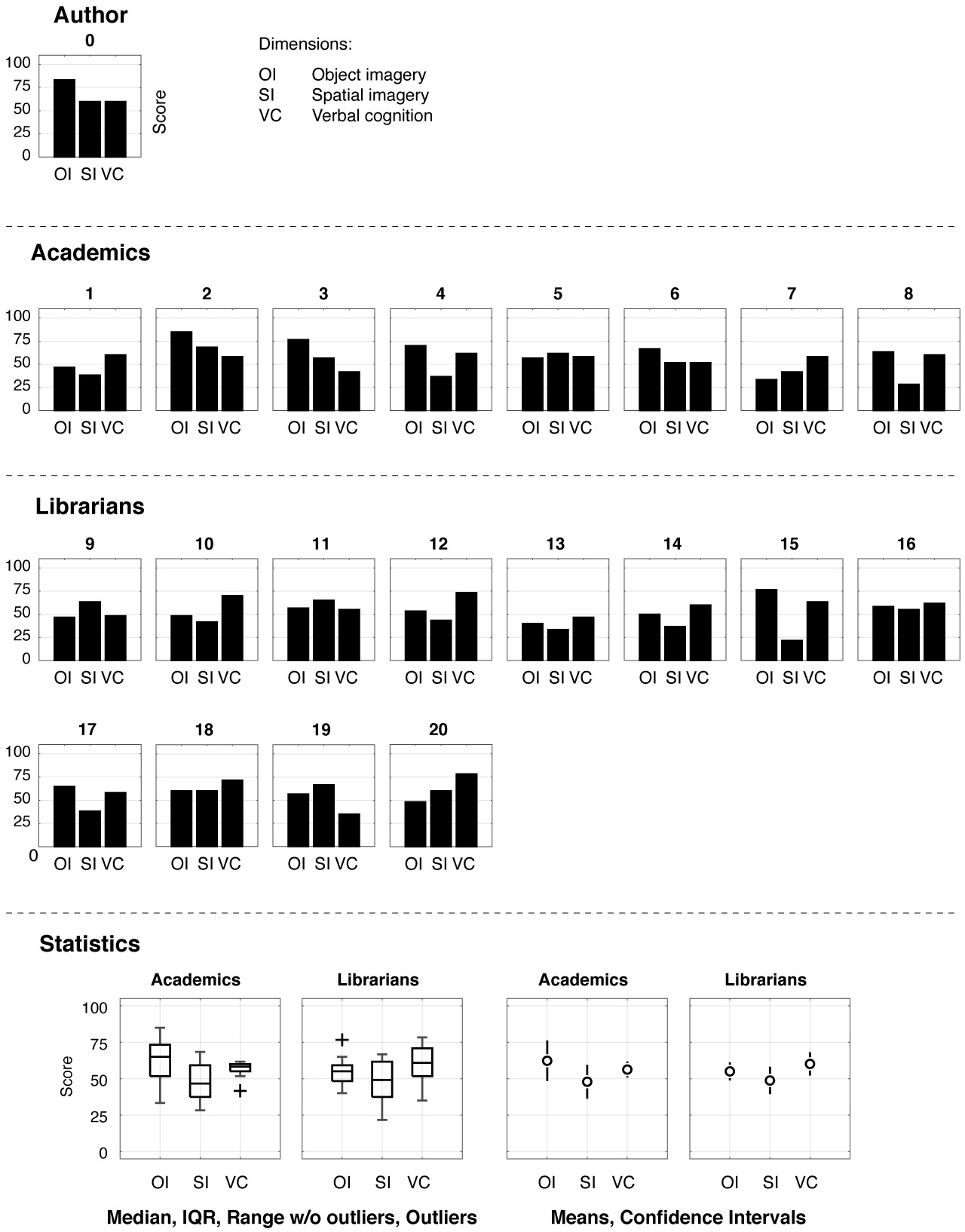
Figure 18. Visual and verbal cognition styles
Mental imagery — The Object-Spatial Imagery and Visual Questionnaire (OSIVQ) is a state-of-the-art, validated, 45-item psychometric questionnaire designed to distinguish between three dimensions of cognitive abilities and preferences for mental representation (Blajenkova et al. 2006; Blajenkova & Kozhevnikov 2009): (1) “Object Imagery” (OI) concerns mental imagery that manifests itself in the form of vivid, colorful, and detailed objects; (2) “Spatial Imagery” (SI) is a type of visual cognition eliciting abstract and schematic mental manifestations of spatial structures and relationships; and (3) “Verbal Cognition” is a dimension that is opposed to the two “visual cognition” dimensions and concerns linguistic preferences and abilities. These three dimensions have been shown to correlate with distinct semiprofessional groups: visual artists score high on “object imagery”, scientists on “spatial imagery”, and humanists on “verbal cognition”.
From among the participants in the usability experiment, N = 20 agreed to complete the questionnaire, and the results are shown in Fig. 18. To illustrate the mindset from which this concept originated, the profile of the Document Towers creator (i.e., the author of this article) is included for reference; he identifies with the academics group.
Notably, there are no discernible differences between the profiles of librarians and academics on any of the cognitive dimensions; this is contrary to what we expected given the clear differences in terms of usability satisfaction. The apparent dominance of “Object Imagery” for academics and “Verbal Cognition” for librarians over the other two dimensions is not significant (OI vs SI for academics has a Hedges’ g = 0.89 and p = 0.081; and VC vs SI for librarians g = 0.48 and p = 0.234; at 95% confidence level).
Curiosity — The Five-Dimensional Curiosity Scale Revised (5CDR) is a state-of-the-art, validated, 24-item psychometric questionnaire designed to measures six aspects of curiosity (Kashdan et al. 2018; Kashdan et al. 2020).
- The “Joyous Exploration” (JE) dimension refers to a psychological outlook in which the world appears as a fascinating place full of exciting things to explore;
- “Deprivation Sensitivity” (DS) measures the drive for problem-solving, with high scores being typical among those who “cannot fall asleep if a solution to the problem absorbing them was not found”;
- “Stress Tolerance” (ST) is about coping with the stress induced by novel situations;
- “Thrill Seeking” (TS) is about deliberately seeking novelties;
- “Overt Social Curiosity” (OSC) measures the degree to which one seeks to learn more about other people by employing direct questioning and other overt means, and can be contrasted with “Covert Social Curiosity” (CSC), associated with a preference for obtaining this information surreptitiously. The five dimensions may be evaluated individually, as well as together, as part of a personal “profile” (e.g. “Fascinated”, “Problem-Solver”, “Empathizer”, and “Avoider”).
As in the case of the mental imagery experiment, the data appears to be heterogeneous, with no distinct trends in dimensions or profiles (fig. 19). Given the small sample size and presence of outliers, we refrain from further statistical analysis beyond visual exploration.
Correlations — In addition to studying the psychometric data per se, it may be instructive to evaluate its correlation with the SUS scores. Again, no clear trends are visible, or, where present, such trends are noticeably weaker than those between the SUS usability scores of the two demographics (fig. 20). Given the combination of low correlation, small sample size, and outliers, it is only possible to hint at some of the factors that might be useful to investigate in future research. Based on the present data, these are “Object Imagery”, with low correlation (Kendall’s τ = 0.335), and “Deprivation Sensitivity”, also with low correlation (τ = 0.288). Kendall’s τ is 0 for no correlation, and +1 and −1 for positive and negative correlation; being rank-based, this non-parametric method is robust to outliers. The null hypothesis that “Object Imagery” and SUS scores are correlated cannot be rejected for a two-tailed t-test at significance level α = 0.05, with p = 0.042; however, the correlation hypothesis for “Deprivation Sensitivity” and SUS scores is rejected (p = 0.090).
Discussion — How might the apparent lack of differences between the psychological profiles differences of librarians and academics be explained, in view of the clear difference in their attitude towards the Document Towers? Based on the classical nature/nurture dichotomy, we propose two hypotheses.
Our first hypothesis is ecological, and speculates that individuals in the two groups are largely indistinguishable—as the psychometric instruments indeed suggest—as long as they evolve in identical contexts; as soon as these contexts diverge, however, group differences begin to manifest. This seems to be the case for the usability experiment, in which the participants evaluate a visualization concept (the Document Towers) not only from their personal psychological, but also from the perspective of their respective socio-professional contexts. Quite literally, the usability of the Document Towers varies depending on the physical setting in which they are experienced: the library building and the university building.
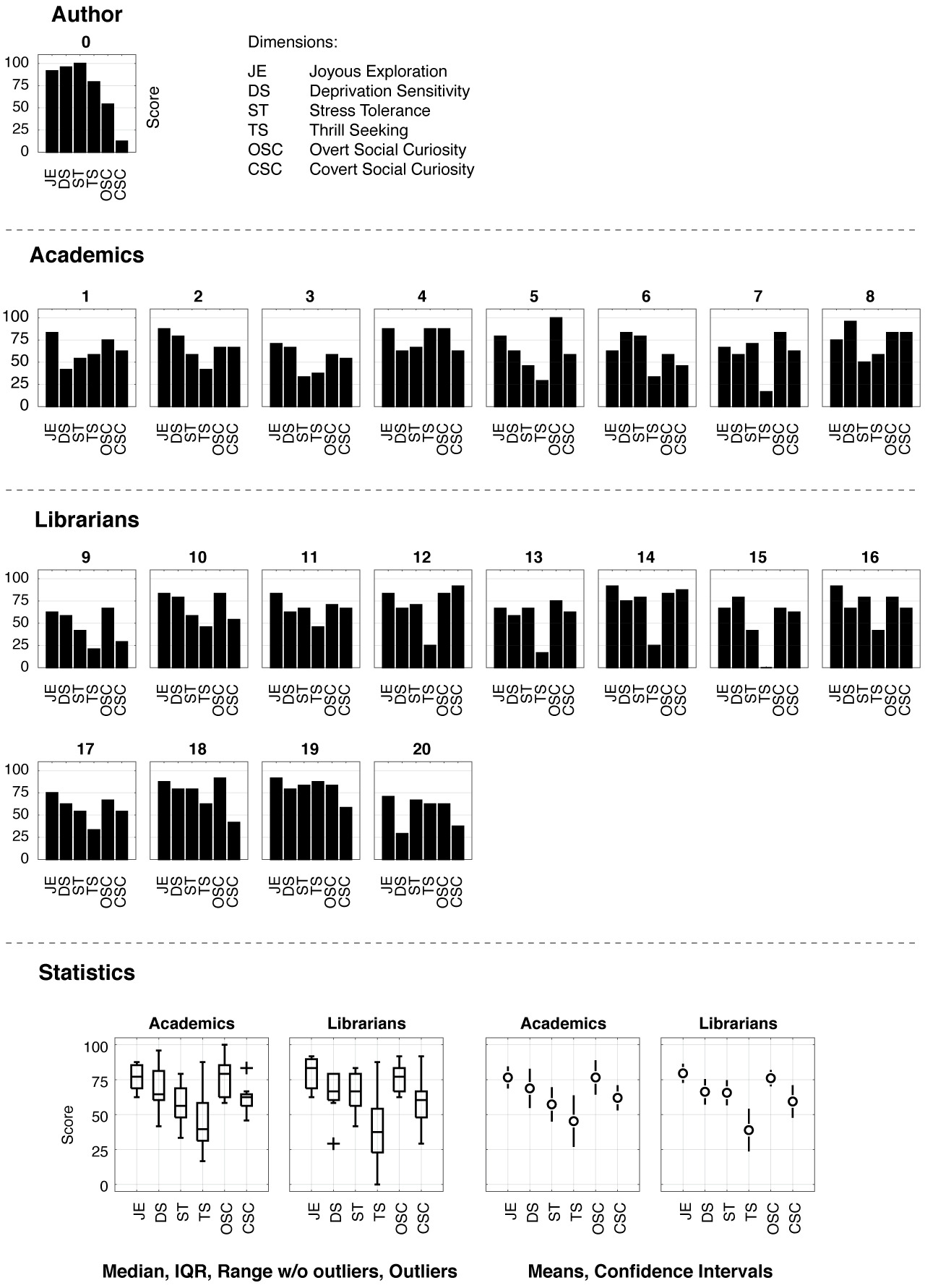
Figure 19. Curiosity styles of the evaluation participants profiled via the Five-Dimensional Curiosity Scale Revised.
The nature of psychological traits is an actively debated subject within the field of psychology, with the current view holding that they may be best described as distributions, whose general statistical makeup is stable for an individual, while comprising variable states; in other words, a psychological profile is modeled as a probabilistic distribution subject to temporal and contextual variation (Fleeson 2001; Bohner & Wänke 2002; Gross et al. 2020). As an example, the SUS scores over a period of one month for the Document Towers as evaluated by the author were 75.0, 77.5, 70.0, and 72.5 (M = 73.8).
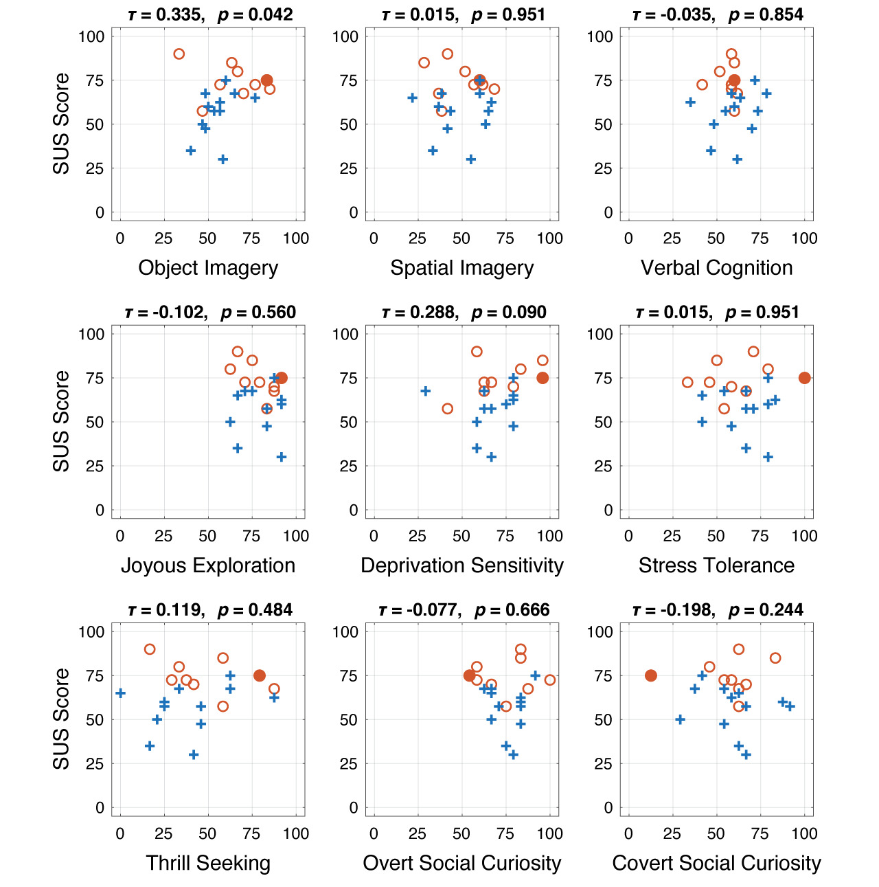
Figure 20. Correlations between psychometric dimensions and subjective usability rating
Figure 20 illustrates the correlations between the psychometric dimensions of the evaluation participants and their subjective usability rating of the Document Towers. The strength of correlation is measured via Kendall’s τ, and p-values. Red circles represent academics, blue crosses denote librarians, and the red dot symbolizes the author.
Two comments made by participants are representative of the role of socio-professional context in the evaluation of the Document Towers. First, at the beginning of the experiment, a librarian asked if I was aiming to sell them a product (“Are you trying to sell us something?”), indicating that they had construed the evaluation in commercial terms (the misconception that the “guided tour” performance was a salesman’s technique was subsequently and duly dispelled). In the context of professional mass digitization, in which “there is a lot of pressure to achieve results within a tight schedule” that obliges employees to work on multiple projects simultaneously [Steffen 2016, p. 2], this comment may also reflect an underlying apprehension that “disruptive technologies” and automation will ultimately increase workloads and stress (Yoose 2015; Rutkowski & Saunders 2019; Panda 2020), in an already hierarchical and routine-prone environment (Nauratil 1989, pp. 45–46, 53–54, 68–73).
On the other hand, a PhD student mused aloud about possible applications of the Document Towers (“I am thinking how I could use the visualization for my research...”), adopting a “blue sky research” attitude towards the visualization. This participant seemed to enjoy the leisure of sagacity, or the “aptitude for investigation and discovery” (OED Online 2022), which together with chance defines the concept of “serendipity”. A recurring answer to the evaluator’s question on the roots of the difference between librarians and academics was “They are librarians, not academics!” But what exactly makes librarians “librarians” and academics “academics”?
This brings us to our second hypothesis, which is essentialist in the sense that it considers the differences to be inherent qualities of the participants. An explicit answer provided by an academic located the difference on the librarians’ side as “the need to classify, yes or no, with no in-between”—after all, a library cannot adopt serendipity as a classification system (unlike some bookshops (Deutsch 2022, pp. 19–49)). Information classification is indeed a central and time-consuming activity engaged in by librarians, with document misclassification representing a constant source of dread and laborious inventory procedures (“A misplaced book is a lost book” is an often-heard admonition — which obviously ignores the pleasures of finding what has been lost) (Cooper & Wolthausen 1977).
The implied cognitive rigidity of the academic’s characterization may be related to the observation that most librarians expect document visualization to be based on the semantics of information rather than its spatial structure, with the latter method deemed “novel”, or at least “unexpected”. One librarian, after more information on the proposed approach had been supplied during a post-evaluation discussion, commented that “I would have rated the visualization differently, would I have known all this”. Moreover, reflecting on the non-predominance of visual representations as information processing tools in libraries, one participant remarked that "after all, libraries are about words, so we use language-based methods". Furthermore, visualization implies a transparency of content that is historically at odds with the material, architectural, technological, and ideological aspects of the library (and even more so of the archive), which encompass the necessity to preserve documents from direct light, the vanishing of documents in virtual clouds, and matters related to censorship.
Since six out of eight academics were either enrolled in a visualization class or had a background in visual art history, it was arguably easier for them to fathom the Document Towers visualization concept—as one participant put it, the benefit of being able to overview documents is “self-evident” (their education may have contributed towards explaining the small correlation observed between “Object Imagery” and SUS scores, in fig. 20). This is also the spirit in which the author initially conceived of the Document Towers: specifically, contrasting the poor quality of document overview in the typographical layout software InDesign (the author freelances as a graphic designer), as well as digital document readers such as Acrobat, Finder, and DjView, with the availability of the spatial coordinates of document objects in digital file formats such as PDF and InDesign’s IDML. Therefore, the difficulties encountered by the librarians—especially when confronted with alternatives that are more time-consuming, resource-intensive, and cumbersome to implement—could seem baffling to other demographics.
While different work contexts may certainly attract different personalities, the explanations collected so far suggest that the observed demographic differences are preponderantly due to educational and socio-professional factors, which encourage a more speculative approach among academics in contrast to more tangible results among librarians. As lightheartedly described in Hazard Adams’ classic account of academic life, The Academic Tribes, “Faculties are, after all, composed largely of people who like problems, perhaps even more than solutions, and even to the point of actively seeking them where they have not been recognized” (Adams 1976, p. 11). The data backs up this view to some extent, revealing a moderate correlation between the perceived usability of the Document Towers and a problem-solving-oriented attitude.
Interestingly, the divide revealed by our small usability experiment parallels a much larger and older divide within academia between faculty and librarians—at times acrimonious, despite the common interest in intellectual matters, the shared mission of student education, and suffering from the same time pressures and technology fatigue. Based on this framing, the stereotypical professor would caricature the librarian as conformist, passive, and uninformed (in short, a Shhh-hissing dragon hoarding knowledge), while the stereotypical librarian would lampoon the (shabby) professor as an arrogant, information-technological illiterate jetsetting between far-flung conferences while on tenure track for cozy sabbaticals (Biggs 1981; Jenkins 2005, pp. 1–35). In fact, a dispassionate investigation would expose the source of conflict as a misunderstanding, along with a mutual ignorance of their respective professional work parameters (or, at least, a difficulty in accommodating them): i.e., intellectual hedonism and freedom as the academic’s main motivators, and community service within a complex organization as the librarian’s job description. Whether related to satisfaction, or lack thereof, with human relations or computer interfaces, these differences are a result (even if not necessarily consciously experienced as such) of the contexts that force specific perspectives upon the individuals who operate within them. (One additional factor suggested as contributing to the faculty–librarian discord is the pervasive sexism experienced by the (overwhelmingly female) librarians in their interactions with (largely male) academics and IT professionals (Wilson 1979; Brandon et al. 2018)).
More research is needed to clarify these issues; this could involve the study of other groups, such as computer scientists (the developers of the technologies used by the librarians) and graphic designers (a group with strong visual imagery, involved in the creation of human–computer interfaces). In this respect, one aspect to consider is that of avoiding the creation of artificial categories: how much of a “librarian” is the academic who took up the job only recently? or the data scientist who happens to work for a library rather than the history department of a university?
While the results of our psychometric experiments were “negative” (in the sense of lack of clear correlations with usability), we consider them to be valuable research, as they may direct future work in research directions that are hopefully more conclusive. One practical outcome of this experiment was that of creating a concise set of guidelines for readers using the Document Towers (see Section 3.3 “Practice”), in view of their potential and the ability of user training to improve their usability.
A prolific literature on librarianship is available to the interested readers to further their understanding of the sociology (e.g. Nauratil 1989), psychology (e.g. Gullickson Spencer et al. 2015), culture (e.g. Crawford 2015), identity (e.g. Deitering et al. 2017), perception (e.g. Pagowsky & Rigby 2014) and cinematic representation of librarianship (Tevis & Tevis 2005), as well as the faculty–librarian relationship (Jenkins 2005) and the personal experience of information technology work in libraries (Brandon et al. 2018).
Conclusions of user satisfaction and psychometrics experiment
Focusing on two stakeholder demographics of digital libraries, namely academics and librarians, we empirically evaluated the usability of the Document Towers from the point of view of user satisfaction, then interpreted the results in terms of user skillsets and mindsets, experimental setup, and socio-professional contexts, on the basis of psychometric experiments on mental imaging and curiosity, which are two cognitive aspects related to the fundamental features of Document Towers studied in this article: namely, visualization and exploration.
The results suggests that the Document Towers visualization concept has both “good” and “poor” usability, depending on the target users and application contexts. Academics may benefit more from the Document Towers than librarians; however, training users may improve usability. These findings raise two practical questions of more general import.
First, information systems appear to be more effective if personalized to specific demographics and individuals, according to their various skillsets and, in particular, mindsets and contexts.
Second, it would be useful to consider what changes in the library environment would be conducive to adopting information technologies that seem to be appreciated and effective for information processing outside the library context.
Conclusions
The case study has yielded eight major results, which can be summarized as follows:
- Confirmation of the utility of Document Towers, along with a list of benefits, conceptual and contextual factors.
- Drawing attention to the importance of serendipity in document exploration and quality control and the need for tools to support it.
- Extension of the definition of quality control as a collateral knowledge-producing tool.
- Demonstrating that even processes, and technologies involved in them, as narrowly defined as document digitization quality control are a dialogue between stakeholders at various stages of the document life cycle.
- Pointing out the issue of possible disparities between usability as perceived by users and objective effectiveness.
- Emphasizing the benefits of personalizing information technologies to the users’ psychological abilities and preferences, and adapting them to the specifics of socio-professional contexts.
- Discovery of possibly the first map published in a Swiss newspaper.
- Some concrete operational changes in quality control at the Swiss National Library, along with the pursuit of future technological collaborations involving the Document Towers between the study participants’ respective institutions.
Some concrete operational changes in quality control at the Swiss National Library, along with the pursuit of future technological collaborations involving the Document Towers between the study participants’ respective institutions.
Opportunities — In line with the initial exploratory goal, the case study described a surprising trajectory from assessing the Document Towers to a historical discovery and back to its utility for quality control. These results recast quality control as a dialogue between librarians, technologists, and readers that is mutually enriching to each community. The dialogue is dynamic, ever-shifting in terms of individual requirements, and creating significant retroprocessing of the same data, as we saw, making it difficult to predict, and complex to model. There is thus a need for appropriately open and flexible technologies.
The importance of this dialogue has been demonstrated in concrete terms by a number of objectively effective aspects of the Document Towers that are not perceived as such by some user groups (e.g. document overview at a glance vs page scrolling). We have situated the disparity between subjective and objective effectiveness at the confluence of individual psychology and socio-professional contexts, and further proposed to reduce this gap through individual training and adjusting the context.
Benefits — The Document Towers are specifically appropriate for quality control because they make document structures visible, preserve the serendipity of pattern discovery (as demanded by quality control), and combine the complementary pattern recognition strengths of humans and machines. The use of the Document Towers has the added value of prompting questions that link quality control to the much broader issue of the usability of digital data and computational resources.
The flexibility of the Document Towers contributes to their performance. Their representation is generic, with any kind of spatially defined information being representable. It covers multiple document scales, from individual pages and single documents to collections, can address multiple sensory modalities (most notably vision, audition, and touch), and has variable information density, from three-dimensional Document Towers to two-dimensional Ribbons to one-dimensional Chips (Atanasiu & Ingold 2021). Last but not least, the representation has polyvalent application potential beyond quality control (Atanasiu 2022a).
Paradigm — The observed performance is, firstly, a result of the naturalness and affordance of the documents-as-Document Towers paradigm, and further answers the critical questions “Why 3D? Why Document Towers?” Paginated documents are physical or conceptual three-dimensional objects, meaning their representation as architectural models maintains structural information, while lower-dimensional representations break the holistic integrity and reduce it to specific aspects. It is thus easy to identify, thanks to a three-dimensional representation, the image at the top of the first page of the ZFZ newspaper in Fig. 11, which is replicated across all issues as the publication’s logo. It is precisely these three-dimensional spatial attributes that made Napoleon’s campaign map stand out (large size and location in the middle of the front page).
Our familiarity with urban Document Towers not only facilitates our interaction with Document Towers (an excellent design feature), but causes us to think about and act differently towards documents in terms of the target domain to which the documents are mapped (much like the reasons for using mathematical transforms). For example, handling XML files becomes far easier simply by referring to them as “tree-like”; similarly, by seeing the structures as “Document Towers”, we naturally become interested in measuring information fragmentation. Furthermore, spatial thinking is a fundamental cognitive ability, and its use in information design is well documented, from present times back to antiquity, as mentioned in (Atanasiu 2022a).
In addition to the specific form of the Document Towers metaphor (architecture and urbanism), their superior performance is also due to some of the generic functions of metaphors, such as their propensity to intrigue and induce a change of mental perspective.
Context — While the generic character of the Document Towers support generalizing their utility from this case study, their acceptance and fit is partially due to certain noteworthy local specificities. Switzerland’s strong federal political system has heretofore precluded the imposition of a unified national digitization program, unlike, for instance, France, a centralized state, where the French National Library has a greater influence on the development of documentary standards than some of its counterparts. Digitization approaches have proliferated in Swiss cantonal, university, and other types of libraries; only recently, with growing amounts of data, library inter-connectivity projects, and rising costs, have the methods and standardization of digitization quality and interaction ergonomics emerged as real issues (Steffen 2019). In this context, the Swiss National Library has a greater openness for “unconventional solutions” (FS) and hybrid human–machine document management processes such as the Document Towers. The “highly political” nature of mass digitization projects (Thylstrup 2019, p. 4) has thus surreptitiously manifested itself, even in a benign academic research project.
Actions — The success of the Document Towers might also be judged by the fact that, although the setting was that of artificial experiments, they prompted a series of actions in the real-world. As a consequence of this evaluation, an actual digitization quality error was identified with respect to non-editorial objects. Given the interest in the missing data among the library patrons, the head of the Digitization Unit, FS, decided to require this kind of information in future calls for tender from digitization service providers. The Document Towers also prompted further discussions among the participants as to what kind of information would be useful to users (which is a question of system design), how to extract it efficiently (a question of pattern analysis), and how to convey it to users (a question of human–computer interaction). Ultimately, the participants decided to develop the visualization into a commercial product in collaboration with an industrial partner.
On a longer-term horizon, the large difference in the perceived usability of the Document Towers between librarians and academics is of sufficient importance for the general issue of the adoption of novel or non-mainstream information technologies in libraries that it warrants further research. What is at stake was put in the following unambiguous terms by one scholar of librarianship: “An awareness of the structural factors involved in the creation and resolution of [librarianship] problems [...] may well be the sine qua non of our effective survival as a profession” (Nauratil 1989, p. 105).
Acknowledgments
The author wishes to express his gratitude to Andreas Fischer and Florian Steffen, as well as to each and every participant in the evaluation experiments, whose contributions have made this research possible. The reviewers are cordially thanked for their unrelenting efforts to support the development of an empirical usability evaluation. K. F. is thanked for having improved the manuscript’s readability. This research was supported by the Hasler Foundation, Switzerland, under grant No. 17039.
References
- Adams, H. (1976) The Academic Tribes. Liveright, New York, NY.
- Almeida, R. A. de, Alessio, P., Topol, A., and Cubaud, P. (2009) A Visualization Technique for Quality Control of Massive Digitization Programs. Proceedings of the 13th European Conference on Research and Advanced Technologies for Digital Libraries (ECDL 2009), 27 September – 2 October 2009, Corfu, Greece, pp. 150–155.
-
Almeida, R. A. de, Cubaud, P., Dupire, J., and Topol, A. (2006) Interactions et métadonnées riches pour les bibliothèques numérisées. Document numérique, 9 (2): 83–109,
https://doi.org/10.3166/dn.9.2.83-109. - Alsina, C., and Nelsen, R. B. (2006) Math Made Visual: Creating Images for Understanding Mathematics. Mathematical Association of America, Washington, DC.
- Anderson, M., Meyer, B., and Olivier, P. (2002) Diagrammatic Representation and Reasoning. Springer, London.
-
Apache Software Foundation, The (2022) Apache PDFBox – A Java PDF Library.
https://pdfbox.apache.org. Accessed 2022/08/18. -
Atanasiu, V. (2014) Expert Bytes: Computer Expertise in Forensic Documents – Players, Needs, Resources and Pitfalls. CRC Press, Boca Raton, FL.
https://doi.org/10.1201/b15467. - Atanasiu, V. (2016) Cuckoos among Your Data: A Quality Control Method to Retrieve Mislabeled Writer Identities from Handwriting Datasets. In IS&T International Symposium on Electronic Imaging 2016, Document Recognition and Retrieval XXIII (DRR’16), 15–18 February 2016, San Francisco, CA, article 56, 14 pages.
-
Atanasiu, V. (2022a) Applications of the Document Towers method of representing document structures. Information Design Journal, in press.
https://doi.org/10.1075/idj.20026.ata. -
Atanasiu, V. (2022b) The Structural Information Potential and Its Application to Document Triage. IEEE Access, 10: 13103–13138.
https://doi.org/10.1109/ACCESS.2021.3133654. -
Atanasiu, V., and Ingold, R. (2021) Document Towers: A MATLAB software implementing a three-dimensional architectural paradigm for the visual exploration of digital documents and libraries. SoftwareX, 14: 100684.
https://doi.org/10. 1016/j.softx.2021.100684. - Back, M., Jonathan, C., Harrison, S., and Minneman, S. (2006) Speeder Reader: An experiment in the future of reading. Computers & Graphics, 26: 623–627.
-
Bangor, A., Kortum, P. T., and Miller, J. T. (2008) An Empirical Evaluation of the System Usability Scale. International Journal of Human–Computer Interaction, 24 (6): 574–594.
https://doi.org/10.1080/10447310802205776. - Bangor, A., Kortum, P. T., and Miller, J. T. (2009) Determining What Individual SUS Scores Mean: Adding an Adjective Rating Scale. Journal of Usability Studies, 4 (3): 114–123.
- Barnett, V., and Lewis, T. (1978) Outliers in Statistical Data (3rd ed). John Wiley & Sons, Chichester.
- Bederson, B. B., Clamage, A., Czerwinski, M. P., and Robertson, G. G. (2004) DateLens: A Fisheye Calendar Interface for PDAs. ACM Transactions on Computer–Human Interaction, 11 (1): 90–119.
- Berlyne, D. E. (1960) Conflict, arousal, and curiosity. McGraw-Hill, New York, NY.
-
Biggs, M. (1981) Sources of Tension and Conflict between Librarians and Faculty. The Journal of Higher Education, 52 (2): 182–201.
https://www.jstor.org/stable/1981090. -
Blajenkova, O., and Kozhevnikov, M. (2009) The New Object-Spatial-Verbal Cognitive Style Model: Theory and Measurement. Applied Cognitive Psychology, 23: 638–663.
https://doi.org/10.1002/acp.1473. -
Blajenkova, O., Kozhevnikov, M., and Motes, M. A. (2006) Object-Spatial Imagery: A New Self-Report Imagery Questionnaire. Applied Cognitive Psychology, 20: 239–263.
https://doi.org/10.1002/acp.1182. - Bogel, E. (1973) Schweizer Zeitungen des 17. Jahrhunderts : Beiträge zur frühen Pressegeschichte von Zürich, Basel, Bern, Schaffhausen, St. Gallen und Solothurn, Schünemann, Bremen.
- Bohner, G., and Wänke, M. (2002) Attitudes and Attitudes Change. Psychology Press, Hove.
-
Bollinger, E. (2018) Freitags-Zeitung. Historisches Lexicon der Schweiz.
https://hls-dhs-dss.ch/de/articles/043059/2018-01-11/. Accessed 2022/08/18. - Bonde, T. N. (2019) The Politics of Mass Digitization. MIT Press, Cambridge, MA.
- Bourdieu, P. (1984) Distinction: A Social Critique of the Judgement of Taste. Harvard University Press, Cambridge, MA.
- Brandon, J., Ladenson, S., and Sattler, K. (2018) We Can Do IT: Women in Library Information Technology. Library Juice Press, Sacramento, CA.
- Briet, S. (1951) Qu’est-ce que la documentation ? Éditions documentaires, industrielles et techniques, Paris.
- Brooke, J. (1996) SUS: a ‘quick and dirty’ usability scale. In Jordan, P. W., Thomas, B., Weerdmeester, B. A., and Mcclelland, I. L. (eds), Usability Evaluation in Industry. Taylor & Francis, London, pp. 189–194.
- Brooke, J. (2013) SUS: A Retrospective. Journal of Usability Studies, 8 (2): 29–40.
-
Brysbaert, M. (2019) How Many Participants Do We Have to Include in Properly Powered Experiments? A Tutorial of Power Analysis with Reference Tables. Journal of Cognition, 2 (1): 1–38.
https://doi.org/10.5334/joc.72. - Buckland, M. (1991) Information and Information Systems. Praeger, New York, NY.
-
Bush, V. (1945) As we may think. Atlantic Monthly, 176 (1): 101–108.
http://dougengelbart.org/content/view/ 258/000/. - Card, S. (2008) Information Visualization. In Jacko, J. A., and Andrew, S. (ed), The Human–Computer Interaction Handbook: Fundamentals, Evolving Technologies, and Emerging Applications (2nd ed). Lawrence Erlbaum, New York, 509–543.
- Carroll, E. A., Latulipe, C., Fung, R., and Terry, M. (2009) Creativity Factor Evaluation: Towards a Standardized Survey Metric for Creativity Support. Proceedings of the 2009 ACM SIGCHI Conference on Creativity and Cognition (C&C ’09), 26–30 October 2009, Berkeley, CA, USA, pp. 127–136.
- Center for Research Libraries (2015) The “State of the Art”: A Comparative Analysis of Newspaper Digitization to Date. http://www.crl.edu/sites/default/files/d6/attachments/events/ICON_Report-State_of_Digitization_final.pdf. Accessed 2019/04/02.
-
Chapman, J., and Leonard, S. (2013) Cost and benefit of quality control visual checks in large-scale digitization of archival manuscripts. Library Hi Tech, 31 (3): 405–418.
https://doi.org/10.1108/LHT-01-2013-0002. -
Chen, L., Wang, N., Yang, Y., Yang, K., and Yuan, Q. (2022) User Validation of Recommendation Serendipity Metrics.
https://doi.org/10.48550/arXiv.1906.11431. Accessed 2022/08/18. -
Clausner, C., Papadopoulos, C., Pletschacher, S., and Antonacopoulos, A. (2015) The ENP Image and Ground Truth Dataset of Historical Newspapers. Proceedings of the 13th International Conference on Document Analysis and Recognition (ICDAR 2015), 23–26 August 2015, Nancy, France, pp. 931–935.
https://doi.org/10.1109/ICDAR.2015.7333898. -
Clausner, C., Pletschacher, S., and Antonacopoulos, A. (2011) Aletheia — An Advanced Document Layout and Text Ground-Truthing System for Production Environments. Proceedings of the 11th International Conference on Document Analysis and Recognition (ICDAR 2011) (18–21 September 2011) Beijing, China, 48–52.
https://doi.org/10.1109/ICDAR.2011.19. -
Clausner, C., Pletschacher, S., and Antonacopoulos, A. (2016) Quality Prediction System for Large-Scale Digitisation Workflows. Proceedings of the 12th IAPR International Workshop on Document Analysis Systems (DAS 2016), 11–14 April 2016, Santorini, Greece, pp. 138–143.
https://doi.org/10.1109/DAS.2016.82. - Cockburn, A., Gutwin, C., and Alexander, J. (2006) Faster Document Navigation with Space-Filling Thumbnails. Proceedings of the SIGCHI conference on Human Factors in computing systems (CHI ‘06), 22–28 April 2006, Montréal, Québec, Canada, 10 pages.
-
Cockburn, A., Karlson, A., and Bederson, B. B. (2008) A Review of Overview+Detail, Zooming, and Focus+Context Interfaces. ACM Computing Surveys, 41 (1): 1–31.
https://doi.org/10.1145/1456650.1456652. -
Coe, R. (2002) It’s the Effect Size, Stupid! What effect size is and why it is important. Proceedings of the Annual conference of the British Educational Research Association, 12–14 Sep. 2002, Exeter, UK.
https://cebma.org/wp-content/uploads/Coe-2002.pdf. -
Content Conversion Specialists. (n.d.) docWorks.
https://content-conversion.com/#docworks-2. Accessed 2019/03/30. -
Cooper, M. D., and Wolthausen, J. (1977) Misplacement of Books on Library Shelves: A Mathematical Model. The Library Quarterly: Information, Community, Policy, 47 (1): 43–57.
https://www.jstor.org/stable/4306756. - Crawford, A. (2015) The Meaning of the Library: A Cultural History. Princeton University Press, Princeton, NJ.
- Deitering, A.-M., Stoddart, R., and Schroeder, R. (2017) The Self as Subject: Autoethnographic Research into Identity, Culture, and Academic Librarianship. Association of College and Research Libraries, Chicago, IL.
-
Demm, E. (n.d.) Censorship. In International Encyclopedia of the First World War.
https://encyclopedia.1914-1918-online.net/article/censorship. Accessed 2019/09/27. - Deutsch, J. (2022) In Praise of Good Bookstores. Princeton University Press, Princeton, NJ.
-
Diagrams (2000–) Diagrams: International Conference on Theory and Application of Diagrams.
https://link.springer. com/conference/diagrams. Accessed 2022/08/18. - Diaper, D., and Stanton, N. A. (2004) The Handbook of Task Analysis for Human–Computer Interaction. Lawrence Erlbaum, Mahwah, NJ.
- Drucker, P. F. (2015) Innovation and Entrepreneurship: Practice and Principles. Routledge, London.
- Dunning, A., The European Library, and Europeana Foundation (2012) D4.1: European Newspaper Survey Report. http://www.europeana-newspapers.eu/wp-content/uploads/2012/04/D4.1-Europeana-newspapers-survey-report.pdf. Accessed 2019/04/02.
-
e-newspaperarchives.ch (n.d.)
https://www.e-newspaperarchives.ch/. Accessed 2019/03/30. - Elmqvist, N., and Yi, J. S. (2015) Patterns for Visualization Evaluation. Information Visualization, 14 (3): 250–269.
-
Europeana Newspapers (n.d.)
http://www.europeana-newspapers.eu. Accessed 2019/04/02. -
Fandom contributors (n.d.) Jedi Archives.
https://starwars.fandom.com/wiki/Jedi_Archives/Legends. Accessed 2022/04/27. - Fang, X., Jacquemin, C., Vernier, F., and Luo, B. (2009) A Survey of 3D Document Corpus Visualization. Information Technology Journal, 8 (1): 1–15.
- Finstad, K. (2006) The System Usability Scale and Non-Native English Speakers. Journal of Usability Studies, 1 (4): 185–188.
-
Fleeson, W. (2001) Toward a Structure- and Process-Integrated View of Personality: Traits as Density Distributions of States. Journal of Personality and Social Psychology, 80 (6): 1011–1027.
https://doi.org/10.1037//0022-3514.80.6.1011. - Franklin, R. D., Allison, D. B., and Gorman, B. S. (2014) Design and Analysis of Single-Case Research. Psychology Press, New York, NY.
- Frölich, M., and Sperlich, S. (2019) Impact Evaluation: Treatment Effects and Causal Analysis. Cambridge: Cambridge University Press.
- Gardner, M. (1958) Logic Machines and Diagrams. McGraw-Hill, New York, NY.
- Gidalewitsch, N. (1956) Bildbericht und Presse. Ein Beitrag zur Geschichte und Organisation der illustrierten Zeitungen. H. Laupp, Tübingen.
-
Gross, M. E., Zedelius, C. M., and Schooler, J. W. (2020) Cultivating an understanding of curiosity as a seed for creativity. Current Opinion in Behavioral Sciences, 35: 77–82.
https://doi.org/10.1016/j.cobeha.2020.07.015. - Guggenbühl, C. (1996) Zensur und Pressefreiheit : Kommunikationskontrolle in Zürich an der Wende zum 19. Jahrhundert. Chronos, Zürich.
- Gullickson Spencer, L., VandeCreek, L., and Wright, H. S. (2015) Technology Anxiety in Academic Professional and Paraprofessional Library Staff. Library Juice Press, Sacramento, CA.
- Hafner, U. (2015) Subversion im Satz : Die turbulenten Anfänge der “Neuen Zürcher Zeitung” (1780–1798). Neue Zürcher Zeitung, Zürich.
- Heath, C., and Luff, P. (2000) Technology in Action. Cambridge University Press, Cambridge.
- Hedges, L. V., and Ingram, O. (1985) Statistical Methods for Meta-Analysis. Academic Press, Orlando, FL.
- Heunen, C., Sadrzadeh, M., and Grefenstette, E. (2013) Quantum Physics and Linguistics: A Compositional, Diagrammatic Discourse. Oxford University Press, Oxford.
- Hoffmann-Feer, E. (1969) Die Typographie im Dienste der Landkarte: Zusammenfassung von bisher erschienenen Veröffentlichungen über typographisch hergestellte Landkarten mit besonderer Berücksichtigung der Haas’schen Blätter. Verlag Helbing & Lichtenhahn, Basel.
- Höhener, H.-P. (2018) Alte Karten des Gebiets des heutigen Kantons St. Gallen. Cartographica Helvetica, 56: 13.
-
i2s (n.d.) LIMB Maestro: Supervising your digitization projects in real time.
https://www.i2s.fr/en/product/limb-maestro. Accessed 2019/03/30. -
Igarashi, T., and Hinckley, K. (2000) Speed-dependent Automatic Zooming for Browsing Large Documents. Proceedings of the 13th annual ACM symposium on User interface software and technology (UIST ‘00), 6–8 November 2000, San Diego, CA, United States, pp. 139–148.
https://doi.org/10.1145/354401.354435. - Ingold, R., Bloechle, J.-L., and Rigamonti, M. (2014) Reverse-Engineering of PDF Files. In Chaudhuri, B. B. and Parui, S. K. (eds), Advances in Digital Document Processing and Retrieval. World Scientific, Singapore, pp. 249–285.
- International Organization for Standardization (2018) ISO 9241-11:2018(E) 2018. Ergonomics of human-system interaction — Part 11: Usability: Definitions and concepts. Standard. International Organization for Standardization, Geneva.
- Jenkins, P. O. (2005) Faculty–Librarian Relationships. Chandos, Oxford.
- Jordan, P. W., Thomas, B., Werdmeester, B. A., and McClelland, I. L. (1996) Usability Evaluation in Industry. Taylor & Francis, London.
-
Kashdan, T. B., Disabato, D. J., Goodman, F. R., and McKnight, P. E. (2020) The Five-Dimensional Curiosity Scale Revised (5DCR): Briefer subscales while separating overt and covert social curiosity. Personality and Individual Differences, 157: 109836.
https://doi.org/10.1016/j.paid.2020.109836. -
Kashdan, T. B., Gallagher, M. W., Silvia, P. J., Winterstein, B. P., Breen, W. E., Terhar, D., and Steger, M. F. (2009) The Curiosity and Exploration Inventory-II: Development, Factor Structure, and Psychometrics. Journal of Research in Personality, 43 (6): 987–998.
https://doi.org/10.1016/j.jrp.2009.04.011. -
Kashdan, T. B., Stiksma, M. C., Disabato, D. J., McKnight, P. E., Bekier, J., Kaji, J., and Lazarus, R. (2018) The five-dimensional curiosity scale: Capturing the bandwidth of curiosity and identifying four unique subgroups of curious people. Journal of Research in Personality, 73: 130–149.
https://doi.org/10.1016/j.jrp.2017.11.011. -
Kaufman, S. B., Quilty, L. C., Grazioplene, R. G., Hirsh, J. B., Gray, J. R., Peterson, J. B., and DeYoung, C. G. (2016) Openness to experience and intellect differentially predict creative achievement in the arts and sciences. Journal of Personality, 84 (2): 248–258.
https://doi.org/10.1111/jopy.12156. -
Kawaguchi, H., and Suzuki, N. (2018) Recommending Colors and Fonts for Cover Page of EPUB Book. Proceedings of the ACM Symposium on Document Engineering 2018, 28–31 August 2018, Halifax, NS, Canada, article 48, 4 pages.
https://doi.org/10.1145/3209280.3229086. -
Kitodo. (n.d.) Kitodo.Production: Workflow management for digitisation.
http://www.kitodo.org/ en/software/kitodoproduction/. Accessed 2019/03/30. - Kline, R. B. (2004) Beyond Significance Testing: Reforming Data Analysis Methods in Behavioral Research. American Psychological Association, Washington, DC.
-
Kortum, P. T., and Bangor, A. (2013) Usability Ratings for Everyday Products Measured With the System Usability Scale. International Journal of Human–Computer Interaction, 29 (2): 67–76.
https://doi.org/10.1080/10447318.2012.681221. - Kume, H. (1985) Statistical Methods for Quality Improvement. The Association for Overseas Technical Scholarship, Tokyo.
- Lador, P.-Y. (1990) L’abeille et la poule. Arbido-R, 5 (4): 113–115. https://www.e-periodica.ch/digbib/view?pid=arb-012%3A1990%3A0%3A%3A118&referrer=search#134.
- Leavy, P. (2014) The Oxford Handbook of Qualitative Research. Oxford University Press, Oxford.
- Lee, J., Olwal, A., Ishii, H., and Boulanger, C. (2013) SpaceTop: Integrating 2D and Spatial 3D Interactions in a See-through Desktop Environment. Proceedings of the SIGCHI conference on Human Factors in computing systems (CHI 2013), 27 April – 2 May 2013, Paris, France, 4 pages.
- Lehman, S. (2011) Mapping Havana in the Gentleman’s Magazine, 1740–1762. In Brückner, M. (ed), Early American Cartographies, University of Carolina Press, Chapel Hill, NC, pp. 339–359.
- Lewis, J. R., and Sauro, J. (2018) Item Benchmarks for the System Usability Scale. Journal of Usability Studies, 13 (3): 158–167.
- Liebert, W.-A. (1994) Lascaux – A Hypermedia Lexicon of Metaphor Models for Scientific Imagination. Proceedings of the Sixth EURALEX International Congress on Lexicography, 30 August – 3 September 1994, Amsterdam, The Netherlands, pp. 495–500.
- Maissen, T. (2005), Die Geschichte der NZZ, 1780–2005, Neue Zürcher Zeitung, Zürich.
- Mandelbrot, B. (1982) The Fractal Geometry of Nature. W. H. Freeman, New York, NY.
- Marshall, C., and Rossman, G. B. (1995) Designing Qualitative Research (2nd ed). Sage, Thousand Oaks, CA.
-
Martin, K., and Quan-Haase, A. (2016) The role of agency in historians’ experiences of serendipity in physical and digital information environments. Journal of Documentation, 72 (6): 1008–1026.
https://doi.org/10.1108/JD-11-2015-0144. -
Martin, K., and Quan-Haase, A. (2017) ‘A Process of Controlled Serendipity’: An Exploratory Study of Historians’ and Digital Historians’ Experiences of Serendipity in Digital Environments. Proceedings of the 80th Annual Meeting of the Association for Information Science and Technology (ASIS&T), 27 October – 1 November 2017, Washington, DC, USA, pp. 289–297.
https://doi.org/10.1002/pra2.2017.14505401032. - McCay-Peet, L., and Toms, E. G. (2018) Researching serendipity in Digital Information Environments. Morgan & Claypool, San Rafael, CA.
- Merton, R. K., and Barber, E. (2004) The Travels and Adventures of Serendipity: A Study in Sociological Semantics and the Sociology of Science. Princeton University Press, Princeton, NJ.
- Monmonier, M. (1989) Maps with the News: The Development of American Journalistic Cartography. University of Chicago Press, Chicago, IL.
- Morley, S. (Auth.), Masterson, C., and Chris J. Main, (2017) Single-Case Methods in Clinical Psychology: A Practical Guide. Routledge, Abingdon.
- Munzner, T. (2015) Visualization Analysis and Design. CRC Press, Boca Raton, FL.
- Mussell, J. (2012) The Nineteenth-Century Press in the Digital Age. Palgrave Macmillan, Houndsmills, UK.
- Mühlberger, G., and Hackl, G. (2015) D5.3: Final public release with updated online resource for documentation. http://www.europeana-newspapers.eu/wp-content/uploads/2015/05/D5.3_Final_release_ ENMAP_1.0.pdf. Accessed 2019/04/02.
- Nakatsu, R. (2010) Diagrammatic Reasoning in AI. John Wiley & Sons, Hoboken, NJ.
- Nauratil, M. J. (1989) The Alienated Librarian. Greenwood Press, New York, NY.
- Neue Zürcher Zeitung (1980) 200 Jahre Neue Zürcher Zeitung: 1780–1980. Neue Zürcher Zeitung, Zürich.
- Nielsen, J. (1993) Usability Engineering. Morgan Kaufmann, San Diego, CA.
- Novaes, A. R. (2019) Maps in Newspapers: Approaches of Study and Practices in Portraying War Since 19th Century. Brill, Leiden.
- Oakland, J. (2008) Statistical Process Control (6th ed). Butterworth-Heineman, Amsterdam.
- Ong, W. J., and Hartley, J. (2012) Orality and Literacy: The Technologizing of the Word. Routledge, London.
-
OED Online (2022) sagacity, n. Oxford English Dictionary Online.
https://www.oed.com/view/Entry/169718. Accessed 2022/07/16. - Ooi, K. (2019) How adult fiction readers select fiction books in public libraries: a study of information-seeking in context. Master’s thesis. School of Information Management, Victoria University of Wellington, Wellington, New Zealand.
- Pagowsky, N., and Rigby, M. (2014) The Librarian Stereotype: Deconstructing Perceptions and Presentations of Information Work. Association of College and Research Libraries, Chicago, IL.
- Panda, S. (2020) Technostress among Library Professionals: Possible Causes, Symptoms, Coping Strategies, and Future Proposals. International Journal of Information Studies and Libraries, 5 (2): 1–19.
- Patton, M. Q. (2001) Qualitative Research and Evaluation Methods (3rd ed). Sage, Thousand Oaks, CA.
-
Pearson, J., and Kosslyn, S. M. (2015) The Heterogeneity of Mental Representation: Ending the Imagery Debate. Proceedings of the National Academy of Sciences of the United States of America, 112 (33): 10089–10092,
https://doi.org/doi.org/10.1073/pnas.1504933112. -
Peirce, C. (1902) Logic, Regarded As Semeiotic. Archive document, Memoir 4, Draft C, MS L75.91–92, Carnegie application. Ransdell, J. (ed)
https://arisbe.sitehost.iu.edu/menu/library/bycsp/L75/ver1/l75v1-02.htm. Accessed 2023/03/06. - Pham, M. T., Meyvis, T., and Zhou, R. (2001) Beyond the Obvious: Chronic Vividness of Imagery and the Use of Information in Decision Making. Organizational Behavior and Human Decision Processes, 84 (2): 226–253.
-
Pletschacher, S., and Antonacopoulos, A. (2010) The PAGE (Page Analysis and Ground-Truth Elements) Format Framework. In Proceedings of the 20th International Conference on Pattern Recognition (ICPR 2010), 23–26 August 2010, Istanbul, Turkey, pp. 257–260.
https://doi.org/10.1109/ICPR.2010.72. - Reinfurt, D., and Wiesenberger, R. (2014) Messages and Means: Muriel Cooper at MIT. (2014) exhibition.
- Rickenbacher, M. (2011) Napoleons Karten der Schweiz: Landesvermessung als Machtfaktor 1798–1815. hier + jetzt, Baden, CH.
- Riley, J., and Whitsel, K. (2005) Practical Quality Control Procedures for Digital Imaging Projects. OCLC Systems & Services 21 (1): 40–48.
- Rossi, P. H., Lipsey, M. W., and Freeman, H. E. (2004) Evaluation: A systematic Approach (7th ed). Sage, Thousand Oaks, CA.
- Rutkowski, A.-F., and Saunders, C. S. (2019) Emotional And Cognitive Overload: The Dark Side of Information Technology. Routledge, Abingdon.
- Sadiq, Sh. (2013) Handbook of Data Quality: Research and Practice. Springer, Berlin.
- Sauro, J. (2011) A Practical Guide to the System Usability Scale. Measuring Usability LLC, Denver, CO.
- Sauro, J., and Lewis, J. R. (2011) When Designing Usability Questionnaires, Does It Hurt to Be Positive? Proceedings of the ACM Conference on Human Factors in Computing Systems (CHI 2011), 7–12 May 2011, Vancouver, BC, Canada, pp. 2215–2223.
- Sauro, J., and Lewis, J. R. (2016) Quantifying the User Experience: Practical Statistics for User Research (2nd ed). Morgan Kaufmann, Cambridge, MA.
-
Schneider, B., Christoph, E., and Wöpking, J. (2016) Diagrammatik-Reader: Grundlegende Texte aus Theorie und Geschichte. De Gruyter, Berlin.
https://doi.org/10.1515/9783050093833. - Schoot, R. van de, and Miočević, M. (2020) Small Sample Size Solutions: A Guide for Applied Researchers and Practitioners. Routledge, Abingdon.
- Schütte, S. (2005) Engineering Emotional Values in Product Design: Kansei Engineering in Development. Ph.D. Dissertation. Department of Mechanical Engineering, University of Linköping, Linköping, Sweden. No. 951.
- Sellen, A. J., and Harper, R. H. R. (2002) The Myth of the Paperless Office. MIT Press, Cambridge, MA.
-
Serenson, C. L. (2000) Guides to Quality in Visual Resource Imaging: Planning an Imaging Project. Washington, DC.
https://www.oclc.org/research/publications/library/visguides/visguide1.html. Accessed 2020/01/20. - Shannon, E. C. (1948) A Mathematical Theory of Communication. The Bell Systems Technical Journal, 27 (3): 379–423.
- Signer, B., and Norrie, M. C. (2010) Interactive Paper: Past, Present and Future. Proceedings of UbiComp 2010: 1st International Workshop on Paper Computing (PaperComp 2010), 26–29 September 2010, Copenhagen, Denmark, 5 pages.
- Spence, R., and Witkowski, M. (2013) Rapid Serial Visual Presentation: Design for Cognition. Springer, London.
-
Staatsbibliothek zu Berlin (2017) Empfehlungen zur Digitalisierung historischer Zeitungen in Deutschland (Masterplan Zeitungsdigitalisierung): Ergebnisse des DFG-Projektes “Digitalisierung historischer Zeitungen” Pilotphase 2013-2015.
http://www.zeitschriftendatenbank.de/fileadmin/user_upload/ZDB/z/Masterplan.pdf. Accessed 2019/04/02. - Steffen, F. (2016) Lessons learned in 7 years of newspaper retro-digitization in Switzerland: How to learn lessons from mistakes, how to establish models and guidelines to avoid repeating them, how to share the lessons learned. Proceedings of the 2016 IFLA [International Federation of Library Associations and Institutions] International News Media Conference, 20–22 April 2016, Hamburg, Germany. http://blogs.sub.uni-hamburg.de/ifla-newsmedia/wp-content/uploads/2016/04/Steffen-Lessons-learned-in-7-years-of-newspaper-retro-digitization-in-Switzerland.pdf.
- Steffen, F. (2019) Der Computergestützte Digitalisierungsworkflow bei der Zeitungsdigitalisierung [Computer-Aided Digitization Workflow for Newspaper Digitization]. Master’s thesis. Wildau Institute of Technology, Wildau, Germany.
-
Sternberg, R. J., and Lubart, T. I. (1991) An Investment Theory of Creativity and Its Development. Human Development, 34 (1): 1–31.
https://doi.org/10.1159/000277029. -
Stockar, C. (2012) Stempelsteuer. Historischer Lexikon der Schweiz.
https://hls-dhs-dss.ch/de/articles/013772/2012-02-14/. Accessed 2022/08/18. - Stone, D., Jarrett, C., Woodroffe, M., and Minocha, S. (2005) User Interface Design and Evaluation. Morgan Kaufmann, San Francisco, CA.
-
Stumm, S. von (2017) Better Open Than Intellectual: The Benefits of Investment Personality Traits for Learning. Personality and Social Psychology Bulletin, 44 (4): 562–573.
https://doi.org/10.1177/0146167217744526. -
Sugarcube. (n.d.)
https://www.sugarcube.ch. Accessed 2020/01/10. -
Swiss National Library. (n.d.)
https://www.nb.admin.ch/snl/en/home.html. Accessed 2019/03/30. - Tevis, R., and Tevis, B. (2005) The Image of Librarians in Cinema, 1917-1999. McFarland & Co, Jefferson, NC.
- Thylstrup, N. B. (2019) The Politics of Mass Digitization. MIT Press, Cambridge, MA.
- Tschichold, J. (1995 [1928]) The New Typography: A Handbook for Modern Designers. University of California Press, Berkeley, CA.
- Tukey, J. W. (1977) Exploratory Data Analysis. Addison-Wesley, Reading, MA.
- Tullis, T. S., and Stetson, J. N. (2004) A Comparison of Questionnaires for Assessing Website Usability. In Proceedings of the 13th Annual Usability Professionals’ Association Conference (UPA 2004), 7–11 June 2004, Minneapolis, MN, USA, 12 pages.
- Turing, A. M. (1950) Computing Machinery and Intelligence. Mind, 59 (236) Pp. 433–460.
- Turner, P. (2017) A Psychology of User Experience: Involvement, Affect and Aesthetics. Springer, Cham.
- Weisz, L., and Verein der Schweizer Presse (1933) Zürcher Zeitungen aus den Jahren 1521–1531. Keller, Luzern.
-
Wikimedia Commons contributors (n.d.) File:Erasmus censored.png.
https://commons.wikimedia.org/wiki/File:Erasmus_censored.png. Accessed 2019/06/07. -
Wikipedia contributors [n.d., a]. ALTO (XML) Website.
https://en.wikipedia.org/wiki/ALTO_(XML). Accessed 2019/04/01. -
Wikipedia contributors [n.d., b]. Metadata Encoding and Transmission Standard.
https://en.wikipedia.org/wiki/Metadata_Encoding_and_Transmission_Standard. Accessed 2019/04/01. -
Wikipedia contributors [n.d., c]. Stamp Act 1765.
https://en.wikipedia.org/wiki/Stamp_Act_1765. Accessed 2019/09/27. -
Wikipedia contributors [n.d., d]. Think (slogan).
https://en.wikipedia.org/wiki/Think_(slogan). Accessed 2022/08/01. -
Wikipedia contributors [n.d., e]. Trove.
https://en.wikipedia.org/wiki/Trove. Accessed 2022/08/19. - Willig, C., and Stainton-Rogers, W. (2008) The SAGE Handbook of Qualitative Research in Psychology. Sage, Thousand Oaks, CA.
-
Wilson, P. (1979) Librarians as Teachers: The Study of an Organization Fiction. The Library Quarterly: Information, Community, Policy, 49 (2): 146–162,
http://www.jstor.org/stable/4307078. - Wiskeman, E. (1959) A Great Swiss Newspaper: The Story of the Neue Zürcher Zeitung. Oxford University Press, Oxford.
- Wüthrich, A. (2010) The Genesis of Feynman Diagrams. Springer, Dordrecht.
- Yoose, B. J. (2015) Technology Anxiety in Academic Professional and Paraprofessional Library Staff. In Gullickson Spencer L., VandeCreek, L., and Wright, H. S. (eds), The Psychology Of Librarianship. Library Juice Press, Sacramento, CA, pp. 157–193.
- Zhang, J. (2008) Visualization for Information Retrieval. Springer, Berlin.