
Jorge Arango
Learning from the Magic Kingdom
Abstract
People interact in and with environments. Information in the environment influences how we perceive places and how we understand what we can and cannot do there. For most of our history, the environments we have interacted in were strictly physical. But starting in the 20th Century, we also started interacting in and with digital environments. We use environmental information to build internal models that allow us to act skillfully toward accomplishing our goals. These internal models are easier to develop if the environment is organized in understandable ways. By studying the design of physical environments, designers can produce digital environments that are easier to understand and navigate. This article offers insights from a specific physical environment: Disneyland Park in Anaheim, California.
Introduction
Information architecture is, among other things, “the structural design of shared information environments” (Rosenfeld & Morville 2006, p. 4), a definition that emerged in the context of software design — specifically that of “large-scale websites.” However, it is equally relevant to the design of physical places, which also present information to the people who inhabit them. When interacting with and in environments, people form internal representations of that space that enable them to act more skillfully. Whether the environment is physical, digital, or a blend of the two, people must form accurate conceptions of it to orient themselves, move around, and accomplish their goals.
Although we have interacted with and in physical environments for most of our history, we increasingly operate in digital environments. As Marc Andreessen put it, “software is eating the world” (Andreessen 2011). As a discipline, the design of digital places is relatively recent: however, people have designed physical places for much longer. As software eats more of the world, designers must produce digital information environments that are easier to navigate and understand: one way to do so is by studying architecture and urban design.
This article examines a physical environment that has valuable lessons for designers of digital information environments: Disneyland. Specifically, we will explore the original Disneyland park, which opened in 1955 in Anaheim, California.
Why Disneyland?
As a designed place, Disneyland is unarguably successful. The park has become one of the world’s most recognizable places and served as the template for five other theme parks that rank among the world’s most popular tourist destinations. In 2019, the last year before the coronavirus pandemic, the original Disneyland in California was the second-most visited theme park in the world. The first, Walt Disney World’s Magic Kingdom, is patterned after Disneyland (Rubin 2020).

Figure 1 Aerial view of Disneyland in 1956. Image: Wikimedia
Disneyland is also a large-scale environment (fig. 1) — smaller than a town but larger than a building — that has been designed and managed by a single entity — the Walt Disney Company and its subsidiaries — for over six decades. As a result, it offers a case study for the controlled evolution of a designed place over a long period (Marling 1997).
Another reason to study Disneyland is that it was designed with storytelling in mind (Imagineers 1998, p. 11). The park is a rich semantic environment where intentional narratives unfold at various levels, ranging from rides that recap plot lines of Disney’s movies to subtle allusions to the company’s characters (fig. 2). Marling (1997, p. 74) writes:
Narrative was what separated Disneyland from all those other parks. After old-timers told Walt’s research squad to avoid walk-through attractions, because people always bunched up in crowds and impeded the stream of movement, the fledgling Imagineers decided to reinterpret a number of the animated features by means of vehicles moving at a fixed rate of speed past scenes loosely derived from their respective films. The original ‘dark ride’ followed the terrifying adventures of Snow White, as she eluded a murderous huntsman, met the dwarfs, and fell victim to the witch’s poisoned apple.
This is a more literal narrative program than that employed by most other architectural projects. As a result, Disneyland is an environment dense with narrative content. In this, it has more commonalities with digital information environments, which tend to be content-dense, than other physical places.

Figure 2. A “hidden Mickey” in Disneyland. Image: Loren Javier
Finally, Disneyland reflects and addresses the anxieties and aspirations of its intended users, middle-class Americans, during the Cold War. As such, it is an excellent example of what the architect Christopher Alexander calls “good fit”: a successful relationship between a form and the context it was designed to address (Alexander 1964, pp. 15–19). These reasons make Disneyland an ideal object of study for designers of information environments. Our investigation will cover three critical aspects of Disneyland’s design: 1) its compelling vision; 2) its clear and logical structures; 3) its use of proven placemaking principles.
A Compelling Vision
Given Disneyland’s current stature and the Disney organization’s cachet, it is not easy to imagine how the project could have been anything but successful. But the park’s viability was not guaranteed. Even for an established organization like the Walt Disney studio, the project was an expensive gamble. Roy O. Disney, Walt Disney’s brother and business partner, initially opposed the idea (Thomas 1976, p. 241). The venture’s success begins with Disney’s unorthodox vision for a new type of amusement place tailored to his tastes and values, which reflected those of mainstream 1950s Americans (Watts 2013, pp. 358–360).
Disneyland’s Origins
The idea of an amusement place offering a mix of entertainment and commerce did not originate with Disney. Markets, fairs, and pleasure gardens have existed for centuries. Tuan and Hoelscher have noted parallels between Disneyland and the Chinese urban concept of the Cosmic city and European princely gardens built between 1500–1800 (Tuan & Hoelscher 1997). International expositions and the World’s Fairs that emerged in the 19th century are also essential precedents.

Figure 3. Luna Park at Coney Island, 1907 Image: Wikimedia
A more direct predecessor is found in amusement parks such as Coney Island (fig. 3), which gained popularity in the early 20th century. These parks consisted of independently owned attractions and tended to be chaotic, dirty, and seedy. Disney was aware of these places but had a different idea for his park. He wanted a clean, family-friendly place that emphasized storytelling through unified theming, a place where the people who loved Disney movies could come to experience them in real life (Marling 1997, p. 39).
The initial plan was to create a small Old West-themed park in a narrow lot across the street from the Disney studio. This early version of the park would primarily serve visitors who would come to the studio to meet Mickey Mouse. However, Burbank city officials rejected this plan, and Disney had to look elsewhere (Marling 1997, p. 54).
Expanding the Concept
Freed from the constraints of the urban lot, Disney’s vision grew to encompass other themes. His design team divided the park into sections, called lands, representing different conceptual domains. For example, one land would be devoted to fairy tales such as those featured in Disney movies and another to the Old West. Several themes were explored and discarded, including “Lilliputian Land,” where everything would be miniaturized — including tiny hot dogs that could be purchased and eaten (Doctorow 2014). The park eventually opened with five themed lands:
- Fantasyland, which brought fairy tales to life;
- Frontierland, a recreation of the American Old West as understood by 1950s audiences;
- Adventureland, an expression of exotic locales and cultures;
- Tomorrowland, which presented an optimistic view of a future made better through science, technology, and free enterprise;
- Main Street U.S.A., a nostalgic recreation of the type of small-town American Main Street that automobile culture was then displacing.
These lands became the conceptual framework around which the Disneyland experience was organized. It is worth noting that this framework also served as the organizing principle for Disney’s first foray into the then-new medium of television (Marling 1997, p. 73) with a show also called Disneyland, which appeared concurrently with (and helped finance) the park’s construction (Thomas 1976, pp. 248–249).
Serving Company and Audience Needs
The Disney organization represents an early instance of corporate synergy (Zenger 2013): different but related businesses working in concert to improve each other’s position in the market (fig. 4). The TV show promoted the park; the park promoted the movies; the movies promoted consumer products, in a virtuous cycle revolving around a consistent set of themes: nostalgia, fantasy, adventure, the old frontier, and new frontiers, all of which informed the products of the Disney studio and of many of its competitors in the mid-1950s.

Figure 4. Mid-1950s map of Disney’s various interrelated businesses. Image: Disney 1957 (via Phillipe Boukobza: http://www.visual-mapping.com/2010/05/visual-map-created-by-walt-disney-53.html)
This was no coincidence. In 1950s America, the economy and the population were booming, the automobile and the interstate highways and suburbs it enabled were changing how people lived, and the Cold War, which elicited both hope and anxiety about technology, cast a shadow over everything. The themes that informed early Disneyland, the opening of the frontier, nostalgia, the promise of tomorrow, all resonated with this primary audience. More than an amusement park, Disneyland would be a place where American families could physically indulge in fantasies about their past, their future, and the innocence of youth (Watts 2013, pp. 393–396). As Watts put it,
(Disneyland’s) powerful cultural brew — a smooth blend of sentimental modernism, sentimental populism, nostalgia, consumerism, family virtue, and corporate abundance — proved an intoxicating experience for the millions of Americans who passed through its gates. It allowed visitors to revel in the fantasy life of their culture during the halcyon days of the American century and ritually reaffirm an idealistic view of themselves (2013, p. 396).
This vision is clearly articulated in a pair of bronze plaques above the park’s entrance tunnels, which say “Here you leave tomorrow and enter the world of yesterday, tomorrow, and fantasy” (fig. 5). It is a powerful vision that differentiated the park when it opened.
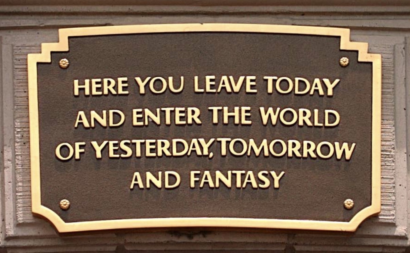
Figure 5. Plaque above one of Disneyland’s two entrance tunnels. Image: https://commons.wikimedia.org/wiki/File:Disneyland_plaque.jpg
Such a clear and relevant vision can inspire and orient design teams around a particular direction. That said, a compelling vision and a clear conceptual framework are not enough. The vision and framework must be concretized so people can experience them. This brings us to the second key aspect of Disneyland’s design: its underlying structures.
Clear and Logical Structures
Downs and Stea (1973) explained how individuals make sense of their environments through the formation of cognitive maps,
a process composed of a series of psychological transformations by which an individual acquires, codes, stores, recalls, and decodes information about the relative locations and attributes of phenomena in his everyday spatial environment.
The idea of cognitive mapping has influenced the discipline of information architecture. Bollini and Palma introduced cognitive maps in the context of web interfaces in 2004 (Bollini & Palma 2004), but only as representational artifacts. Morville suggested cognitive maps play a role in wayfinding in digital information environments (Morville 2005), and Hinton addressed the role of cognitive maps in contextual sense-making while noting the limitations of the mapping metaphor (Hinton 2014, pp. 113–117). Resmini noted the role of cognitive maps in helping users perceive narrative coherence in simulated digital spatial experiences (Resmini 2021).
Whether digital or physical, the legibility and coherence of the environment, objects, and actors within it determine the degree to which people can form cognitive maps. As Hinton put it,
(a) city’s layout, culture’s language, and the ever-present activity of other people serve as extended-cognitive scaffolding that have the models already in them, without our having to keep them in our heads. The environment that makes up someone’s context is inseparable from their ability to understand, learn, and navigate that environment. All the more reason why we have to make environments that are coherently structured so that user perception can make sense of them based on what they present to the perceiver in the moment, rather than some hoped-for map in the user’s head.
Simpler configurations with clearly distinguishable features are easier to learn than vague, random, or chaotic configurations. With its hodgepodge of themes and experiences designed to excite and entertain, Disneyland could be difficult to learn and navigate. The park’s original narrative themes (European fairy tales, the settling of the American West, colonial-era exotica, and corporate-driven research and development) do not fit together conceptually or aesthetically. Haphazardly merging these themes could result in an incoherent environment that would make it difficult for guests to form accurate cognitive maps.
Disneyland’s carefully designed structures bring coherence and order to this heterogeneous mix of narratives. These structural constructs allow guests to create good internal models so they can understand where they are, what they can do there, and where they can go next, despite the park’s eclectic content. As we shall see, they also allow the park to evolve while maintaining conceptual coherence.
We will examine three critical structural aspects of the Disneyland experience: its taxonomy, its topological structure, and its use of metaphors.
Disneyland’s Taxonomy
Disneyland is divided into lands such as Tomorrowland, Fantasyland, and Adventureland. These lands, and the attractions they contain, can be rendered as a taxonomy. For example, the Jungle Cruise attraction only makes sense in Adventureland, given that the attraction’s narrative and theme (a cruise through tropical rivers of the world) align with that of the land (equatorial colonial outposts.) The hierarchical outline of the lands and the elements they contain can be seen as a map to Disneyland’s content, an index to the experiences and narratives it offers, much like a sitemap represents a website’s content.
Disneyland’s Topological Structure
This taxonomy has a peculiar characteristic: even though each land contains elements that are unique to it, such as the Jungle Cruise in Adventureland, all lands offer the same types of things: they all have attractions, restaurants, shops, and guest services facilities such as bathrooms or first aid stations. I call this structural self-similarity between the main areas of the place its topological structure.
In his work on the conceptualization of blended space, Benyon uses the term “topology” to describe relationships between objects in an environment: “how local or distant the objects are from one another and the direction that they lie in” (Benyon 2014). This usage is consistent with the spatial sense of the term. While the relationship between the two meanings of the term is worth exploring, I am using “topology” here in its mathematical sense, the study of the properties that are preserved when something undergoes non-destructive transformations such as twisting, stretching, and scaling. For example, if you stretch a circle, you create an ellipse. The ellipse and the circle are topologically equivalent in that the former preserves the latter’s essential shape, only elongated in one dimension. However, if you tear the ellipse in half, it would no longer be topologically equivalent to the circle.
In this sense, Disneyland’s lands are topologically equivalent. Even though they feature different elements and themes, the lands share a standard structure that makes them echo each other. The attractions-restaurants-shops-services template is an invariant structural construct: all lands in all Disneyland parks use it.
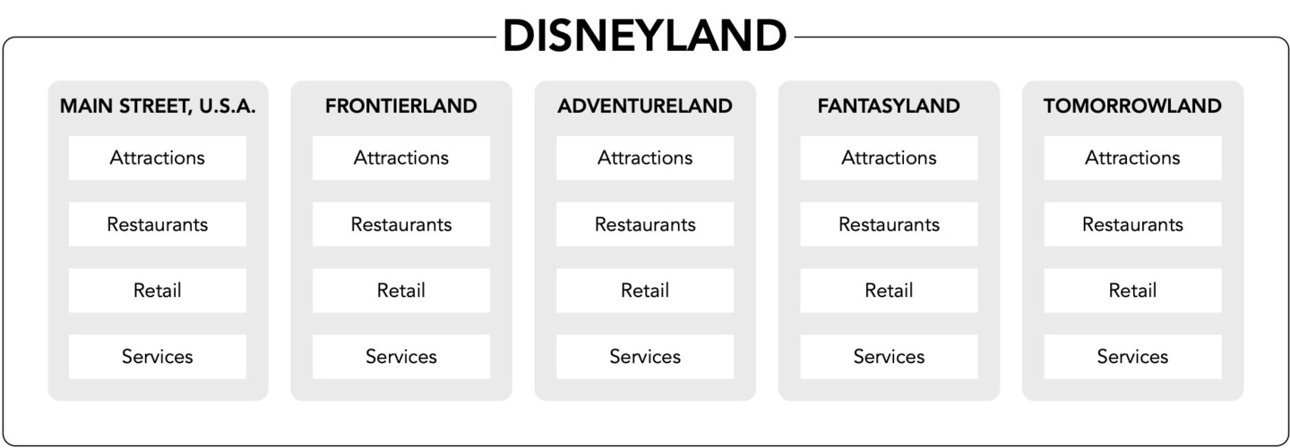
Figure 6. Disneyland’s topological “land” structure, with each land containing attractions, restaurants, retail, and facilities
This arrangement has an important effect on how visitors understand and navigate the park. For one thing, themes are made more apparent because they are presented as variations on top of an invariant, predictable structure. This structure makes the environment easier to learn since the types of elements available in one land are present in the others. For example, having visited Frontierland and experienced its western-themed attractions and retail and food options, Adventureland visitors can expect to find appropriately themed offerings there. Because the types of offerings are predictable, users can focus their attention on the differences between them (i.e., narratives and themes) instead.
It is worth noting that this invariance does not mean the elements’ relationships, proportions, and amounts are identical in all the lands. Adventureland has more attractions than Main Street, U.S.A., for example. What’s important is that the underlying structure itself remains constant as guests move from one land to the next.
This topological structure has made it possible for Disneyland to change and grow over the decades while preserving the environment’s clarity. Park designers occasionally add and remove attractions, restaurants, shops, and services to the park. Occasionally they also add a new land with its own set of attractions, restaurants, shops, and services. And, of course, the park/land construct itself has been replicated in the other five Disneyland-style parks worldwide.
Topological structures are also relevant to the design of digital information environments. An essential purpose of establishing a content strategy is identifying content types so that large-scale information environments can change organically while maintaining coherence and understandability. Such content types are a topological construct. That said, topologies apply to more than just content-heavy systems: they are an essential consideration for any large-scale environment that must adapt to changing conditions over time.
Metaphors and Language
Another cunning use of structural distinctions in Disneyland is how it deploys language and metaphor to influence human behavior. For example, the people who work in the park are called cast members instead of employees (Watts 2013, p. 391), and customers are referred to as guests (Snow 2019, p. 186) [1]
Underlying Disneyland’s peculiar use of language is a ubiquitous metaphor: that its employees are putting on a show for the benefit of guests (fig. 7). This metaphor informs the Disneyland experience for both guests and employees. For example, areas of the park forbidden to guests are said to be “backstage”. When something is broken, and in plain sight of guests, it is said to be “bad show”. And cast members don’t wear uniforms; they wear “costumes”.

Figure 7. Disney custodial staff member entertaining guests. Image: Loren Javier
The words we use to describe elements and actors in the environment influence how we think about them. We think differently of actors in the environment if we consider them customers or consumers rather than users. Industry-specific terms, such as patient (in healthcare) can clarify the actor’s role and change our understanding of what they are expected to do — and not do — in the environment.
Disneyland’s show business metaphor, as expressed through semantic distinctions such as member/guest and front stage/backstage, is an essential structural construct that organizes and directs the experience of interacting in and with the park. In conjunction with the park’s taxonomical and topological structures, this metaphor establishes distinctions and relationships between the elements that constitute the environment.
The mindful use of metaphors and disciplined language distinctions is also central to making digital information environments more understandable. For example, most desktop and laptop computers implement user interfaces that rely on a file/folder metaphor, which make the underlying data structures more understandable to non-technical users. In accordance with this metaphor, computers running Windows and macOS operating systems refer to file containers using the word folders, whereas operating systems descended from UNIX (such as Linux) refer to file containers as directories, a term that suggests a different metaphor.
Coherent semantic structures make the environment easier to learn and navigate. They influence how people think and behave when they interact in the place. Structures also enable the environment to evolve while preserving its conceptual coherence. But these are abstract ideas. These structures must be made tangible for people to relate to the environment. This brings us to the third aspect of Disneyland’s design: how it manifests these structures through proven placemaking principles.
Proven Placemaking Principles
A coherent structural framework isn’t sufficient to create an understandable environment. People only relate to artifacts they can experience. As a result, software designers must manifest these conceptual structures as tangible forms that people can experience. Urban design and architecture offer important precedents.
The study of how people form internal representations of the places they inhabit can be especially useful. In “Pervasive Information Architecture”, Resmini and Rosati noted the influence of Kevin Lynch’s seminal book, “The Image of the City”, on the discipline of information architecture (Resmini & Rosati 2011, pp. 71–72). Lynch (1960) describes five elements that define how people experience urban environments:
- Districts: The sections of the town or city, which have individual characters, and which people have a sense of being “inside of”;
- Paths: How people move around the environment;
- Landmarks: Physical structures that give people a sense of bearing;
- Edges: Boundaries between two phases, lines that break continuity in the place;
- Nodes: Areas of concentration of activity that serve as focal points for people to go to or from.
Particular combinations of these elements make cities and towns different from each other and allow people to create cognitive maps of the environment.
Because Disneyland is an urban-sized environment that has been designed and maintained by a single entity, these elements come together in a harmonious, focused, and legible manner. The park’s designers paid careful attention to the hierarchy of the various components of the environment, the transitions and boundaries between areas of the park, and the connections between them, creating a place that is not only easy to get around in but also coherent, learnable, and memorable, despite its potentially confusing content.
When navigating digital information environments, people also need to understand where they are, what they can do there, and where they can go next. Studying Lynch’s elements and how they manifest in Disneyland can help designers create information environments that make this possible.
Overall Navigation Strategy
When software designers think of navigation systems, they usually think about navigation bars and search mechanisms. These components allow people to move from one area of a website or app to another and get closer to what they are looking for. Navigation in Disneyland has similar purposes.
Disneyland’s designers used a “hub and spoke” navigation model: it features a central hub from which all lands radiate (fig. 8). The hub is central to the Disneyland experience, physically and conceptually. As Marling described it, the hub
diagrammed the concepts of choice and change. Like a Wednesday-night (television) viewer, the tourist standing in the Hub at Disneyland was presented with a whole range of possibilities (Marling 1997, p. 74).
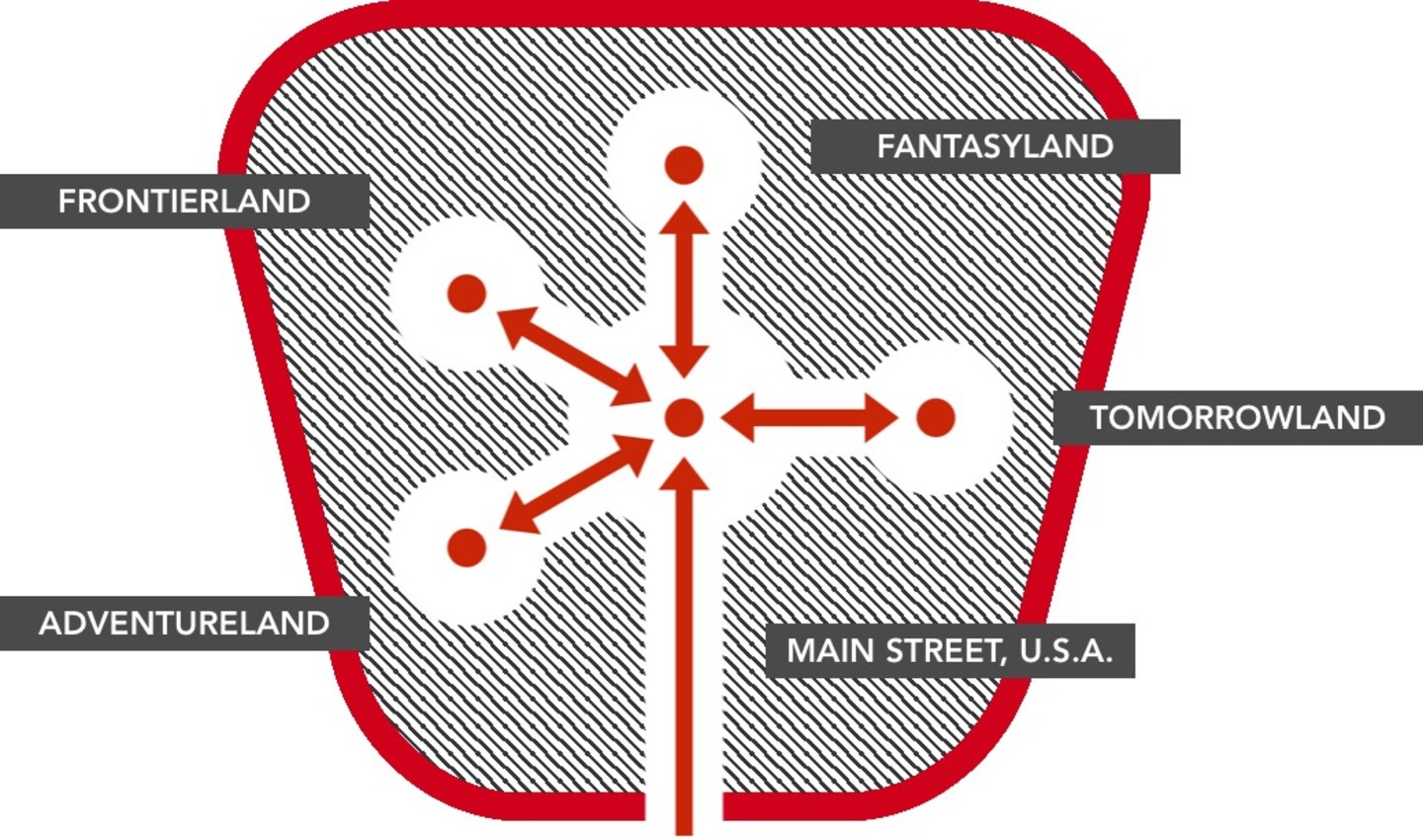
Figure 8. Disneyland’s original layout (1955)
Initially, the park had a single entrance in front of Main Street U.S.A., a direct conduit to this central hub. The single entrance was another innovation in amusement park design: when Disney consulted other amusement park operators during the design of Disneyland, he was told this scheme would create traffic issues (Thomas 1976, p. 251). In short, the hub allows guests to quickly and easily move between parts of the environment, which they do via paths.
Paths
It’s essential that guests find their way from the park’s entrance to the hub. This move is easier to undertake if the path between them is clearly perceived. In Disneyland’s case, paths are exceptionally clear.
Guests enter the park by crossing one of two tunnels underneath a train station. They then head down Main Street, U.S.A. towards the hub, from which they can choose to visit any of the other lands. As the conduit to the hub, Main Street, U.S.A. illustrates Lynch’s concept of paths: a way for people to get from one place to another. The hub is connected to each land with clearly labeled paths.
In many websites, the primary navigation bar plays a similar role as the hub: it clarifies for users the paths available to different parts of the site. For example, visitors to apple.com see options to navigate to pages related to company product lines, its online store, support, etc. (fig. 9) Because the bar is available in a stable location on most pages, users can return there to visit different parts of the site, much like they can with Disneyland’s hub.

Figure 9. apple.com’s primary navigation bar
Landmarks
People know to walk down Main Street, U.S.A. because their attention is drawn to an unusual element at the end of the street: Sleeping Beauty Castle, a sight never seen before at the end of a traditional American Main Street. The castle is an example of what Disney called a “wienie”: a prominent vertical element meant to pique guests’ interest and entice them to move in that direction (Marling 1997, p. 66).

Figure 10. The TWA Moonliner rocket, an early Tomorrowland wienie. Image: T. Simpson
The hub-and-spoke organization scheme, combined with the castle wienie, would allow guests to orient themselves and traverse the environment more efficiently (Snow 2019). Once in the hub, guests would look around and see other wienies beckoning them: the Mark Twain Riverboat in Frontierland and the TWA rocket ship in Tomorrowland (fig. 10) (Thomas 1976, p. 251)[2].
These “wienies” are examples of Lynch’s landmarks: they not only attract attention by standing out but also orient guests as they move around the busy environment. In websites and apps, prominent and persistent visual elements play a similar role. For example, Amazon’s website and apps feature an iconic shopping cart icon, always beckoning the user to initiate the checkout process (fig. 11).

Figure 11. The shopping cart icon in Amazon’s website and iOS app
Nodes
Walking toward “wienies”, Disneyland guests eventually find themselves in an opening or plaza where they can experience the theming and attractions unique to each land. These central areas are examples of Lynch’s nodes. The combination of these nodes, paths, and landmarks makes Disneyland easy to navigate.
There are equivalents to all three in software user interface design. Navigation bars and search systems allow users of digital information environments to move from one part of the environment to another. Consistent semantic elements such as labels and icons provide landmarks that help people orient themselves and indicate where they can go. Second-level screens serve as nodes that provide focused access to related information elements and a sense of local identity for different areas of the environment.
Districts
Disneyland’s lands such as Fantasyland or Adventureland can be thought of as instances of Lynch’s districts. They have unique characteristics that set them apart and give them particular flavors. The lands convey these concepts and narrative — the things that make them different from each other — through thorough and detailed theming. For example, everything in Adventureland — the architecture, the foliage, the music, the smells — has been carefully orchestrated to make guests feel like they are standing in an exotic jungle outpost.
In software and web design, the equivalent of districts are parts of the environment with distinctive characteristics or themes that set them apart from other parts of the environment. For example, usatoday.com uses color to differentiate the site’s main sections, so users moving from the “Money” section of the site to “Sports” or “Entertainment” will notice ambient differences that let them know they’re in different parts of the environment.
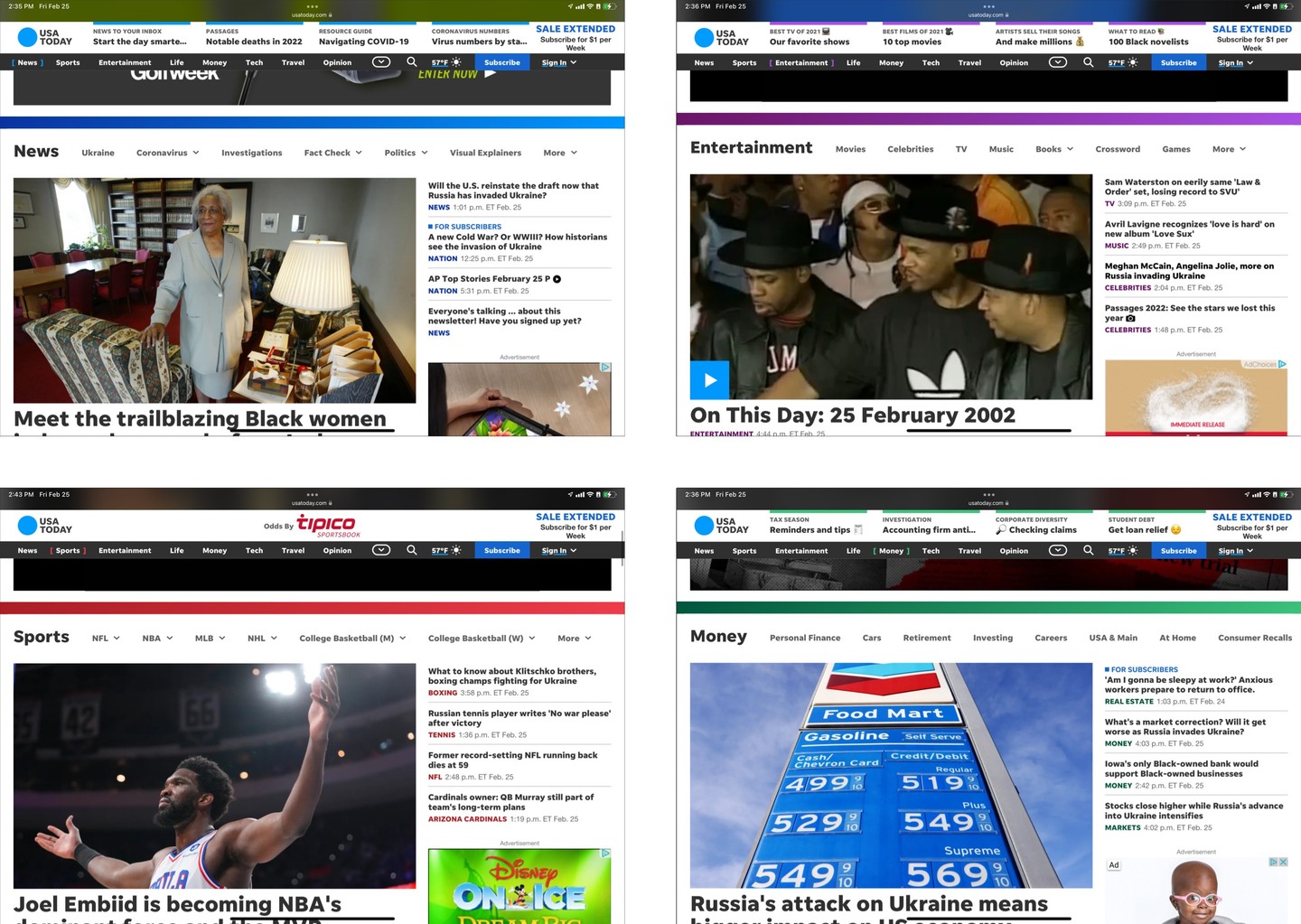
Figure 12. usatoday.com’s main sections.
Two main areas of focus come to mind with regard to theming: visual presentation and writing style or tone of voice. Both are subject to stylistic trends that can override practical needs and sometimes even usability.
Consider the move towards “flat” visual design in the early 2010s. The flat aesthetic does not just eschew “skeuomorphic” (or “realistic”) details in favor of a more “honest” digital aesthetic but also does away with many visual affordances. While the flat aesthetic might have arisen to satisfy practical needs (e.g. designing digital products that adapt to different screen sizes,) its ensuing widespread adoption likely owes much to subjective taste. By the early 2010s, skeuomorphic interfaces were seen as outdated — a liability in the fast-moving world of tech.
Rather than follow stylistic trends, theming should be in service to the conceptual framework that underlies the environment. Disneyland would be much less successful if its designers pursued an aesthetic that expressed the “honest” nature of its materials: fiberglass, wood, and steel. Instead, Disney’s designers harnessed the plastic capabilities of those materials to reinforce the differences between lands in support of the conceptual framework that makes the park such a compelling experience.
Edges
One of Disneyland’s most interesting features is how it deals with transitions: those between the individual lands and between the park and the outside world. These barriers and transitions are examples of Lynch’s edges.
The park’s lands have been carefully designed so that themes blend smoothly into each other. A guest walking from Adventureland to Frontierland will not experience an abrupt change. Instead, the environments blend into each other to achieve what has been compared to a cinematic cross-dissolve in real-life [3]. These smooth transitions can be called “soft” edges.
The opposite, “hard” edges, are transitions that have been intentionally designed to keep things apart. Disneyland also offers a prime example of these hard edges. Disney wanted to keep guests from seeing the outside world within the park so their experience would be more immersive. To do this, he surrounded Disneyland with a train track atop a raised earth berm, which occludes sightlines into and out of the park (Snow 2019, pp. 132–133). When the park first opened, this berm was crossed at only one point: the previously mentioned entrance tunnels leading to Main Street, U.S.A. This berm is an example of a hard edge.
People using digital information environments must often move from one part of the environment to another. The hardness or softness of the edges between parts of the environment conveys essential information about the intended meaning of the interaction.
For example, like many financial services websites, Citibank’s website features areas meant for public use (i.e. the bank’s marketing pages) and more private “logged-in” areas intended only for customers. Users cross from the public to the private areas by entering their username and password into a login box. After they do so, they do not just see different content but also a different set of primary navigation choices (fig. 13).
This is a kind of hard edge in that users cannot see any private content before entering their credentials and see different content with different navigational options once they do. The two sites look superficially similar but are, in fact, very different spaces. Because the transition from public to private requires users to log in, they are aware of having moved from one part of the environment to another.
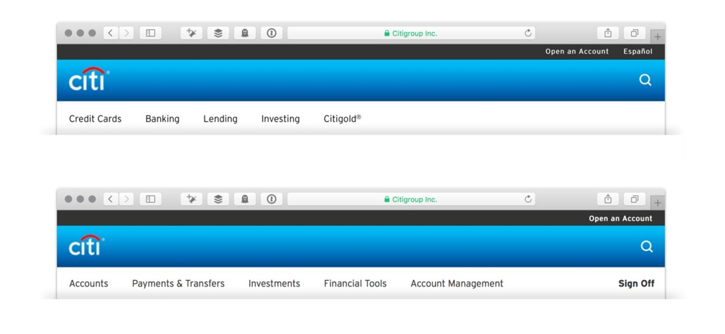
Figure 13. The primary navigation bars for the public and private areas of citibank.com
In other cases, boundaries are softer, with more gradual transitions. For example, Citibank’s iPhone app provides users with information about their bank balances without requiring them to log in every time. After the initial login, they are only asked to authenticate again to undertake other actions, such as transferring funds between accounts.
The intermediate state, where the user sees some personal information without being logged in, relies on the fact that some actions users can undertake are more dangerous than others. While reading account balances can be a serious privacy breach, it is not as serious as transferring funds. And users can protect the entire device with a passcode or biometrics, so it’s possible for the app itself to be operating within a secure context.
This in-between state represents a kind of soft edge between the public and private environments. The app’s designers have sought to make tradeoffs between convenience (e.g. being able to read balances at a glance) and security (e.g. only being able to read balances and not undertaking other actions).

Figure 14. The Citibank iPhone app showing account balances. Image: Citibank
Notwithstanding technical constraints, the edge’s degree of hardness should be a design consideration aimed at helping users better understand the environment’s intended use.
Conclusions
People form internal models of urban environments, such as towns and cities, using five elements: districts, edges, nodes, paths, and landmarks. Information environments have comparable elements that help people understand where they are and what they can do there. These placemaking elements are most effective when they work together to implement a semantic structure that brings coherence to the environment. This structure implements distinctions and metaphors that allow people to relate to and understand the environment. This structure is most effective when directed by a clear vision. In the case of Disneyland, this vision was set forth early on in the design process. It guided the design team toward creating a new type of environment that resonated deeply with its users.
These three components — vision, structure, and placemaking elements — build on each other. It is challenging to create meaningful structures when the vision is not clear, and designing placemaking elements without a clear semantic structure supporting them can only lead to an incoherent environment. As they do with physical environments, people who use digital information environments must build effective internal models to act more skillfully. Designers can help them by using proven principles to create more legible places informed by a coherent structure that articulates a relevant vision. Disneyland offers a good model of how such a vision can produce structures that underpin a successful place.
References
- Alexander, C. (1964) Notes on the Synthesis of Form. Harvard University Press.
- Andreessen, M. (2011). Why Software Is Eating the World. Wall Street Journal, C2. https://www.wsj.com/articles/SB10001424053111903480904576512250915629460.
- Benyon, D. (2014) Spaces of interaction, places for experience. Synthesis Lectures on Human-Centered Information. Morgan & Claypool.
- Bollini, L. and Palma, G. (2004) Cognitive maps: new paradigms in information architecture and interface design for the web: the opsis identifier descriptive model for web information architecture based on cognitive maps: designing-X a case study. In Cañas, A. J., Novak, J. D., González Garcia, F. M. (eds) Concept maps: theory, methodology, technology: proceedings of the first International Conference on Concept Mapping. Universidad de Navarra. Pp. 95-98. https://dialnet.unirioja.es/servlet/articulo?codigo=5601752.
- Doctorow, C. (2014) Disneyland’s original prospectus revealed! https://boingboing.net/2014/05/20/disneylandprospectus.html.
- Downs, R. M. and Stea, D. (1973) Cognitive Maps and Spatial Behavior: Process and Products. In Image and Environment: Cognitive Mapping and Spatial Behavior. Aldine Publishing Company.
- Hinton, A. (2014).Understanding Context: Environment, Language, and Information Architecture. O’Reilly Media.
- Imagineers, The (1998) Walt Disney Imagineering: A Behind the Dreams Look at Making the Magic Real. Hyperion Books. http://books.google.com/books?id=b5vpAAAAMAAJ&hl=&source=gbs_api.
- Lynch, K. (1960) The Image of the City. The MIT Press.
- Marling, K. A. (1997) Imagineering the Disney Theme Parks. In Marling, K. A. (ed) Designing Disney’s Theme Parks: The Architecture of Reassurance. Flammarion. Pp. 29–177.
- Morville, P. (2005) Ambient Findability: What We Find Changes Who We Become. O’Reilly Media.
- Resmini, A. (2021) The Organization and Exploration of Space as Narrative: Information Architecture in Video Games. In Resmini, A., Rice, S. A. and Irizarry, B. (eds) Advances in Information Architecture. Springer. HCI Series. Pp. 195–210. https://link.springer.com/chapter/10.1007/978-3-030-63205-2_18
- Resmini, A. and Rosati, L. (2011) Pervasive Information Architecture: Designing Cross-channel User Experiences. Morgan Kaufmann.
- Rosenfeld, L. and Morville, P. (2006) Information Architecture for the World Wide Web (3rd ed). O’Reilly Media.
- Rubin, J. (2020) Global Attractions Attendance Report. https://www.teaconnect.org/images/files/TEA_408_543519_211001.pdf.
- Snow, R. (2019) Disney’s Land: Walt Disney and the Invention of the Amusement Park That Changed the World. Scribner.
- Thomas, B. (1976) Walt Disney: An American Original. Hyperion.
- Tuan, Y.-F. and Hoelscher, S. D. (1997) Disneyland: Its Place in World Culture. In Marling, K. A. (ed) Designing Disney’s Theme Parks: The Architecture of Reassurance. Flammarion. Pp. 191–200.
- Watts, S. (2013) The Magic Kingdom: Walt Disney and the American Way of Life. University of Missouri Press.
- Zenger, T. (2013) The Disney Recipe. Harvard Business Review. https://hbr.org/2013/05/what-makes-a-good-corporate-st.
Footnotes
[1] The traditional term for the latter in the amusement park industry before Disney was “marks”, a derogatory term.
[2] Eventually, the Swiss Family Robinson’s treehouse played a similar role in Adventureland.
[3] Many of Disneyland’s designers came from the movie industry. As a result, their approach to designing the environment was influenced by cinematic conventions.

